The Science in Data Science

The science in “data science” basically represents the “scientific method”.

It’s a decade since the phrase “data scientist” got coined, though if you go on LinkedIn, you will find people who claim to have more than two years of experience in the subject.

The origins of the phrase itself are unclear, though some sources claim that it came out of this HBR article in 2012 written by Thomas Davenport and DJ Patil (though, in 2009, Hal Varian, formerly Google’s Chief Economist had said that the “sexiest job of the 21st century” will be that of a statistician).

Some of you might recall that in 2018, I had said that “I’m not a data scientist any more“. That was mostly down to my experience working with companies in London, where I found that data science was used as a euphemism for “machine learning” – something I was incredibly uncomfortable with.

With the benefit of hindsight, it seems like I was wrong. My view on data science being a euphemism for machine learning came from interacting with small samples of people (though it could be an English quirk). As I’ve dug around over the years, it seems like the “science” in data science comes not from the maths in machine learning, but elsewhere.

One phenomenon that had always intrigued me was the number of people with PhDs, especially NOT in maths, computer science of statistics, who have made a career in data science. Initially I dismissed it down to “the gap between PhD and tenure track faculty positions in science”. However, the numbers kept growing.

The more perceptive of you might know that I run a podcast now. It is called “Data Chatter“, and is ten episodes old now. The basic aim of the podcast is for me to have some interesting conversations – and then release them for public benefit. Yeah, yeah.

So, there was this thing that intrigued me, and I have a podcast. I did what you would have expected me to do – get on a guest who went from a science background to data science. I got Dhanya, my classmate from school, to talk about how her background with a PhD in neuroscience has helped her become a better data scientist.

It is a fascinating conversation, and served its primary purpose of making me understand what the “science” in data science really is. I had gone into the conversation expecting to talk about some machine learning, and how that gets used in academia or whatever. Instead, we spoke for an hour about designing experiments, collecting data and testing hypotheses.

The science in “data science” basically represents the “scientific method“. What Dhanya told me (you should listen to the conversation) is that a PhD prepares you for thinking in the scientific method, and drills into you years of practice in it. And this is especially true of “experimental” PhDs.

And then, last night, while preparing the notes for the podcast release, I stumbled upon the original HBR article by Thomas Davenport and DJ Patil talking about “data science”. And I found that they talk about the scientific method as well. And I found that I had talked about it in my newsletter as well – only to forget it later. This is what I had written:

Reading Patil and Davenport’s article carefully suggests, however, that companies might be making a deliberate attempt at recruiting pure science PhDs for data scientist roles.

The following excerpts from the article (which possibly shaped the way many organisations think about data science) can help us understand why PhDs are sought after as data scientists.

  • Data scientists’ most basic, universal skill is the ability to write code. This may be less true in five years’ time (Ed: the article was published in late 2012, so we’re almost “five years later” now)
  • Perhaps it’s becoming clear why the word “scientist” fits this emerging role. Experimental physicists, for example, also have to design equipment, gather data, conduct multiple experiments, and communicate their results.
  • Some of the best and brightest data scientists are PhDs in esoteric fields like ecology and systems biology.
  • It’s important to keep that image of the scientist in mind—because the word “data” might easily send a search for talent down the wrong path

Patil and Davenport make it very clear that traditional “data analysts” may not make for great data scientists.

We learn, and we forget, and we re-learn. But learning is precisely what the scientific method, which underpins the “science” in data science, is all about. And it is definitely NOT about machine learning.

Should this have been my SOP?

I was chatting with a friend yesterday about analytics and “data science” and machine learning and data engineering and all that, and he commented that in his opinion a lot of the work mostly involves gathering and cleaning the data, and that any “analytics” is mostly around averaging and the sort.

This reminded me of an old newsletter I’d written way back in January 2018, soon after I’d read Raphael Honigstein‘s Das Reboot. A short discussion ensued. I sent him the link to that newsletter. And having read the bit about Das Reboot (I was talking about how SAP had helped the German national team win the 2014 FIFA World Cup) and the subsequent section of the newsletter, my friend remarked that I could have used that newsletter edition as a “statement of purpose for my job hunt”.

Now that my job hunt is done, and I’m no more in the job market, I don’t need an SOP. However, for the purpose that I don’t forget this, and keep in mind the next time I’m applying for a job, I’m reproducing a part of that newsletter here. Even if you subscribed to that newsletter, I recommend that you read it again. It’s been a long time, and this is still relevant.

Das Reboot

This is not normally the kind of book you’d see being recommended in a Data Science newsletter, but I found enough in Raphael Honigstein’s book on the German football renaissance in the last 10 years for it to merit a mention here.

So the story goes that prior to the 2014 edition of the Indian Premier League (cricket), Kolkata Knight Riders had announced a partnership with tech giant SAP, and claimed that they would use “big data insights” from SAP’s HANA system to power their analytics. Back then, I’d scoffed, since I wasn’t sure if the amount of data that’s generated in all cricket matches till then wasn’t big enough to merit “big data analytics”.

As it happens, the Knight Riders duly won that edition of the IPL. Perhaps coincidentally, SAP entered into a partnership with another champion team that year – the German national men’s football team, and Honigstein dedicates a chapter of his book to this, and other, partnerships, and the role of analytics in helping the team’s victory in that year’s World Cup.

If you look past all the marketing spiel (“HANA”, “big data”, etc.) what SAP did was to group data, generate insights and present it to the players in an easily consumable format. So in the football case, they developed an app for players where they could see videos of specific opponents doing things. It made it easy for players to review certain kinds of their own mistakes. And so on. Nothing particularly fancy; simply simple data put together in a nice easy-to-consume format.

A couple of money quotes from the book. One on what makes for good analytics systems:

‘It’s not particularly clever,’ says McCormick, ‘but its ease of use made it an effective tool. We didn’t want to bombard coaches or players with numbers. We wanted them to be able to see, literally, whether the data supported their gut feelings and intuition. It was designed to add value for a coach or athlete who isn’t that interested in analytics otherwise. Big data needed to be turned into KPIs that made sense to non-analysts.’

And this one on how good analytics can sometimes invert hierarchies, and empower the people on the front to make their own good decisions rather than always depend on direction from the top:

In its user-friendliness, the technology reversed the traditional top-down flow of tactical information in a football team. Players would pass on their findings to Flick and Löw. Lahm and Mertesacker were also allowed to have some input into Siegenthaler’s and Clemens’ official pre-match briefing, bringing the players’ perspective – and a sense of what was truly relevant on the pitch – to the table.

A lot of business analytics is just about this – presenting the existing data in an easily consumable format. There might be some statistics or machine learning involved somewhere, but ultimately it’s about empowering the analysts and managers with the right kind of data and tools. And what SAP’s experience tells us is that it may not be that bad a thing to tack on some nice marketing on top!

Hiring data scientists

I normally don’t click through on articles in my LinkedIn feed, but this article about the churn in senior data scientists caught my eye enough for me to click through and read the whole thing. I must admit to some degree of confirmation bias – the article reflected my thoughts a fair bit.

Given this confirmation bias, I’ll spare you my commentary and simply put in a few quotes:

Many large companies have fallen into the trap that you need a PhD to do data science, you don’t.

Not to mention, I have yet to see a data science program I would personally endorse. It’s run by people who have never done the job of data science outside of a lab. That’s not what you want for your company.

Doing data science and managing data science are not the same. Just like being an engineer and a product manager are not the same. There is a lot of overlap but overlap does not equal sameness.

Most data scientists are just not ready to lead the teams. This is why the failure rate of data science teams is over 90% right now. Often companies put a strong technical person in charge when they really need a strong business person in charge. I call it a data strategist.

I have worked with companies that demand agile and scrum for data science and then see half their team walk in less than a year. You can’t tell a team they will solve a problem in two sprints. If they don’t’ have the data or tools it won’t happen.

I’ll end this blog post with what my friend had to say (yesterday) about what I’d written about how SAP helped the German National team. “This is what everyone needs to do first. (All that digital transformation everyone is working on should be this kind of work)”.

I agree with him on this.

The first heart attack

Gerard Houllier is no more. The man who led Liverpool to the “cup treble” in 2001 passed away following a heart operation. Supporters of the club might remember that he had had yet another heart operation when he was managing Liverpool, and the impact of that heart attack on the club was serious.

I’m reusing a graph that I’d put here a couple of years back. This shows Liverpool’s Elo Rating (as per clubelo.com) over the years, with managers’s reigns being overlaid on top.

Notice the green region towards the right – it says “Houllier”, and it has one massive up and one massive down. Actually I’m going to re-upload this graph to blow up the Premier League period.

Liverpool’s Elo Rating in the Premier League period

Now you can see that there are two separate regions marked “Gerard Houllier”, with a small gap that says “Phil Thompson”. This gap represented Houllier’s first heart operation. Notice how, before his heart operation, Liverpool had been on a massive upswing, on their way back nearly to the levels where they had started off in the Premier League (they had last won  the league in 1990; compare to the first graph here).

And then the heart attack, and heart operation happened. Houllier’s assistant Phil Thompson took over and held things (here is Thompson’s tribute to Houllier). And then Houllier came back and he and Thompson became joint managers (the “orange” region here). And Liverpool’s rally was gone. The 2001-2 season was gone.

Looking at this graph, with the full benefit of hindsight, Houllier’s sacking in 2004 (to be replaced by Rafa Benitez) seems fully justified. And then notice the club’s steep fall under Benitez after Xabi Alonso got sold in 2009.

I’ve said here before – these Elo graphs can be used to tell a lot of footballing stories.

69 is the answer

The IDFC-Duke-Chicago survey that concluded that 50% of Bangalore had covid-19 in late June only surveyed 69 people in the city. 

When it comes to most things in life, the answer is 42. However, if you are trying to rationalise the IDFC-Duke-Chicago survey that found that over 50% of people in Bangalore had had covid-19 by end-June, then the answer is not 42. It is 69.

For that is the sample size that the survey used in Bangalore.

Initially I had missed this as well. However, this evening I attended half of a webinar where some of the authors of the survey spoke about the survey and the paper, and there they let the penny drop. And then I found – it’s in one small table in the paper.

The IDFC-Duke-Chicago survey only surveyed 69 people in Bangalore

The above is the table in its glorious full size. It takes effort to read the numbers. Look at the second last line. In Bangalore Urban, the ELISA results (for antibodies) were available for only 69 people.

And if you look at the appendix, you find that 52.5% of respondents in Bangalore had antibodies to covid-19 (that is 36 people). So in late June, they surveyed 69 people and found that 36 had antibodies for covid-19. That’s it.

To their credit, they didn’t highlight this result (I sort of dug through their paper to find these numbers and call the survey into question). And they mentioned in tonight’s webinar as well that their objective was to get an idea of the prevalence in the state, and not just in one particular region (even if it be as important as Bangalore).

That said, two things that they said during the webinar in defence of the paper that I thought I should point out here.

First, Anu Acharya of MapMyGenome (also a co-author of the survey) said “people have said that a lot of people we approached refused consent to be surveyed. That’s a standard of all surveying”. That’s absolutely correct. In any random survey, you will always have an implicit bias because the sort of people who will refuse to get surveyed will show a pattern.

However, in this particular case, the point to note is the extremely high number of people who refused to be surveyed – over half the households in the panel refused to be surveyed, and in a further quarter of the panel households, the identified person refused to be surveyed (despite the family giving clearance).

One of the things with covid-19 in India is that in the early days of the pandemic, anyone found having the disease would be force-hospitalised. I had said back then (not sure where) that hospitalising asymptomatic people was similar to the “precogs” in Minority Report – you confine the people because they MIGHT INFECT OTHERS.

For this reason, people didn’t want to get tested for covid-19. If you accidentally tested positive, you would be institutionalised for a week or two (and be made to pay for it, if you demanded a private hospital). Rather, unless you had clear symptoms or were ill, you were afraid of being tested for covid-19 (whether RT-PCR or antibodies, a “representative sample” won’t understand).

However, if you had already got covid-19 and “served your sentence”, you would be far less likely to be “afraid of being tested”. This, in conjunction with the rather high proportion of the panel that refused to get tested, suggests that there was a clear bias in the sample. And since the numbers for Bangalore clearly don’t make sense, it lends credence to the sampling bias.

And sample size apart, there is nothing Bangalore-specific about this bias (apart from that in some parts of the state, the survey happened after people had sort of lost their fear of testing). This further suggests that overall state numbers are also an overestimate (which fits in with my conclusion in the previous blogpost).

The other thing that was mentioned in the webinar that sort of cracked me up was the reason why the sample size was so low in Bangalore – a lockdown got announced while the survey was on, and the sampling team fled. In today’s webinar, the paper authors went off on a rant about how surveying should be classified as an “essential activity”.

In any case, none of this matters. All that matters is that 69 is the answer.


More on Covid-19 prevalence in Karnataka

As the old song went, “when the giver gives, he tears the roof and gives”.

Last week the Government of Karnataka released its report on the covid-19 serosurvey done in the state. You might recall that it had concluded that the number of cases had been undercounted by a factor of 40, but then some things were suspect in terms of the sampling and the weighting.

This week comes another sero-survey, this time a preprint of a paper that has been submitted to a peer reviewed journal. This survey was conducted by the IDFC Institute, a think tank, and involves academics from the University of Chicago and Duke University, and relies on the extensive sampling network of CMIE.

At the broad level, this survey confirms the results of the other survey – it concludes that “Overall seroprevalence in the state implies that by August at least 31.5 million residents had been infected by August”. This is much higher than the overall conclusions of the state-sponsored survey, which had concluded that “about 19 million residents had been infected by mid-September”.

I like seeing two independent assessments of the same quantity. While each may have its own sources of error, and may not independently offer much information, comparing them can offer some really valuable insights. So what do we have here?

The IDFC-Duke-Chicago survey took place between June and August, and concluded that 31.5 million residents of Karnataka (out of a total population of about 70 million) have been infected by covid-19. The state survey in September had suggested 19 million residents had been infected by September.

Clearly, since these surveys measure the number of people “who have ever been affected”, both of them cannot be correct. If 31 million people had been affected by end August, clearly many more than 19 million should have been infected by mid-September. And vice versa. So, as Ravi Shastri would put it, “something’s got to give”. What gives?

Remember that I had thought the state survey numbers might have been an overestimate thanks to inappropriate sampling (“low risk” not being low risk enough, and not weighting samples)? If 20 million by mid-September was an overestimate, what do you say about 31 million by end August? Surely an overestimate? And that is not all.

If you go through the IDFC-Duke-Chicago paper, there are a few figures and tables that don’t make sense at all. For starters, check out this graph, that for different regions in the state, shows the “median date of sampling” and the estimates on the proportion of the population that had antibodies for covid-19.

Check out the red line on the right. The sampling for the urban areas for the Bangalore region was completed by 24th June. And the survey found that more than 50% of respondents in this region had covid-19 antibodies. On 24th June.

Let’s put that in context. As of 24th June, Bangalore Urban had 1700 confirmed cases. The city’s population is north of 10 million. I understand that 24th June was the “median date” of the survey in Bangalore city. Even if the survey took two weeks after that, as of 8th of July, Bangalore Urban had 12500 confirmed cases.

The state survey had estimated that known cases were 1 in 40. 12500 confirmed cases suggests about 500,000 actual cases. That’s 5% of Bangalore’s population, not 50% as the survey claimed. Something is really really off. Even if we use the IDFC-Duke-Chicago paper’s estimates that only 1 in 100 cases were reported / known, then 12500 known cases by 8th July translates to 1.25 million actual cases, or 12.5% of the city’s population (well below 50% ).

My biggest discomfort with the IDFC-Duke-Chicago effort is that it attempts to sample a rather rapidly changing variable over a long period of time. The survey went on from June 15th to August 29th. By June 15th, Karnataka had 7200 known cases (and 87 deaths). By August 29th the state had 327,000 known cases and 5500 deaths. I really don’t understand how the academics who ran the study could reconcile their data from the third week of June to the data from the third week of August, when the nature of the pandemic in the state was very very different.

And now, having looked at this paper, I’m more confident of the state survey’s estimations. Yes, it might have sampling issues, but compared to the IDFC-Duke-Chicago paper, the numbers make so much more sense. So yeah, maybe the factor of underestimation of Covid-19 cases in Karnataka is 40.

Putting all this together, I don’t understand one thing. What these surveys have shown is that

  1. More than half of Bangalore has already been infected by covid-19
  2. The true infection fatality rate is somewhere around 0.05% (or lower).

So why do we still have a (partial) lockdown?

PS: The other day on WhatsApp I saw this video of an extremely congested Chickpet area on the last weekend before Diwali. My initial reaction was “these people have lost their minds. Why are they all in such a crowded place?”. Now, after thinking about the surveys, my reaction is “most of these people have most definitely already got covid and recovered. So it’s not THAT crazy”.

Covid-19 Prevalence in Karnataka

Finally, many months after other Indian states had conducted a similar exercise, Karnataka released the results of its first “covid-19 sero survey” earlier this week. The headline number being put out is that about 27% of the state has already suffered from the infection, and has antibodies to show for it. From the press release:

Out of 7.07 crore estimated populationin Karnataka, the study estimates that 1.93 crore (27.3%) of the people are either currently infected or already had the infection in the past, as of 16 September 2020.

To put that number in context, as of 16th September, there were a total of 485,000 confirmed cases in Karnataka (official statistics via covid19india.org), and 7536 people had died of the disease in the state.

It had long been estimated that official numbers of covid-19 cases are off by a factor of 10 or 20 – that the actual number of people who have got the disease is actually 10 to 20 times the official number. The serosurvey, assuming it has been done properly, suggests that the factor (as of September) is 40!

If the ratio has continued to hold (and the survey accurate), nearly one in two people in Karnataka have already got the disease! (as of today, there are 839,000 known cases in Karnataka)

Of course, there are regional variations, though I should mention that the smaller the region you take, the less accurate the survey will be (smaller sample size and all that). In Bangalore Urban, for example, the survey estimates that 30% of the population had been infected by mid-September. If the ratio holds, we see that nearly 60% of the population in the city has already got the disease.

The official statistics (separate from the survey) also suggest that the disease has peaked in Karnataka. In fact, it seems to have peaked right around the time the survey was being conducted, in September. In September, it was common to see 7000-1000 new cases confirmed in Karnataka each day. That number has come down to about 3000 per day now.

Now, there are a few questions we need to answer. Firstly – is this factor of 40 (actual cases to known cases) feasible? Based on this data point, it makes sense:

In May, when Karnataka had a very small number of “native cases” and was aggressively testing everyone who had returned to the state from elsewhere, a staggering 93% of currently active cases were asymptomatic. In other words, only 1 in 14 people who was affected was showing any sign of symptoms.

Then, as I might have remarked on Twitter a few times, compulsory quarantining or hospitalisation (which was in force until July IIRC) has been a strong disincentive to people from seeking medical help or getting tested. This has meant that people get themselves tested only when the symptoms are really clear, or when they need attention. The downside of this, of course, has been that many people have got themselves tested too late for help. One statistic I remember is that about 33% of people who died of covid-19 in hospitals died within 24 hours of hospitalisation.

So if only one in 14 show any symptoms, and only those with relatively serious symptoms (or with close relatives who have serious symptoms) get themselves tested, this undercount by a factor of 40 can make sense.

Then – does the survey makes sense? Is 15000 samples big enough for a state of 70 million? For starters, the population of the state doesn’t matter. Rudimentary statistics (I always go to this presentation by Rajeeva Karandikar of CMI)  tells us that the size of the population doesn’t matter. As long as the sample has been chosen randomly, all that matters for the accuracy of the survey is the size of the sample. And for a binary decision (infected / not), 15000 is good enough as long as the sample has been random.

And that is where the survey raises questions – the survey has used an equal number of low risk, high risk and medium risk samples. “High risk” have been defined as people with comorbidities. Moderate risk are people who interact a lot with a lot of people (shopkeepers, healthcare workers, etc.). Both seem fine. It’s the “low risk” that seems suspect, where they have included pregnant women and attendants of outpatient patients in hospitals.

I have a few concerns – are the “low risk” low risk enough? Doesn’t the fact that you have accompanied someone to hospital, or  gone to hospital yourself (because you are pregnant), make you higher than average risk? And then – there are an equal number of low risk, medium risk and high risk people in the sample and there doesn’t seem to be any re-weighting. This suggests to me that the medium and high risk people have been overrepresented in the sample.

Finally, the press release says:

We excluded those already diagnosed with SARS-CoV2 infection, unwilling to provide a sample for the test, or did not agree to provide informed consent

I wonder if this sort of exclusion doesn’t result in a bias in itself.

Putting all this together – that there are qual samples of low, medium and high risk, that the “low risk” sample itself contains people of higher than normal risk, and that people who have refused to participate in the survey have been excluded – I sense that the total prevalence of covid-19 in Karnataka is likely to be overstated. By what factor, it is impossible to say. Maybe our original guess that the incidence of the disease is about 20 times the number of known cases is still valid? We will never know.

Nevertheless, we can be confident that a large section of the state (may not be 50%, but maybe 40%?) has already been infected with covid-19 and unless the ongoing festive season plays havoc, the number of cases is likely to continue dipping.

However, this is no reason to be complacent. I think Nitin Pai is  bang on here.

And I know a lot of people who have been aggressively social distancing (not even meeting people who have domestic help coming home, etc.). It is important that when they do relax, they do so in a graded manner.

Wear masks. Avoid crowded closed places. If you are going to get covid-19 anyway (and many of us have already got it, whether we know it or not), it is significantly better for you that you get a small viral load of it.

Opinion polling in India and the US

(Relative) old-time readers of this blog might recall that in 2013-14 I wrote a column called “Election Metrics” for Mint, where I used data to analyse elections and everything else related to that. This being the election where Narendra Modi suddenly emerged as a spectacular winner, the hype was high. And I think a lot of people did read my writing during that time.

In any case, somewhere during that time, my editor called me “Nate Silver of India”.

I followed that up with an article on why “there can be no Nate Silver in India” (now they seem to have put it behind a sort of limited paywall). In that, I wrote about the polling systems in India and in the US, and about how India is so behind the US when it comes to opinion polling.

Basically, India has fewer opinion polls. Many more political parties. A far more diverse electorate. Less disclosure when it comes to opinion polls. A parliamentary system. And so on and so forth.

Now, seven years later, as we are close to a US presidential election, I’m not sure the American opinion polls are as great as I made them out to be. Sure, all the above still apply. And when these poll results are put in the hands of a skilled analyst like Nate Silver, it is possible to make high quality forecasts based on that.

However, the reporting of these polls in the mainstream media, based on my limited sampling, is possibly not of much higher quality than what we see in India.

Basically I don’t understand why analysts abroad make such a big deal of “vote share” when what really matters is the “seat share”.

Like in 2016, Hillary Clinton won more votes than Donald Trump, but Trump won the election because he got “more seats” (if you think about it, the US presidential elections is like a first past the post parliamentary election with MASSIVE constituencies (California giving you 55 seats, etc.) ).

And by looking at the news (and social media), it seems like a lot of Americans just didn’t seem to get it. People alleged that Trump “stole the election” (while all he did was optimise based on the rules of the game). They started questioning the rules. They seemingly forgot the rules themselves in the process.

I think this has to do with the way opinion polls are reported in the US. Check out this graphic, for example, versions of which have been floating around on mainstream and social media for a few months now.

This shows voting intention. It shows what proportion of people surveyed have said they will vote for one of the two candidates (this is across polls. The reason this graph looks so “continuous” is that there are so many polls in the US). However, this shows vote share, and that might have nothing to do with seat share.

The problem with a lot (or most) opinion polls in India is that they give seat share predictions without bothering to mention what the vote share prediction is. Most don’t talk about sample sizes. This makes it incredibly hard to trust these polls.

The US polls (and media reports of those) have the opposite problem – they try to forecast vote share without trying to forecast how many “seats” they will translate to. “Biden has an 8 percentage point lead over Trump” says nothing. What I’m looking for is something like “as things stand, Biden is likely to get 20 (+/- 15) more electoral college votes than Trump”. Because electoral college votes is what this election is about. The vote share (or “popular vote”, as they call it in the US (perhaps giving it a bit more legitimacy than it deserves) ), for the purpose of the ultimate result, doesn’t matter.

In the Indian context, I had written this piece on how to convert votes to seats (again paywalled, it seems like). There, I had put some pictures (based on state-wise data from general elections in India before 2014).

An image from my article for Mint in 2014 on converting votes to seats. Look at the bottom left graph

What I had found is that in a two-cornered contest, small differences in vote share could make a massive difference in the number of seats won. This is precisely the situation that they have in the US – a two cornered contest. And that means opinion polls predicting vote shares only should be taken with some salt.

Scrabble

I’ve forgotten which stage of lockdown or “unlock” e-commerce for “non-essential goods” reopened, but among the first things we ordered was a Scrabble board. It was an impulse decision. We were on Amazon ordering puzzles for the daughter, and she had just about started putting together “sounds” to make words, so we thought “scrabble tiles might be useful for her to make words with”.

The thing duly arrived two or three days later. The wife had never played Scrabble before, so on the day it arrived I taught her the rules of the game. We play with the Sowpods dictionary open, so we can check words that hte opponent challenges. Our “scrabble vocabulary” has surely improved since the time we started playing (“Qi” is a lifesaver, btw).

I had insisted on ordering the “official Scrabble board” sold by Mattel. The board is excellent. The tiles are excellent. The bag in which the tiles are stored is also excellent. The only problem is that there was no “scoreboard” that arrived in the set.

On the first day we played (when I taught the wife the rules, and she ended up beating me – I’m so horrible at the game), we used a piece of paper to maintain scores. The next day, we decided to score using an Excel sheet. Since then, we’ve continued to use Excel. The scoring format looks somewhat like this.

So each worksheet contains a single day’s play. Initially after we got the board, we played pretty much every day. Sometimes multiple times a day (you might notice that we played 4 games on 3rd June). So far, we’ve played 31 games. I’ve won 19, Priyanka has won 11 and one ended in a tie.

In any case, scoring on Excel has provided an additional advantage – analytics!! I have an R script that I run after every game, that parses the Excel sheet and does some basic analytics on how we play.

For example, on each turn, I make an average of 16.8 points, while Priyanka makes 14.6. Our score distribution makes for interesting viewing. Basically, she follows a “long tail strategy”. Most of the time, she is content with making simple words, but occasionally she produces a blockbuster.

I won’t put a graph here – it’s not clear enough. This table shows how many times we’ve each made more than a particular threshold (in a single turn). The figures are cumulative

Threshold
Karthik
Priyanka
30 50 44
40 12 17
50 5 10
60 3 5
70 2 2
80 0 1
90 0 1
100 0 1

Notice that while I’ve made many more 30+ scores than her, she’s made many more 40+ scores than me. Beyond that, she has crossed every threshold at least as many times as me.

Another piece of analysis is the “score multiple”. This is a measure of “how well we use our letters”. For example, if I start place the word “tiger” on a double word score (and no double or triple letter score), I get 12 points. The points total on the tiles is 6, giving me a multiple of 2.

Over the games I have found that I have a multiple of 1.75, while she has a multiple of 1.70. So I “utilise” the tiles that I have (and the ones on the board) a wee bit “better” than her, though she often accuses me of “over optimising”.

It’s been fun so far. There was a period of time when we were addicted to the game, and we still turn to it when one of us is in a “work rut”. And thanks to maintaining scores on Excel, the analytics after is also fun.

I’m pretty sure you’re spending the lockdown playing some board game as well. I strongly urge you to use Excel (or equivalent) to maintain scores. The analytics provides a very strong collateral benefit.


Covid-19 superspreaders in Karnataka

Through a combination of luck and competence, my home state of Karnataka has handled the Covid-19 crisis rather well. While the total number of cases detected in the state edged past 2000 recently, the number of locally transmitted cases detected each day has hovered in the 20-25 range.

Perhaps the low case volume means that Karnataka is able to give out data at a level that few others states in India are providing. For each case, the rationale behind why the patient was tested (which is usually the source where they caught the disease) is given. This data comes out in two daily updates through the @dhfwka twitter handle.

There was this research that came out recently that showed that the spread of covid-19 follows a classic power law, with a low value of “alpha”. Basically, most infected people don’t infect anyone else. But there are a handful of infected people who infect lots of others.

The Karnataka data, put out by @dhfwka  and meticulously collected and organised by the folks at covid19india.org (they frequently drive me mad by suddenly changing the API or moving data into a new file, but overall they’ve been doing stellar work), has sufficient information to see if this sort of power law holds.

For every patient who was tested thanks to being a contact of an already infected patient, the “notes” field of the data contains the latter patient’s ID. This way, we are able to build a sort of graph on who got the disease from whom (some people got the disease “from a containment zone”, or out of state, and they are all ignored in this analysis).

From this graph, we can approximate how many people each infected person transmitted the infection to. Here are the “top” people in Karnataka who transmitted the disease to most people.

Patient 653, a 34 year-old male from Karnataka, who got infected from patient 420, passed on the disease to 45 others. Patient 419 passed it on to 34 others. And so on.

Overall in Karnataka, based on the data from covid19india.org as of tonight, there have been 732 cases where a the source (person) of infection has been clearly identified. These 732 cases have been transmitted by 205 people. Just two of the 205 (less than 1%) are responsible for 79 people (11% of all cases where transmitter has been identified) getting infected.

The top 10 “spreaders” in Karnataka are responsible for infecting 260 people, or 36% of all cases where transmission is known. The top 20 spreaders in the state (10% of all spreaders) are responsible for 48% of all cases. The top 41 spreaders (20% of all spreaders) are responsible for 61% of all transmitted cases.

Now you might think this is not as steep as the “well-known” Pareto distribution (80-20 distribution), except that here we are only considering 20% of all “spreaders”. Our analysis ignores the 1000 odd people who were found to have the disease at least one week ago, and none of whose contacts have been found to have the disease.

I admit this graph is a little difficult to understand, but basically I’ve ordered people found for covid-19 in Karnataka by number of people they’ve passed on the infection to, and graphed how many people cumulatively they’ve infected. It is a very clear pareto curve.

The exact exponent of the power law depends on what you take as the denominator (number of people who could have infected others, having themselves been infected), but the shape of the curve is not in question.

Essentially the Karnataka validates some research that’s recently come out – most of the disease spread stems from a handful of super spreaders. A very large proportion of people who are infected don’t pass it on to any of their contacts.

Placing data labels in bar graphs

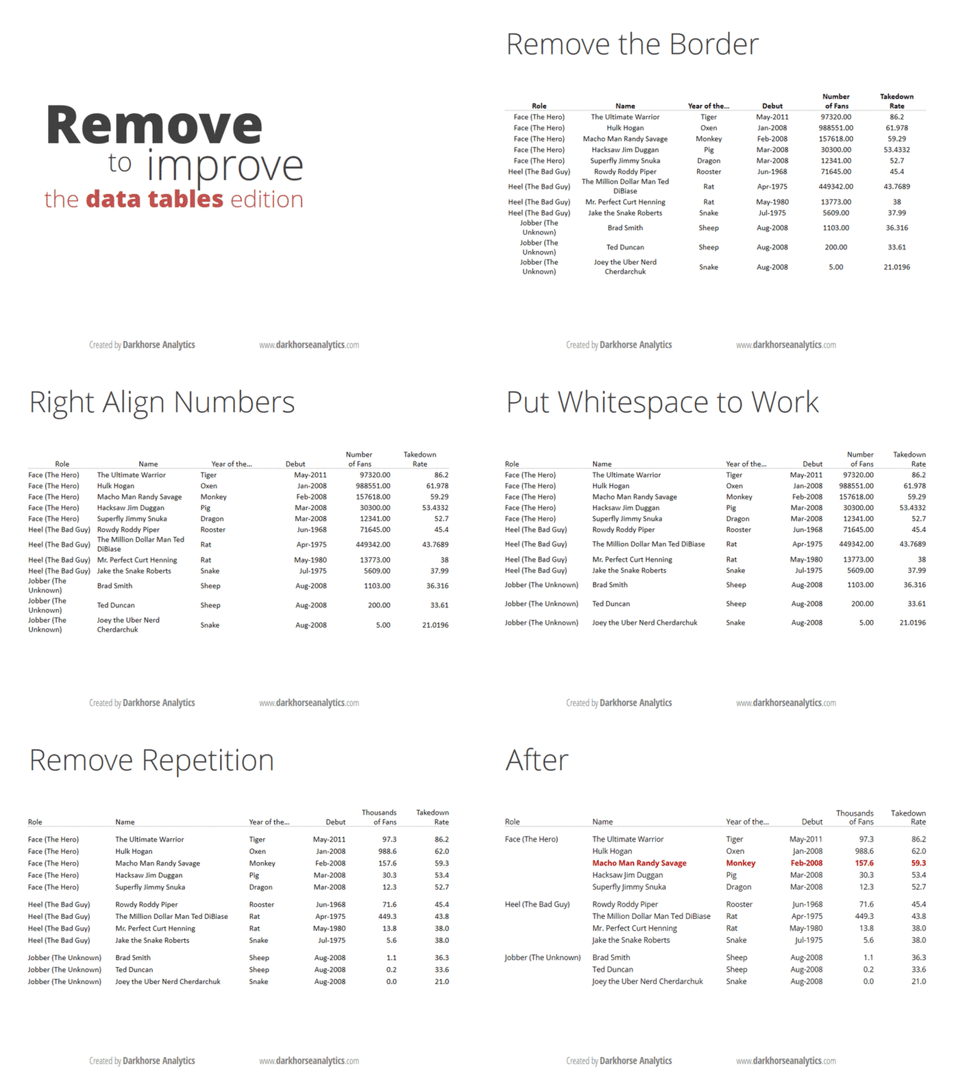
If you think you’re a data visualisation junkie, it’s likely that you’ve read Edward Tufte’s Visual Display Of Quantitative Information. If you are only a casual observer of the topic, you are likely to have come across these gifs that show you how to clean up a bar graph and a data table.

And if you are a real geek when it comes to visualisation, and you are the sort of person who likes long-form articles about the information technology industry, I’m sure you’ve come across Eugene Wei’s massive essay on “remove the legend to become one“.

The idea in the last one is that when you have something like a line graph, a legend telling you which line represents what can be distracting, especially if you have too many lines. You need to constantly move your head back and forth between the chart and the table as you try to interpret it. So, Wei says, in order to “become a legend” (by presenting information that is easily consumable), you need to remove the legend.

My equivalent of that for bar graphs is to put data labels directly on the bar, rather than having the reader keep looking at a scale (the above gif with bar graphs also does this). It makes for easier reading, and by definition, the bar graph conveys the information on the relative sizes of the different data points as well.

There is one problem, though, especially when you’re drawing what my daughter calls “sleeping bar graphs” (horizontal) – where do you really put the text so that it is easily visible? This becomes especially important if you’re using a package like R ggplot where you have control over where to place the text, what size to use and so on.

The basic question is – do you place the label inside or outside the bar? I was grappling with this question yesterday while making some client chart. When I placed the labels inside the bar, I found that some of the labels couldn’t be displayed in full when the bars were too short. And since these were bars that were being generated programmatically, I had no clue beforehand how long the bars would be.

So I decided to put all the labels outside. This presented a different problem – with the long bars. The graph would automatically get cut off a little after the longest bar ended, so if you placed the text outside, then the labels on the longest bar couldn’t be seen! Again the graphs have to come out programmatically so when you’re making them you don’t know what the length of the longest bar will be.

I finally settled on this middle ground – if the bar is at least half as long as the longest bar in the chart set, then you put the label inside the bar. If the bar is shorter than half the longest bar, then you put the label outside the bar. And then, the text inside the bar is right-justified (so it ends just inside the end of the bar), and the text outside the bar is left-justified (so it starts exactly where the bar ends). And ggplot gives you enough flexibility to decide the justification (‘hjust’) and colour of the text (I keep it white if it is inside the bar, black if outside), that the whole thing can be done programmatically, while producing nice and easy-to-understand bar graphs with nice labels.

Obviously I can’t share my client charts here, but here is one I made for the doubling days for covid-19 cases by district in India. I mean it’s not exactly what I said here, but comes close (the manual element here is a bit more).