Legacy Metrics

Yesterday (or was it the day before? I’ve lost track of time with full time WFH now) the Times of India Bangalore edition had two headlines.

One was the Karnataka education minister BC Nagesh talking about deciding on school closures on a taluk (sub-district) wise basis. “We don’t want to take a decision for the whole state. However, in taluks where test positivity is more than 5%, we will shut schools”, he said.

That was on page one.

And then somewhere inside the newspaper, there was another article. The Indian Council for Medical Research has recommended that “only symptomatic patients should be tested for Covid-19”. However, for whatever reason, Karnataka had decided to not go by this recommendation, and instead decided to ramp up testing.

These two articles are correlated, though the paper didn’t say they were.

I should remind you of one tweet, that I elaborated about a few days back:


The reason why Karnataka has decided to ramp up testing despite advisory to the contrary is that changing policy at this point in time will mess with metrics. Yes, I stand by my tweet that test positivity ratio is a shit metric. However, with the government having accepted over the last two years that it is a good metric, it has become “conventional wisdom”. Everyone uses it because everyone else uses it. 

And so you have policies on school shutdowns and other restrictive measures being dictated by this metric – because everyone else uses the same metric, using this “cannot be wrong”. It’s like the old adage that “nobody got fired for hiring IBM”.

ICMR’s message to cut testing of asymptomatic individuals is a laudable one – given that an overwhelming number of people infected by the incumbent Omicron variant of covid-19 have no symptoms at all. The reason it has not been accepted is that it will mess with the well-accepted metric.

If you stop testing asymptomatic people, the total number of tests will drop sharply. The people who are ill will get themselves tested anyways, and so the numerator (number of positive reports) won’t drop. This means that the ratio will suddenly jump up.

And that needs new measures – while 5% is some sort of a “critical number” now (like it is with p-values), the “critical number” will be something else. Moreover, if only symptomatic people are to be tested, the number of tests a day will vary even more – and so the positivity ratio may not be as stable as it is now.

All kinds of currently carefully curated metrics will get messed up. And that is a big problem for everyone who uses these metrics. And so there will be pushback.

Over a period of time, I expect the government and its departments to come up alternate metrics (like how banks have now come up with an alternative to LIBOR), after which the policy to cut testing for asymptomatic people will get implemented. Until then, we should bow to the “legacy metric”.

And if you didn’t figure out already, legacy metrics are everywhere. You might be the cleverest data scientist going around and you might come up with what you think might be a totally stellar metric. However, irrespective of how stellar it is, that people have to change their way of thinking and their process to process it means that it won’t get much acceptance.

The strategy I’ve come to is to either change the metric slowly, in stages (change it little by little), or to publish the new metric along with the old one. Depending on how clever the new metric is, one of the metrics will die away.

Metrics

Over the weekend, I wrote this on twitter:


Surprisingly (at the time of writing this at least), I haven’t got that much abuse for this tweet, considering how “test positivity” has been held as the gold standard in terms of tracking the pandemic by governments and commentators.

The reason why I say this is a “shit metric” is simple – it doesn’t give that much information. Let’s think about it.

For a (ratio) metric to make sense, both the numerator and the denominator need to be clearly defined, and there needs to be clear information content in the ratio. In this particular case, both the numerator and the denominator are clear – latter is the number of people who got Covid tests taken, and the former is the number of these people who returned a positive test.

So far so good. Apart from being an objective measure, test positivity ratio is  also a “ratio”, and thus normalised (unlike absolute number of positive tests).

So why do I say it doesn’t give much information? Because of the information content.

The problem with test positivity ratio is the composition of the denominator (now we’re getting into complicated territory). Essentially, there are many reasons why people get tested for Covid-19. The most obvious reason to get tested is that you are ill. Then, you might get tested when a family member is ill. You might get tested because your employer mandates random tests. You might get tested because you have to travel somewhere and the airline requires it. And so on and so forth.

Now, for each of these reasons for getting tested, we can define a sort of “prior probability of testing positive” (based on historical averages, etc). And the positivity ratio needs to be seen in relation to this prior probability. For example, in “peaceful times” (eg. Bangalore between August and November 2021), a large proportion of the tests would be “random” – people travelling or employer-mandated. And this would necessarily mean a low test positivity.

The other extreme is when the disease is spreading rapidly – few people are travelling or going physically to work. Most of the people who get tested are getting tested because they are ill. And so the test positivity ratio will be rather high.

Basically – rather than the ratio telling you how bad the covid situation is in a region, it is influenced by how bad the covid situation is. You can think of it as some sort of a Schrödinger-ian measurement.

That wasn’t an offhand comment. Because government policy is an important input into test positivity ratio. For example, take “contact tracing”, where contacts of people who have tested positive are hunted down and also tested. The prior probability of a contact of a covid patient testing positive is far higher than the prior probability of a random person testing positive.

And so, as and when the government steps up contact tracing (as it does in the early days of each new wave), test positivity ratio goes up, as more “high prior probability” people get tested. Similarly, whether other states require a negative test to travel affects positivity ratio – the more the likelihood that you need a test to travel, the more likely that “low prior probability” people will take the test, and the lower the ratio will be. Or when governments decide to “randomly test” people (puling them off the streets of whatever), the ratio will come down.

In other words – the ratio can be easily gamed by governments, apart from just being influenced by government policy.

So what do we do now? How do we know whether the Covid-19 situation is serious enough to merit clamping down on people’s liberties? If test positivity ratio is a “shit metric” what can be a better one?

In this particular case (writing this on 3rd Jan 2022), absolute number of positive cases is as bad a metric as test positivity – over the last 3 months, the number of tests conducted in Bangalore has been rather steady. Moreover, the theory so far has been that Omicron is far less deadly than earlier versions of Covid-19, and the vaccination rate is rather high in Bangalore.

While defining metrics, sometimes it is useful to go back to first principles, and think about why we need the metric in the first place and what we are trying to optimise. In this particular case, we are trying to see when it makes sense to cut down economic activity to prevent the spread of the disease.

And why do we need lockdowns? To prevent hospitals from getting overwhelmed. You might remember the chaos of April-May 2021, when it was near impossible to get a hospital bed in Bangalore (even crematoriums had long queues). This is a situation we need to avoid – and the only one that merits lockdowns.

One simple measure we can use is to see how many hospital beds are actually full with covid patients, and if that might become a problem soon. Basically – if you can measure something “close to the problem”, measure it and use that as the metric. Rather than using proxies such as test positivity.

Because test positivity depends on too many factors, including government action. Because we are dealing with a new variant here, which is supposedly less severe. Because most of us have been vaccinated now, our response to getting the disease will be different. The change in situation means the old metrics don’t work.

It’s interesting that the Mumbai municipal corporation has started including bed availability in its daily reports.

Covid-19 recoveries in Bangalore

Something seems off in terms of the Covid-19 statistics for Bangalore. The number of “active cases” just don’t seem to be going down in line with the drop in the number of new cases. It seems like we’re not counting “recoveries” like we used to.

Active covid-19 cases in Bangalore in the second wave

In terms of active cases, covid-19 cases in Bangalore peaked in the middle of May. And then active cases started dropping rapidly. It seemed (when I ran this analysis towards the end of June) that active cases would drop well below 50,000 in the middle of June. However, as the graph shows, that hasn’t happened. The reduction in active cases has come down to a trickle.

Now it might well be that the way down is more gradual than the way up, but the thing is that the drop in active cases doesn’t square at all with the number of daily cases.

One metric we can look at is – how many days back do we have to go (in terms of newly infected cases) to get the current number of active cases? This is not correct – it assumes that infection is “first in first out” – but a good enough assumption for our analysis.

I’m writing this on 20th of June. As of today, there are 71000 odd active cases in Bangalore. And we have to go back 26 days to total up 71000 NEW INFECTIONS (assuming none of these people have died). This means that the average recovery period is far more than 26 days.

It wasn’t like this. I graphed this (I’m apologising for using a weird metric here. I thought of dividing active cases by new cases but thought that’s less accurate than this).

At the beginning of June, the number of active cases was equal to the number of new cases in the preceding 18 days. And notice that through June that number has gone up steadily. For whatever reason, the number of days after which a patient is considered “recovered” has been going up. It seems like we’re not counting the recoveries like we used to earlier.

I don’t know why we are doing this.

For the record, if the number of active cases has continued to be in the range of the number of new cases in the preceding 18 days, then we would have about 35,000 active cases in Bangalore right now. That is half the official number of active cases right now.

Again – I’m indulging in curve-fitting of some kind. Just that the data doesn’t tally.

PS: All data in this post from the brilliant covid19india.org .

Risk and data

A while back a group of <a large number of scientists> wrote an open letter to the Prime Minister demanding greater data sharing with them. I must say that the letter is written in academic language and the effort to understand it was too much, but in the interest of fairness I’ll put a screenshot that was posted on twitter here.

I don’t know about this clinical and academic data. However, the holding back of one kind of data, in my opinion, has massively (and negatively) impacted people’s mental health and risk calculations.

This is data on mortality and risk. The kind of questions that I expect government data to have answered was:

  1. If I get covid-19 (now in the second wave), what is the likelihood that I will die?
  2. If my oxygen level drops to 90 (>= 94 is “normal”), what is the likelihood that I will die?
  3. If I go to hospital, what is the likelihood I will die?
  4. If I go to ICU what is the likelihood I will die?
  5. What is the likelihood of a teenager who contracts the virus (and is otherwise in good health) dying of the virus?

And so on. Simple risk-based questions whose answers can help people calibrate their lives and take calculated enough risks to get on with it without putting themselves and their loved ones at risk.

Instead, what we find from official sources are nothing but aggregates. Total numbers of people infected, dead, recovered and so on. And it is impossible to infer answers to the “risk questions” based no that.

And who fill in the gaps? Media of course.

I must have discussed “spectacularness bias” on this blog several times before. Basically the idea is that for something to be news, it needs to carry information. And an event carries information if it occurs despite having a low prior probability (or not occurring despite a high prior probability). As I put it in my lectures, “‘dog bites man’ is not news. ‘man bits dog’ is news”.

So when we rely on media reports to fill in our gaps in our risk systems, we end up taking all the wrong kinds of lessons. We learn that one seventeen year old boy died of covid despite being otherwise healthy. In the absence of other information, we assume that teenagers are under grave risk from the disease.

Similarly, cases of children looking for ICU beds get forwarded far more than cases of old people looking for ICU beds. In the absence of risk information, we assume that the situation must be grave among children.

Old people dying from covid goes unreported (unless the person was famous in some way or the other), since the information content in that is low. Young people dying gets amplified.

Based on all the reports that we see in the papers and other media (including social media), we get an entirely warped sense of what the risk profile of the disease is. And panic. When we panic, our health gets worse.

Oh, and I haven’t even spoken about bad risk reporting in the media. I saw a report in the Times of India this morning (unable to find a link to it) that said that “young are facing higher mortality in this wave”. Basically the story said that people under 60 account for a far higher proportion of deaths in the second wave than in the first.

Now there are two problems with that story.

  1. A large proportion of over 60s in India are vaccinated, so mortality is likely to be lower in this cohort.
  2. What we need is the likelihood of a person under 60 dying upon contracting covid. NOT the proportion of deaths accounted for by under 60s. This is the classic “averaging along the wrong axis” that they unleash upon you in the first test of any statistics course.

Anyway, so what kind of data would have helped?

  1. Age profile of people testing positive, preferably state wise (any finer will be noise)
  2. Age profile of people dying of covid-19, again state wise

I’m sure the government collects this data. Just that they’re not used to releasing this kind fo data, so we’re not getting it. And so we have to rely on the media and its spectacularness bias to get our information. And so we panic.

PS: By no means am I stating that covid-19 is not a risk. All I am stating is that the information we have been given doesn’t help us make good risk decisions

Start the schools already

Irrespective of when you open the schools, there will be a second wave at that point in time. So we might as well reopen sooner rather than later and put children (and parents of young children) out of their misery.

OK, I admit I have a personal interest in this one. Being a double income, single kid, no nanny, nuclear family, we have been incredibly badly hit by the school shutdown for the last nine months. The wife and I have been effectively working at 50% capacity since March, been incredibly stressed out, and have no time for anything.

And now that I’ve begun a “proper job”, her utilisation has dropped well below 50%. This can’t last for long.

Then again, this post is not being driven solely by personal agendas or interests. The more perceptive of you might know that on my twitter account, I publish a bunch of graphs every morning, based on the statistics put out by covid19india.org . And every day, even when I don’t log into twitter, I go and take a look at the graphs to see what’s happening in the country.

And the message is clear – the pandemic is dying down in India. It is a pretty consistent trend. The Levitt Model might not really be true (my old friend’s comment that it is “random curve fitting” when I first came across it holds true, I would think), but it gives a great picture of how the pandemic has been performing in India. This is the graph I put out today.

In most states in India, the Levitt measure is incredibly close to 1, indicating that the pandmic is all but over. However, you might notice that the decline in this metric is not monotoniuc.

However, if you look at the Delhi numbers on the top right, notice how nicely the Levitt metric shows the three “waves” of the disease in the city. And you can see here that the third wave in Delhi is all but over. And while you see the clear effect of Delhi’s third wave in the Levitt metric, you can also see that it coincided with a second wave in Haryana, and a (barely noticeable) second wave in Uttar Pradesh and Rajasthan.

This wave was due to increased pollution, primarily on the account of crop burning in Punjab and Haryana in October-November. The reason the second waves in Uttar Pradesh and Rajasthan (as seen in terms of the Levitt measures) were small is that they are rather large states, and the areas affected by the bad pollution was fairly small.

And along with this, consider the serosurveys in Karnataka (both the government one and the IDFC-sponsored one), which estimated that the number of actual infections in the state are higher than the official counts of infections by a factor of 40 to 100 (we had initially assumed 10-20 for this factor). In other words, an overwhelmingly large number of cases in India are “asymptomatic” (which is to say that the people are, for all practical purposes, “unaffected”).

In other words, we know cases only when someone is affected badly enough to get themselves tested, or has a family member affected badly enough to get themselves tested. And what happened in Delhi and surrounding states in October-November was that with higher pollution, everyone who got affected got affected more severely than they would have otherwise.

Some people who might have otherwise been unaffected showed symptoms and got themselves tested. Some people who might have not been affected seriously enough ended up in hospital. Pollution meant that some people who might have recovered in hospital ended up dying. And as the crops finished burning and pollution levels dropped, you can see the Levitt metric dropping as well.

And lest you argue that I’m making an argument based on a mostly discredited metric, here is the actual number of known cases in the most affected states in the country. The graph is a Loess smoothing, and the points can be seen here.

See the precipitous decline in Delhi (green line) and Karnataka (orange) and Andhra Pradesh (pink) in the last couple of months. The pandemic has pretty much burnt through in most states. We can start relaxing, and opening schools.

You might be tempted to ask, “but won’t there be a second wave when schools reopen?”. That is a very fair concern, since people who have so far been extremely conservative might relatively relax when the schools open. The counterpoint to that is, “irrespective of when you open the schools, there will be a second wave at that point in time“.

It doesn’t matter if we reopen the schools now, or in April, or in August, or in next December. There will always be a few vestigial (possibly unaffected) cases going around, and there will be a spike in known cases at that point. And by quickly dialling up and down, we can control that.

So I hereby strongly urge the state governments (especially looking at you, Government of Karnataka) to permit schools to reopen. A few vocal and overly conservative parents should not be able to hold the rest of the country (or state) to ransom.

69 is the answer

The IDFC-Duke-Chicago survey that concluded that 50% of Bangalore had covid-19 in late June only surveyed 69 people in the city. 

When it comes to most things in life, the answer is 42. However, if you are trying to rationalise the IDFC-Duke-Chicago survey that found that over 50% of people in Bangalore had had covid-19 by end-June, then the answer is not 42. It is 69.

For that is the sample size that the survey used in Bangalore.

Initially I had missed this as well. However, this evening I attended half of a webinar where some of the authors of the survey spoke about the survey and the paper, and there they let the penny drop. And then I found – it’s in one small table in the paper.

The IDFC-Duke-Chicago survey only surveyed 69 people in Bangalore

The above is the table in its glorious full size. It takes effort to read the numbers. Look at the second last line. In Bangalore Urban, the ELISA results (for antibodies) were available for only 69 people.

And if you look at the appendix, you find that 52.5% of respondents in Bangalore had antibodies to covid-19 (that is 36 people). So in late June, they surveyed 69 people and found that 36 had antibodies for covid-19. That’s it.

To their credit, they didn’t highlight this result (I sort of dug through their paper to find these numbers and call the survey into question). And they mentioned in tonight’s webinar as well that their objective was to get an idea of the prevalence in the state, and not just in one particular region (even if it be as important as Bangalore).

That said, two things that they said during the webinar in defence of the paper that I thought I should point out here.

First, Anu Acharya of MapMyGenome (also a co-author of the survey) said “people have said that a lot of people we approached refused consent to be surveyed. That’s a standard of all surveying”. That’s absolutely correct. In any random survey, you will always have an implicit bias because the sort of people who will refuse to get surveyed will show a pattern.

However, in this particular case, the point to note is the extremely high number of people who refused to be surveyed – over half the households in the panel refused to be surveyed, and in a further quarter of the panel households, the identified person refused to be surveyed (despite the family giving clearance).

One of the things with covid-19 in India is that in the early days of the pandemic, anyone found having the disease would be force-hospitalised. I had said back then (not sure where) that hospitalising asymptomatic people was similar to the “precogs” in Minority Report – you confine the people because they MIGHT INFECT OTHERS.

For this reason, people didn’t want to get tested for covid-19. If you accidentally tested positive, you would be institutionalised for a week or two (and be made to pay for it, if you demanded a private hospital). Rather, unless you had clear symptoms or were ill, you were afraid of being tested for covid-19 (whether RT-PCR or antibodies, a “representative sample” won’t understand).

However, if you had already got covid-19 and “served your sentence”, you would be far less likely to be “afraid of being tested”. This, in conjunction with the rather high proportion of the panel that refused to get tested, suggests that there was a clear bias in the sample. And since the numbers for Bangalore clearly don’t make sense, it lends credence to the sampling bias.

And sample size apart, there is nothing Bangalore-specific about this bias (apart from that in some parts of the state, the survey happened after people had sort of lost their fear of testing). This further suggests that overall state numbers are also an overestimate (which fits in with my conclusion in the previous blogpost).

The other thing that was mentioned in the webinar that sort of cracked me up was the reason why the sample size was so low in Bangalore – a lockdown got announced while the survey was on, and the sampling team fled. In today’s webinar, the paper authors went off on a rant about how surveying should be classified as an “essential activity”.

In any case, none of this matters. All that matters is that 69 is the answer.


Record of my publicly available work

A few people who I’ve spoken to as part of my job hunt have asked to see some “detailed descriptions” of work that I’ve done. The other day, I put together an email with some of these descriptions. I thought it might make sense to “document” it in one place (and for me, the “obvious one place” is this blog). So here it is. As you might notice, this takes the form of an email.


I’m putting together links to some of the publicly available work that i’ve done.
1. Cricket
I have a model to evaluate and “tell the story of a cricket match”. This works for all limited overs games, and is based on a dynamic programming algorithm similar to the WASP. The basic idea is to estimate the odds of each team winning at the end of each ball, and then chart that out to come up with a “match story”.
And through some simple rules-based intelligence, the key periods in the game are marked out.
The model can also be used to evaluate the contributions of individual batsmen and bowlers towards their teams’ cause, and when aggregated across games and seasons, can be used to evaluate players’ overall contributions.
Here is a video where I explain the model and how to interpret it:
The algorithm runs live during a game. You can evaluate the latest T20 game here:
Here is a more interactive version , including a larger selection of matches going back in time.
Related to this is a cricket analytics newsletter I actively wrote during the World Cup last year. Most Indians might find this post from the newsletter interesting:
2. Covid-19
At the beginning of the pandemic (when we had just gone under a national lockdown), I had built a few agent based models to evaluate the risk associated with different kinds of commercial activities. They are described here.
Every morning, a script that I have written parses the day’s data from covid19india.org and puts out some graphs to my twitter account  This is a daily fully automated feature.
Here is another agent based model that I had built to model the impact of social distancing on covid-19.
tweetstorm based on Bayes Theorem that I wrote during the pandemic went viral enough that I got invited to a prime time news show (I didn’t go).
3. Visualisations
I used to collect bad visualisations.
I also briefly wrote a newsletter analysing “good and bad visualisations”.
4. I have an “app” to predict which single malts you might like based on your existing likes. This blogpost explains the process behind (a predecessor of ) this model.
5. I had some fun with machine learning, using different techniques to see how they perform in terms of predicting different kinds of simple patterns.
6. I used to write a newsletter on “the art of data science”.
In addition to this, you can find my articles for Mint here. Also, this page on my website  as links to some anonymised case studies.

I guess that’s a lot? In any case, now I’m wondering if I did the right thing by choosing “skthewimp” as my Github username.

More on Covid-19 prevalence in Karnataka

As the old song went, “when the giver gives, he tears the roof and gives”.

Last week the Government of Karnataka released its report on the covid-19 serosurvey done in the state. You might recall that it had concluded that the number of cases had been undercounted by a factor of 40, but then some things were suspect in terms of the sampling and the weighting.

This week comes another sero-survey, this time a preprint of a paper that has been submitted to a peer reviewed journal. This survey was conducted by the IDFC Institute, a think tank, and involves academics from the University of Chicago and Duke University, and relies on the extensive sampling network of CMIE.

At the broad level, this survey confirms the results of the other survey – it concludes that “Overall seroprevalence in the state implies that by August at least 31.5 million residents had been infected by August”. This is much higher than the overall conclusions of the state-sponsored survey, which had concluded that “about 19 million residents had been infected by mid-September”.

I like seeing two independent assessments of the same quantity. While each may have its own sources of error, and may not independently offer much information, comparing them can offer some really valuable insights. So what do we have here?

The IDFC-Duke-Chicago survey took place between June and August, and concluded that 31.5 million residents of Karnataka (out of a total population of about 70 million) have been infected by covid-19. The state survey in September had suggested 19 million residents had been infected by September.

Clearly, since these surveys measure the number of people “who have ever been affected”, both of them cannot be correct. If 31 million people had been affected by end August, clearly many more than 19 million should have been infected by mid-September. And vice versa. So, as Ravi Shastri would put it, “something’s got to give”. What gives?

Remember that I had thought the state survey numbers might have been an overestimate thanks to inappropriate sampling (“low risk” not being low risk enough, and not weighting samples)? If 20 million by mid-September was an overestimate, what do you say about 31 million by end August? Surely an overestimate? And that is not all.

If you go through the IDFC-Duke-Chicago paper, there are a few figures and tables that don’t make sense at all. For starters, check out this graph, that for different regions in the state, shows the “median date of sampling” and the estimates on the proportion of the population that had antibodies for covid-19.

Check out the red line on the right. The sampling for the urban areas for the Bangalore region was completed by 24th June. And the survey found that more than 50% of respondents in this region had covid-19 antibodies. On 24th June.

Let’s put that in context. As of 24th June, Bangalore Urban had 1700 confirmed cases. The city’s population is north of 10 million. I understand that 24th June was the “median date” of the survey in Bangalore city. Even if the survey took two weeks after that, as of 8th of July, Bangalore Urban had 12500 confirmed cases.

The state survey had estimated that known cases were 1 in 40. 12500 confirmed cases suggests about 500,000 actual cases. That’s 5% of Bangalore’s population, not 50% as the survey claimed. Something is really really off. Even if we use the IDFC-Duke-Chicago paper’s estimates that only 1 in 100 cases were reported / known, then 12500 known cases by 8th July translates to 1.25 million actual cases, or 12.5% of the city’s population (well below 50% ).

My biggest discomfort with the IDFC-Duke-Chicago effort is that it attempts to sample a rather rapidly changing variable over a long period of time. The survey went on from June 15th to August 29th. By June 15th, Karnataka had 7200 known cases (and 87 deaths). By August 29th the state had 327,000 known cases and 5500 deaths. I really don’t understand how the academics who ran the study could reconcile their data from the third week of June to the data from the third week of August, when the nature of the pandemic in the state was very very different.

And now, having looked at this paper, I’m more confident of the state survey’s estimations. Yes, it might have sampling issues, but compared to the IDFC-Duke-Chicago paper, the numbers make so much more sense. So yeah, maybe the factor of underestimation of Covid-19 cases in Karnataka is 40.

Putting all this together, I don’t understand one thing. What these surveys have shown is that

  1. More than half of Bangalore has already been infected by covid-19
  2. The true infection fatality rate is somewhere around 0.05% (or lower).

So why do we still have a (partial) lockdown?

PS: The other day on WhatsApp I saw this video of an extremely congested Chickpet area on the last weekend before Diwali. My initial reaction was “these people have lost their minds. Why are they all in such a crowded place?”. Now, after thinking about the surveys, my reaction is “most of these people have most definitely already got covid and recovered. So it’s not THAT crazy”.

Covid-19 Prevalence in Karnataka

Finally, many months after other Indian states had conducted a similar exercise, Karnataka released the results of its first “covid-19 sero survey” earlier this week. The headline number being put out is that about 27% of the state has already suffered from the infection, and has antibodies to show for it. From the press release:

Out of 7.07 crore estimated populationin Karnataka, the study estimates that 1.93 crore (27.3%) of the people are either currently infected or already had the infection in the past, as of 16 September 2020.

To put that number in context, as of 16th September, there were a total of 485,000 confirmed cases in Karnataka (official statistics via covid19india.org), and 7536 people had died of the disease in the state.

It had long been estimated that official numbers of covid-19 cases are off by a factor of 10 or 20 – that the actual number of people who have got the disease is actually 10 to 20 times the official number. The serosurvey, assuming it has been done properly, suggests that the factor (as of September) is 40!

If the ratio has continued to hold (and the survey accurate), nearly one in two people in Karnataka have already got the disease! (as of today, there are 839,000 known cases in Karnataka)

Of course, there are regional variations, though I should mention that the smaller the region you take, the less accurate the survey will be (smaller sample size and all that). In Bangalore Urban, for example, the survey estimates that 30% of the population had been infected by mid-September. If the ratio holds, we see that nearly 60% of the population in the city has already got the disease.

The official statistics (separate from the survey) also suggest that the disease has peaked in Karnataka. In fact, it seems to have peaked right around the time the survey was being conducted, in September. In September, it was common to see 7000-1000 new cases confirmed in Karnataka each day. That number has come down to about 3000 per day now.

Now, there are a few questions we need to answer. Firstly – is this factor of 40 (actual cases to known cases) feasible? Based on this data point, it makes sense:

In May, when Karnataka had a very small number of “native cases” and was aggressively testing everyone who had returned to the state from elsewhere, a staggering 93% of currently active cases were asymptomatic. In other words, only 1 in 14 people who was affected was showing any sign of symptoms.

Then, as I might have remarked on Twitter a few times, compulsory quarantining or hospitalisation (which was in force until July IIRC) has been a strong disincentive to people from seeking medical help or getting tested. This has meant that people get themselves tested only when the symptoms are really clear, or when they need attention. The downside of this, of course, has been that many people have got themselves tested too late for help. One statistic I remember is that about 33% of people who died of covid-19 in hospitals died within 24 hours of hospitalisation.

So if only one in 14 show any symptoms, and only those with relatively serious symptoms (or with close relatives who have serious symptoms) get themselves tested, this undercount by a factor of 40 can make sense.

Then – does the survey makes sense? Is 15000 samples big enough for a state of 70 million? For starters, the population of the state doesn’t matter. Rudimentary statistics (I always go to this presentation by Rajeeva Karandikar of CMI)  tells us that the size of the population doesn’t matter. As long as the sample has been chosen randomly, all that matters for the accuracy of the survey is the size of the sample. And for a binary decision (infected / not), 15000 is good enough as long as the sample has been random.

And that is where the survey raises questions – the survey has used an equal number of low risk, high risk and medium risk samples. “High risk” have been defined as people with comorbidities. Moderate risk are people who interact a lot with a lot of people (shopkeepers, healthcare workers, etc.). Both seem fine. It’s the “low risk” that seems suspect, where they have included pregnant women and attendants of outpatient patients in hospitals.

I have a few concerns – are the “low risk” low risk enough? Doesn’t the fact that you have accompanied someone to hospital, or  gone to hospital yourself (because you are pregnant), make you higher than average risk? And then – there are an equal number of low risk, medium risk and high risk people in the sample and there doesn’t seem to be any re-weighting. This suggests to me that the medium and high risk people have been overrepresented in the sample.

Finally, the press release says:

We excluded those already diagnosed with SARS-CoV2 infection, unwilling to provide a sample for the test, or did not agree to provide informed consent

I wonder if this sort of exclusion doesn’t result in a bias in itself.

Putting all this together – that there are qual samples of low, medium and high risk, that the “low risk” sample itself contains people of higher than normal risk, and that people who have refused to participate in the survey have been excluded – I sense that the total prevalence of covid-19 in Karnataka is likely to be overstated. By what factor, it is impossible to say. Maybe our original guess that the incidence of the disease is about 20 times the number of known cases is still valid? We will never know.

Nevertheless, we can be confident that a large section of the state (may not be 50%, but maybe 40%?) has already been infected with covid-19 and unless the ongoing festive season plays havoc, the number of cases is likely to continue dipping.

However, this is no reason to be complacent. I think Nitin Pai is  bang on here.

And I know a lot of people who have been aggressively social distancing (not even meeting people who have domestic help coming home, etc.). It is important that when they do relax, they do so in a graded manner.

Wear masks. Avoid crowded closed places. If you are going to get covid-19 anyway (and many of us have already got it, whether we know it or not), it is significantly better for you that you get a small viral load of it.

The Tube Strike Model For The Pandemic

In 2002, as part of my undergrad in computer science, I took a course in “Artificial Intelligence”. It was a “restricted elective” – you had to either take that or another course called “Artificial Neural Networks”. That Neural Networks was then considered disjoint from AI will tell you how the field of computer science has changed in the 15 years since I graduated.

In any case, as part of our course on AI, we learnt heuristics. These were approximate algorithms to solve a problem – seldom did well in terms of worst case complexity but in most cases got the job done. Back then, the dominant discourse was that you had to tell a computer how to solve a problem, not just show it a large number of positive and negative examples and allow it to learn by itself (though that was the approach taken by the elective I did not elect for).

One such heuristic was Simulated Annealing. The problem with a classic “hill climbing” algorithm is that you can get caught in local optima. And the deterministic hill climbing algorithm doesn’t let you get off your local optima to search for better optima. Hence there are variants. In Simulated Annealing, in the early part of the algorithm you are allowed to take big steps down (assuming you are trying to find the peak). As the algorithm progresses, it “cools down” (hence simulated annealing) and the extent to which you are allowed to climb down is massively reduced.

It is not just in algorithms, or in the case of AI, do we get stuck in local optima. In a recent post, I had made a passing reference to a paper about the tube strikes of 2014.

It is clearly visible from the two panels that far fewer commuters were able to use their modal station during the strike, which implies that a substantial number of individuals were forced to explore alternative routes. The data also suggest that the strike brought about some lasting changes in behaviour, as the fraction of commuters that made use of their modal station seemingly drops after the strike (in the paper we substantiate this claim econometrically).

Screw the paper if you don’t want to read it. Basically the concept is that the strike of 2014 shook things up. People were forced to explore alternatives. And some alternatives stuck. In other words, a lot of people had got stuck in local maxima. And when an external event (the strike) pushed them off their local pedestals (figuratively speaking), they were able to find better maxima.

And that was only the result of a three-day strike. Now, the pandemic has gone on for 5-6 months now (depending on the part of world you are in). During this time, a lot of behaviour otherwise considered normal have been questioned by people behaving thus. My theory is that a lot of these hitherto “normal behaviours” were essentially local optima. And with the pandemic forcing people to rethink their behaviours, they will find better optima.

I can think of a few examples from my own life.

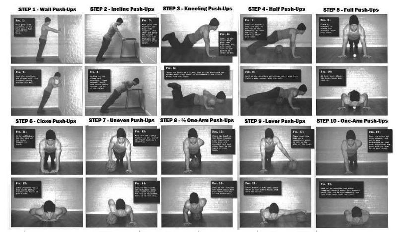
  1. I wrote about this the other day. I had gotten used to a schedule of heavy weight lifting for my workouts. I had plateaued in all my lifts, and this meant that my upper body had plateaued at a rather suboptimal level. However much I tried to improve my bench press and shoulder press (using only these movements) the bar refused to budge. And my shoulders refused to get bigger. I couldn’t do a (palms facing away) pull up.
    Thanks to the pandemic, the gym shut, and I was forced to do body weight exercises at home. There was a limit on how much I could load my legs and back, so I focussed more on my upper body, especially doing different progressions of the pushup. And back in the gym today, I discovered I could easily do pullups now.

    Similarly, the progression of body weight squats I knew forced me to learn to squat deep (hamstrings touching calves). Today for the first time ever I did deep front squats. This means in a few months I can learn to clean.

  2. I was used to eating Milky Mist set curd (the one that comes in a 1kg box). It was nice and creamy and I loved eating it. It isn’t widely available and there was one supermarket close to home from where I could get it. As soon as the lockdown happened that supermarket shut. Even when it opened it had long lines, and there were physical barricades between my house and that so I couldn’t drive to it.

    In the meantime I figured that the guy who delivers milk to my door in the morning could deliver (Nandini) curd as well. And I started buying from him. Well, it’s not as creamy as Milky Mist, but it’s good enough. And I’m not going back.

  3. This was a see-saw. For the first month of the lockdown most bakeries nearby were shut. So I started trying out bread at this supermarket close to home (not where I got Milky Mist from). I loved it. Presently, bakeries reopened and the density of cases in Bangalore meant I became wary of going to supermarkets. So now we’ve shifted back to freshly baked bread from the local bakery
  4. I’d tried intermittent fasting several times in life but had never been able to do it on a consistent basis. In the initial part of the lockdown good bread was hard to come by (since the bakeries shut and I hadn’t discovered the supermarket bread yet). There had been a bird flu scare near Bangalore so we weren’t buying eggs either. What do we do for breakfast? Just skip it. Now i have no problem not having breakfast at all

The list goes on. And I’m sure this applies to you as well. Think of all the behavioural changes that the pandemic has forced on you, and think of which all you will go back on once it has passed. There is likely to be a set of behavioural changes that won’t change back.

Like how one in 20 passengers who changed routes following the 2014 tube strikes never went back to their earlier routes. Except that this time it is a 6-month disruption.

What this means is that even when the pandemic is past us, the economy will not look like the economy that was before the pandemic hit us. There will be winners and losers. And since it will take time and effort for people doing “loser jobs” to retrain themselves (if possible) to do “winner jobs”, the economic downturn will be even longer.

I’m calling it the “tube strike mental model” for behavioural change during the pandemic.