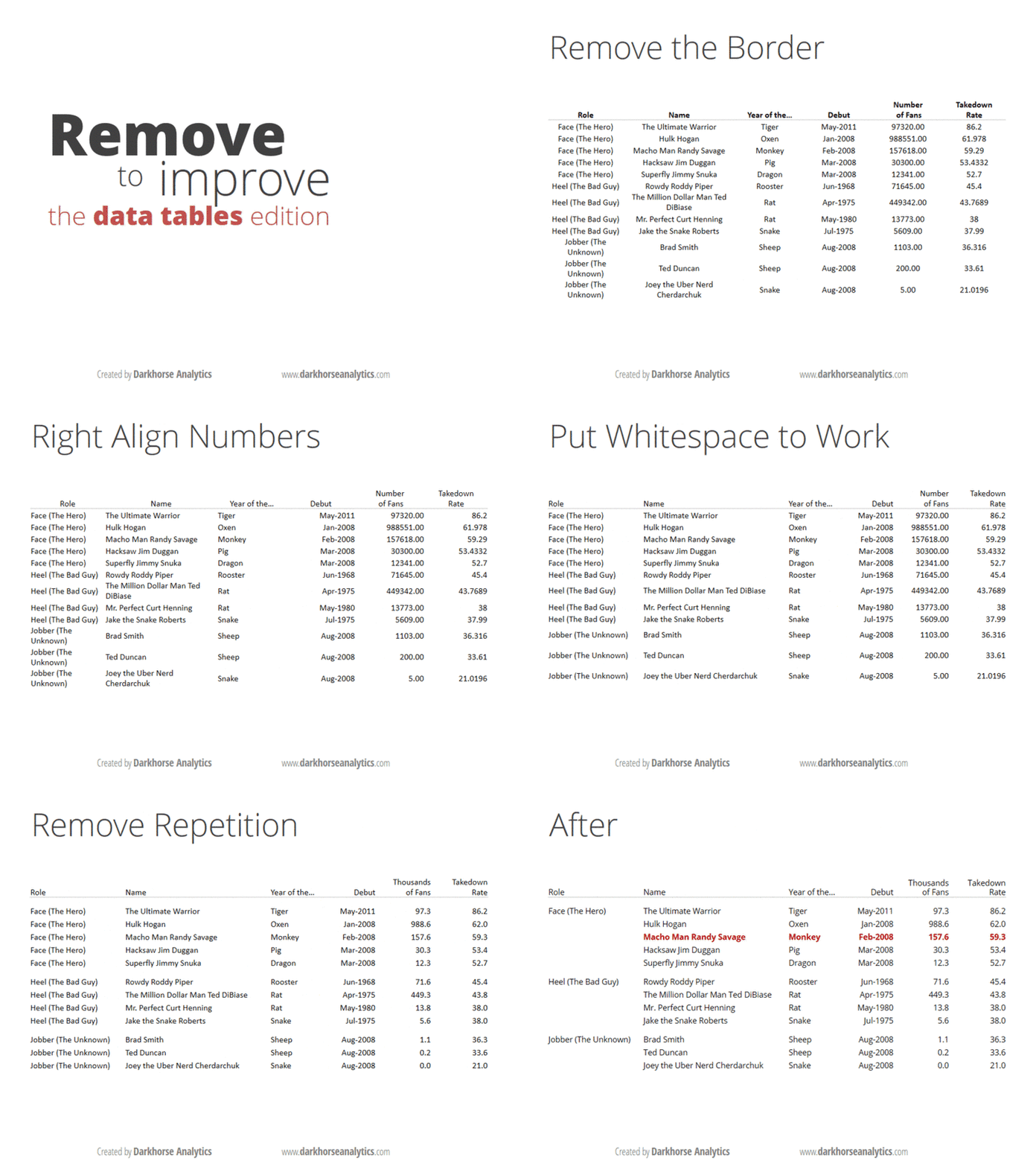
If you think you’re a data visualisation junkie, it’s likely that you’ve read Edward Tufte’s Visual Display Of Quantitative Information. If you are only a casual observer of the topic, you are likely to have come across these gifs that show you how to clean up a bar graph and a data table.

And if you are a real geek when it comes to visualisation, and you are the sort of person who likes long-form articles about the information technology industry, I’m sure you’ve come across Eugene Wei’s massive essay on “remove the legend to become one“.
The idea in the last one is that when you have something like a line graph, a legend telling you which line represents what can be distracting, especially if you have too many lines. You need to constantly move your head back and forth between the chart and the table as you try to interpret it. So, Wei says, in order to “become a legend” (by presenting information that is easily consumable), you need to remove the legend.
My equivalent of that for bar graphs is to put data labels directly on the bar, rather than having the reader keep looking at a scale (the above gif with bar graphs also does this). It makes for easier reading, and by definition, the bar graph conveys the information on the relative sizes of the different data points as well.
There is one problem, though, especially when you’re drawing what my daughter calls “sleeping bar graphs” (horizontal) – where do you really put the text so that it is easily visible? This becomes especially important if you’re using a package like R ggplot where you have control over where to place the text, what size to use and so on.
The basic question is – do you place the label inside or outside the bar? I was grappling with this question yesterday while making some client chart. When I placed the labels inside the bar, I found that some of the labels couldn’t be displayed in full when the bars were too short. And since these were bars that were being generated programmatically, I had no clue beforehand how long the bars would be.
So I decided to put all the labels outside. This presented a different problem – with the long bars. The graph would automatically get cut off a little after the longest bar ended, so if you placed the text outside, then the labels on the longest bar couldn’t be seen! Again the graphs have to come out programmatically so when you’re making them you don’t know what the length of the longest bar will be.
I finally settled on this middle ground – if the bar is at least half as long as the longest bar in the chart set, then you put the label inside the bar. If the bar is shorter than half the longest bar, then you put the label outside the bar. And then, the text inside the bar is right-justified (so it ends just inside the end of the bar), and the text outside the bar is left-justified (so it starts exactly where the bar ends). And ggplot gives you enough flexibility to decide the justification (‘hjust’) and colour of the text (I keep it white if it is inside the bar, black if outside), that the whole thing can be done programmatically, while producing nice and easy-to-understand bar graphs with nice labels.
Obviously I can’t share my client charts here, but here is one I made for the doubling days for covid-19 cases by district in India. I mean it’s not exactly what I said here, but comes close (the manual element here is a bit more).
In fact, there is wide divergence within states as well
Within states, we see high divergence in doubling rates across districts pic.twitter.com/jIU9CmitRx— Karthik (@karthiks) May 1, 2020
