How Python swallowed R

A week ago, I put a post on LinkedIn saying if someone else working in analytics / data science primarily uses R for their work, I would like to chat.

I got two responses, one of which was from a guy who strictly isn’t in analytics / data science, but needs to analyse large amounts of data for his work. I had a long chat with the other guy today.

Yesterday I put the same post on Twitter, and have got a few more responses from there. However, it is staggering. An overwhelming majority of data people who I know work in Python. One of the reasons I put these posts was to assure myself that I’m not alone in using R, though the response so far hasn’t given me too much of an assurance.

So why do most companies end up using Python for analytics, even when R is clearly better for things like data wrangling, reporting, visualisation, dashboarding, etc.? I have a few theories on this, and I think all of them come together to result in python having its “overwhelming marketshare” (at least among people I know).

Tech people clearly prefer python since it’s easier to integrate. So the tech leaders request the data science leaders to use Python, since it is much easier for the tech people. In a lot of organisations, data science reports into tech, so this request is honoured.

Even if it isn’t, if you recall, “data scientists” are generally tech facing rather than business facing. This means that the models they build need to be codified, and added to the company’s code base. This means necessarily working together with tech, and this means using a programming language that tech is comfortable with.

Then, this spills over. Usually, someone has the bright idea that the firm shouldn’t use two languages for what is essentially the same thing. And so the analytics people are also forced to use python for their analytics, even if it isn’t built for the purpose. And then it spreads.

Next is the “cool factor”. There is this impression that the more technical a solution is, the more superior it is, even if it has no direct business impact (an employer had once  told me, “I have raised money saying we are using machine learning. If our investors see the algorithms you’re proposing, they’ll want their money back”).

So a youngster getting into data wants to do “all the latest stuff”. This means machine learning. Deep learning. Reinforcement learning. And all that. There is an impression that this kind of work is “better work” compared to let’s say generating business insights using data. And in general, the packages for machine learning have traditionally been easier in Python than they are in R (though R is fast catching up, and in general python is far behind R when it comes to user friendliness).

Then, the growth in data and jobs associated with it such as machine learning or data engineering have meant that a lot of formerly tech people have got into data work. Python is fundamentally a programming language, with a package (pandas) added on to do data work. Techies find it far more intuitive than R, which is fundamentally a statistical software. On the other hand, people who are coming from a business / Excel background find it far more comfortable to use R. Python can be intimidating (I fall in this bucket).

So yeah – the tech integration, the number of tech people who are coming into data and the “cool factor” associated with the more techie stuff means that Python is gaining, at R’s expense (in my circle at least).

In any case I’m going to continue to use R. I’m at least 10X faster in R than I am in Python, and having used R for 12 years now, I’m too used to that way of working to change things up.

What is the Case Fatality Rate of Covid-19 in India?

The economist in me will give a very simple answer to that question – it depends. It depends on how long you think people will take from onset of the disease to die.

The modeller in me extended the argument that the economist in me made, and built a rather complicated model. This involved smoothing, assumptions on probability distributions, long mathematical derivations and (for good measure) regressions.. And out of all that came this graph, with the assumption that the average person who dies of covid-19 dies 20 days after the thing is detected.


Yes, there is a wide variation across the country. Given that the disease is the same and the treatment for most people diseased is pretty much the same (lots of rest, lots of water, etc), it is weird that the case fatality rate varies by so much across Indian states. There is only one explanation – assuming that deaths can’t be faked or miscounted (covid deaths attributed to other reasons or vice versa), the problem is in the “denominator” – the number of confirmed cases.

What the variation here tells us is that in states towards the top of this graph, we are likely not detecting most of the positive cases (serious cases will get themselves tested anyway, and get hospitalised, and perhaps die. It’s the less serious cases that can “slip”). Taking a state low down below in this graph as a “good tester” (say Andhra Pradesh), we can try and estimate what the extent of under-detection of cases in each state is.

Based on state-wise case tallies as of now (might be some error since some states might have reported today’s number and some mgiht not have), here are my predictions on how many actual number of confirmed cases there are per state, based on our calculations of case fatality rate.

Yeah, Maharashtra alone should have crossed a million caess based on the number of people who have died there!

Now let’s get to the maths. It’s messy. First we look at the number of confirmed cases per day and number of deaths per day per state (data from here). Then we smooth the data and take 7-day trailing moving averages. This is to get rid of any reporting pile-ups.

Now comes the probability assumption – we assume that a proportion p of all the confirmed cases will die. We assume an average number of days (N) to death for people who are supposed to die (let’s call them Romeos?). They all won’t pop off exactly N days after we detect their infection. Let’s say a proportion \lambda dies each day. Of everyone who is infected, supposed to die and not yet dead, a proportion \lambda will die each day.

My maths has become rather rusty over the years but a derivation I made shows that \lambda = \frac{1}{N}. So if people are supposed to die in an average of 20 days, \frac{1}{20} will die today, \frac{19}{20}\frac{1}{20} will die tomorrow. And so on.

So people who die today could be people who were detected with the infection yesterday, or the day before, or the day before day before (isn’t it weird that English doesn’t a word for this?) or … Now, based on how many cases were detected on each day, and our assumption of p (let’s assume a value first. We can derive it back later), we can know how many people who were found sick k days back are going to die today. Do this for all k, and you can model how many people will die today.

The equation will look something like this. Assume d_t is the number of people who die on day t and n_t is the number of cases confirmed on day t. We get

d_t = p  (\lambda n_{t-1} + (1-\lambda) \lambda n_{t-2} + (1-\lambda)^2 \lambda n_{t-3} + ... )

Now, all these ns are known. d_t is known. \lambda comes from our assumption of how long people will, on average, take to die once their infection has been detected. So in the above equation, everything except p is known.

And we have this data for multiple days. We know the left hand side. We know the value in brackets on the right hand side. All we need to do is to find p, which I did using a simple regression.

And I did this for each state – take the number of confirmed cases on each day, the number of deaths on each day and your assumption on average number of days after detection that a person dies. And you can calculate p, which is the case fatality rate. The true proportion of cases that are resulting in deaths.

This produced the first graph that I’ve presented above, for the assumption that a person, should he die, dies on an average 20 days after the infection is detected.

So what is India’s case fatality rate? While the first graph says it’s 5.8%, the variations by state suggest that it’s a mild case detection issue, so the true case fatality rate is likely far lower. From doing my daily updates on Twitter, I’ve come to trust Andhra Pradesh as a state that is testing well, so if we assume they’ve found all their active cases, we use that as a base and arrive at the second graph in terms of the true number of cases in each state.

PS: It’s common to just divide the number of deaths so far by number of cases so far, but that is an inaccurate measure, since it doesn’t take into account the vintage of cases. Dividing deaths by number of cases as of a fixed point of time in the past is also inaccurate since it doesn’t take into account randomness (on when a Romeo might die).

Anyway, here is my code, for what it’s worth.

deathRate <- function(covid, avgDays) {
covid %>%
mutate(Date=as.Date(Date, '%d-%b-%y')) %>%
gather(State, Number, -Date, -Status) %>%
spread(Status, Number) %>%
arrange(State, Date) -> 
cov1

# Need to smooth everything by 7 days 
cov1 %>%
arrange(State, Date) %>%
group_by(State) %>%
mutate(
TotalConfirmed=cumsum(Confirmed),
TotalDeceased=cumsum(Deceased),
ConfirmedMA=(TotalConfirmed-lag(TotalConfirmed, 7))/7,
DeceasedMA=(TotalDeceased-lag(TotalDeceased, 7))/ 7
) %>%
ungroup() %>%
filter(!is.na(ConfirmedMA)) %>%
select(State, Date, Deceased=DeceasedMA, Confirmed=ConfirmedMA) ->
cov2

cov2 %>%
select(DeathDate=Date, State, Deceased) %>%
inner_join(
cov2 %>%
select(ConfirmDate=Date, State, Confirmed) %>%
crossing(Delay=1:100) %>%
mutate(DeathDate=ConfirmDate+Delay), 
by = c("DeathDate", "State")
) %>%
filter(DeathDate > ConfirmDate) %>%
arrange(State, desc(DeathDate), desc(ConfirmDate)) %>%
mutate(
Lambda=1/avgDays,
Adjusted=Confirmed * Lambda * (1-Lambda)^(Delay-1)
) %>%
filter(Deceased > 0) %>%
group_by(State, DeathDate, Deceased) %>%
summarise(Adjusted=sum(Adjusted)) %>%
ungroup() %>%
lm(Deceased~Adjusted-1, data=.) %>%
summary() %>%
broom::tidy() %>%
select(estimate) %>%
first() %>%
return()
}

Placing data labels in bar graphs

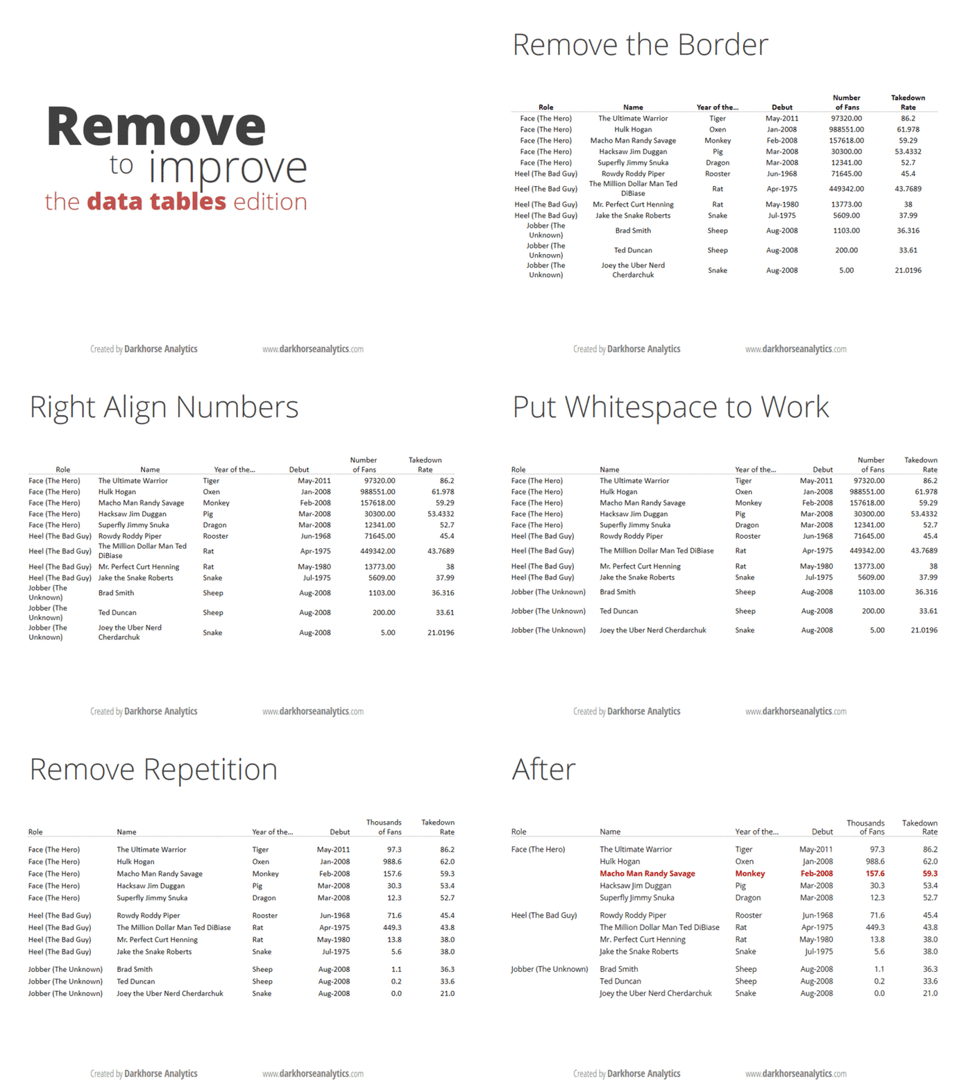
If you think you’re a data visualisation junkie, it’s likely that you’ve read Edward Tufte’s Visual Display Of Quantitative Information. If you are only a casual observer of the topic, you are likely to have come across these gifs that show you how to clean up a bar graph and a data table.

And if you are a real geek when it comes to visualisation, and you are the sort of person who likes long-form articles about the information technology industry, I’m sure you’ve come across Eugene Wei’s massive essay on “remove the legend to become one“.

The idea in the last one is that when you have something like a line graph, a legend telling you which line represents what can be distracting, especially if you have too many lines. You need to constantly move your head back and forth between the chart and the table as you try to interpret it. So, Wei says, in order to “become a legend” (by presenting information that is easily consumable), you need to remove the legend.

My equivalent of that for bar graphs is to put data labels directly on the bar, rather than having the reader keep looking at a scale (the above gif with bar graphs also does this). It makes for easier reading, and by definition, the bar graph conveys the information on the relative sizes of the different data points as well.

There is one problem, though, especially when you’re drawing what my daughter calls “sleeping bar graphs” (horizontal) – where do you really put the text so that it is easily visible? This becomes especially important if you’re using a package like R ggplot where you have control over where to place the text, what size to use and so on.

The basic question is – do you place the label inside or outside the bar? I was grappling with this question yesterday while making some client chart. When I placed the labels inside the bar, I found that some of the labels couldn’t be displayed in full when the bars were too short. And since these were bars that were being generated programmatically, I had no clue beforehand how long the bars would be.

So I decided to put all the labels outside. This presented a different problem – with the long bars. The graph would automatically get cut off a little after the longest bar ended, so if you placed the text outside, then the labels on the longest bar couldn’t be seen! Again the graphs have to come out programmatically so when you’re making them you don’t know what the length of the longest bar will be.

I finally settled on this middle ground – if the bar is at least half as long as the longest bar in the chart set, then you put the label inside the bar. If the bar is shorter than half the longest bar, then you put the label outside the bar. And then, the text inside the bar is right-justified (so it ends just inside the end of the bar), and the text outside the bar is left-justified (so it starts exactly where the bar ends). And ggplot gives you enough flexibility to decide the justification (‘hjust’) and colour of the text (I keep it white if it is inside the bar, black if outside), that the whole thing can be done programmatically, while producing nice and easy-to-understand bar graphs with nice labels.

Obviously I can’t share my client charts here, but here is one I made for the doubling days for covid-19 cases by district in India. I mean it’s not exactly what I said here, but comes close (the manual element here is a bit more).


Football Elo Application

This morning, I discovered the Club Elo Ratings, and promptly proceeded to analyse Liverpool FC’s performance over the years based on these ratings, and then correlated the performance by manager.

Then, playing around with the data of different clubs, I realised that there are plenty more stories to be told using this data, and they are best told by people who are passionate about their respective clubs. So the best thing I could do is to put the data out there (in a form similar to what I did for Liverpool), so that people can analyse how their clubs have performed over the years, and under different managers.

Sitting beside me as I was doing this analysis, my wife popped in with a pertinent observation. Now, she doesn’t watch football. She hates it that I watch so much football. Nevertheless, she has a strong eye for metrics. And watching me analyse club performance by manager, she asked me if I can analyse manager performance by club!

And so I’ve added that as well to the Shiny app that I’ve built. It might look a bit clunky, with two unrelate graphs, one on top of the other, but since the two are strongly related, it makes sense to have both in the same app. The managers listed in the bottom dropdown are those who have managed at least two clubs in the Premier League.

If you’re interested in Premier League football, you should definitely check out the app. I think there are some interesting insights to be gleaned (such as what I presented in this morning’s post).

Single Malt Recommendation App

Life is too short to drink whisky you don’t like.

How often have you found yourself in a duty free shop in an airport, wondering which whisky to take back home? Unless you are a pro at this already, you might want something you haven’t tried before, but don’t want to end up buying something you may not like. The names are all grand, as Scottish names usually are. The region might offer some clue, but not so much.

So I started on this work a few years back, when I first discovered this whisky database. I had come up with a set of tables to recommend what whisky is similar to what, and which single malts are the “most unique”. Based on this, I discovered that I might like Ardbeg. And I ended up absolutely loving it.

And ever since, I’ve carried a couple of tables in my Evernote to make sure I have some recommendations handy when I’m at a whisky shop and need to make a decision. But then the tables are not user friendly, and don’t typically tell you what you should buy, and what your next choice should be and so on .

To make things more user-friendly, I have built this app where all you need to enter is your favourite set of single malts, and it gives you a list of other single malts that you might like.

The data set is the same. I once again use cosine similarity to find the similarity of different whiskies. Except that this time I take the average of your favourite whiskies, and then look for the whiskies that are closest to that.

In terms of technologies, I’ve used this R package called Shiny to build the app. It took not more than half an hour of programming effort to build, and most of that was in actually building the logic, not the UI stuff.

So take it for a spin, and let me know what you think.


Programming Languages

I take this opportunity to apologise for my prior belief that all that matters is thinking algorithmically, and language in which the ideas are expressed doesn’t matter.

About a decade ago, I used to make fun of information technology company that hired developers based on the language they coded in. My contention was that writing code is a skill that you either have or you don’t, and what a potential employer needs to look for is the ability to think algorithmically, and then render ideas in code. 

While I’ve never worked as a software engineer I find myself writing more and more code over the years as a part of doing data analysis. The primary tool I use is R, where coding doesn’t really feel like coding, since it is a rather high level language. However, I’m occasionally asked to show code in Python, since some clients are more proficient in that, and the one thing that has done is to teach me the value of domain knowledge of a programming language. 

I take this opportunity to apologise for my prior belief that all that matters is thinking algorithmically, and language in which the ideas are expressed doesn’t matter. 

This is because the language you usually program in subtly nudges you towards thinking in a particular way. Having mostly used R over the last decade, I think in terms of tables and data frames, and after having learnt tidyverse earlier this year, my way of thinking algorithmically has become in a weird way “object oriented” (no, this has nothing to do with classes). I take an “object” (a data frame) and then manipulate it in various ways, changing it, summarising stuff, calculating things on the fly and aggregating, until the point where the result comes out in an elegant manner. 

And while Pandas allows chaining (in fact, it is from Pandas that I suspect the tidyverse guys got the idea for the “%>%” chaining operator), it is by no means as complete in its treatment of chaining as R, and that that makes things tricky. 

Moreover, being proficient in R makes you think in terms of vectorised operations, and when you see that python doesn’t necessarily offer that, and and operations that were once simple in R are now rather complicated in Python, using list comprehension and what not. 

Putting it another way, thinking algorithmically in the framework offered by one programming language makes it rather stressful to express these thoughts in another language where the way of algorithmic thinking is rather different. 

For example, I’ve never got the point of the index in pandas dataframes, and I only find myself “resetting” it constantly so that my way of addressing isn’t mangled. Compared to the intuitive syntax in R, which is first and foremost a data analysis tool, and where the data frame is “native”, the programming language approach of python with its locs and ilocs is again irritating. 

I can go on… 

And I’m guessing this feeling is mutual – someone used to doing things the python way would find R’s syntax and way of doing things rather irritating. R’s machine learning toolkit for example is nowhere as easy as scikit learn is in python (this doesn’t affect me since I seldom need to use machine learning. For example, I use regression less than 5% of the time in my work). 

The next time I see a job opening for a “java developer” I will not laugh like I used to ten years ago. I know that this posting is looking for a developer who can not only think algorithmically, but also algorithmically in the way that is most convenient to express in Java. And unlearning one way of algorithmic thinking and learning another isn’t particularly easy. 

Python and Hindi

So I’ve recently discovered that using Python to analyse data is, to me, like talking in Hindi. Let me explain.

Back in 2008-9 I lived in Delhi, where the only language spoken was Hindi. Now, while I’ve learnt Hindi formally in school (I got 90 out of 100 in my 10th boards!), and watched plenty of Hindi movies, I’ve never been particularly fluent in the language.

The basic problem is that I don’t know the language well enough to think in it. So when I’m talking Hindi, I usually think in Kannada and then translate my thoughts. This means my speech is slow – even Atal Behari Vajpayee can speak Hindi faster than me.

More importantly, thinking in Kannada and translating means that I can get several idioms wrong (can’t think of particular examples now). And I end up using the language in ways that native speakers don’t (again can’t think of examples here).

I recently realised it’s the same with programming languages. For some 7 years now I’ve mostly used R for data analysis, and have grown super comfortable with it. However, at work nowadays I’m required to use Python for my analysis, to ensure consistency with the rest of the firm.

While I’ve grown reasonably comfortable with using Python over the last few months, I realise that I have the same Hindi problem. I simply can’t think in Python. Any analysis I need to do, I think about it in R terms, and then mentally translate the code before performing it in Python.

This results in several inefficiencies. Firstly, the two languages are constructed differently and optimised for different things. When I think in one language and mentally translate the code to the other, I’m exploiting the efficiencies of the thinking language rather than the efficiencies of the coding language.

Then, the translation process itself can be ugly. What might be one line of code in R can sometimes take 15 lines in Python (and vice versa). So I end up writing insanely verbose code that is hard to read.

Such code also looks ugly – a “native user” of the language finds it rather funnily written, and will find it hard to read.

A decade ago, after a year of struggling in Delhi, I packed my bags and moved back to Bangalore, where I could both think and speak in Kannada. Wonder what this implies in a programming context!

R, Windows, Mac, and Bangalore and Chennai Auto Rickshaws

R on Windows is like a Bangalore auto rickshaw, R on Mac is a Chennai auto rickshaw. Let me explain.

For a long time now I’ve been using R for all my data management and manipulation and analysis and what not. Till two months back I did so on a Windows laptop and a desktop. The laptop had 8 GB RAM and the desktop had 16GB RAM. I would handle large datasets, and sometimes when I would try to do something complicated that required the use of more memory space than the computer had, the process would fail, saying “fail to allocate X GB of memory”. On Windows R would not creep into the hard disk, into virtual memory territory.

In other words it was like a Bangalore auto rickshaw, which plies mostly on meter but refuses to come to areas that are outside the driver’s “zone”. A binary decision. A yes or a no. No concept of price discrimination.

The Mac, which I’ve been using for the last two months, behaves differently. This one has only 8GB of RAM, but I’m able to handle large datasets without ever running out of memory. How is this achieved? By means of using the system’s Virtual Memory. This means the system doesn’t run out of memory, I haven’t received the “can’t allocate memory” error even once on this Mac.

So the catch here is that the virtual memory (despite having a SSD hard disk) is painfully slow, and it takes a much longer time for the program to read and write from the memory than it does with the main memory. This means that processes that need more than 8 GB of RAM (I frequently end up running such queries) execute, but take a really long time to do so.

This is like Chennai auto rickshaws, who never say “no” but make sure they charge a price that will well compensate them for the distance and time and trouble and effort, and a bit more.