So many numbers! Must be very complicated!

The story dates back to 2007. Fully retrofitting, I was in what can be described as my first ever “data science job”. After having struggled for several months to string together a forecasting model in Java (the bugs kept multiplying and cascading), I’d given up and gone back to the familiarity of MS Excel and VBA (remember that this was just about a year after I’d finished my MBA).

My seat in the office was near a door that led to the balcony, where smokers would gather. People walking to the balcony, with some effort, could see my screen. No doubt most of them would’ve seen my spending 90% (or more) of my time on Google Talk (it’s ironical that I now largely use Google Chat for work). If someone came at an auspicious time, though, they would see me really working, which was using MS Excel.

I distinctly remember this one time this guy who shared my office cab walked up behind me. I had a full sheet of Excel data and was trying to make sense of it. He took one look at my screen and exclaimed, “oh, so many numbers! Must be very complicated!” (FWIW, he was a software engineer). I gave him a fairly dirty look, wondering what was complicated about a fairly simple dataset on Excel. He moved on, to the balcony. I moved on, with my analysis.

It is funny that, fifteen years down the line, I have built my career in data science. Yet, I just can’t make sense of large sets of numbers. If someone sends me a sheet full of numbers I can’t make out the head or tail of it. Maybe I’m a victim of my own obsessions, where I spend hours visualising data so I can make some sense of it – I just can’t understand matrices of numbers thrown together.

At the very least, I need the numbers formatted well (in an Excel context, using either the “,” or “%” formats), with all numbers in a single column right aligned and rounded off to the exact same number of decimal places (it annoys me that by default, Excel autocorrects “84.0” (for example) to “84” – that disturbs this formatting. Applying “,” fixes it, though). Sometimes I demand that conditional formatting be applied on the numbers, so I know which numbers stand out (again I have a strong preference for red-white-green (or green-white-red, depending upon whether the quantity is “good” or “bad”) formatting). I might even demand sparklines.

But send me a sheet full of numbers and without any of the above mentioned decorations, and I’m completely unable to make any sense or draw any insight out of it. I fully empathise now, with the guy who said “oh, so many numbers! must be very complicated!”

And I’m supposed to be a data scientist. In any case, I’d written a long time back about why data scientists ought to be good at Excel.

How Python swallowed R

A week ago, I put a post on LinkedIn saying if someone else working in analytics / data science primarily uses R for their work, I would like to chat.

I got two responses, one of which was from a guy who strictly isn’t in analytics / data science, but needs to analyse large amounts of data for his work. I had a long chat with the other guy today.

Yesterday I put the same post on Twitter, and have got a few more responses from there. However, it is staggering. An overwhelming majority of data people who I know work in Python. One of the reasons I put these posts was to assure myself that I’m not alone in using R, though the response so far hasn’t given me too much of an assurance.

So why do most companies end up using Python for analytics, even when R is clearly better for things like data wrangling, reporting, visualisation, dashboarding, etc.? I have a few theories on this, and I think all of them come together to result in python having its “overwhelming marketshare” (at least among people I know).

Tech people clearly prefer python since it’s easier to integrate. So the tech leaders request the data science leaders to use Python, since it is much easier for the tech people. In a lot of organisations, data science reports into tech, so this request is honoured.

Even if it isn’t, if you recall, “data scientists” are generally tech facing rather than business facing. This means that the models they build need to be codified, and added to the company’s code base. This means necessarily working together with tech, and this means using a programming language that tech is comfortable with.

Then, this spills over. Usually, someone has the bright idea that the firm shouldn’t use two languages for what is essentially the same thing. And so the analytics people are also forced to use python for their analytics, even if it isn’t built for the purpose. And then it spreads.

Next is the “cool factor”. There is this impression that the more technical a solution is, the more superior it is, even if it has no direct business impact (an employer had once  told me, “I have raised money saying we are using machine learning. If our investors see the algorithms you’re proposing, they’ll want their money back”).

So a youngster getting into data wants to do “all the latest stuff”. This means machine learning. Deep learning. Reinforcement learning. And all that. There is an impression that this kind of work is “better work” compared to let’s say generating business insights using data. And in general, the packages for machine learning have traditionally been easier in Python than they are in R (though R is fast catching up, and in general python is far behind R when it comes to user friendliness).

Then, the growth in data and jobs associated with it such as machine learning or data engineering have meant that a lot of formerly tech people have got into data work. Python is fundamentally a programming language, with a package (pandas) added on to do data work. Techies find it far more intuitive than R, which is fundamentally a statistical software. On the other hand, people who are coming from a business / Excel background find it far more comfortable to use R. Python can be intimidating (I fall in this bucket).

So yeah – the tech integration, the number of tech people who are coming into data and the “cool factor” associated with the more techie stuff means that Python is gaining, at R’s expense (in my circle at least).

In any case I’m going to continue to use R. I’m at least 10X faster in R than I am in Python, and having used R for 12 years now, I’m too used to that way of working to change things up.

Liverpool FC: Mid Season Review

After 20 games played, Liverpool are sitting pretty on top of the Premier League with 58 points (out of a possible 60). The only jitter in the campaign so far came in a draw away at Manchester United.

I made what I think is a cool graph to put this performance in perspective. I looked at Liverpool’s points tally at the end of the first 19 match days through the length of the Premier League, and looked at “progress” (the data for last night’s win against Sheffield isn’t yet up on my dataset, which also doesn’t include data for the 1992-93 season, so those are left out).

Given the strength of this season’s performance, I don’t think there’s that much information in the graph, but here it goes in any case:

I’ve coloured all the seasons where Liverpool were the title contenders. A few things stand out:

  1. This season, while great, isn’t that much better than the last one. Last season, Liverpool had three draws in the first half of the league (Man City at home, Chelsea away and Arsenal away). It was the first month of the second half where the campaign faltered (starting with the loss to Man City).
  2. This possibly went under the radar, but Liverpool had a fantastic start to the 2016-17 season as well, with 43 points at the halfway stage. To put that in perspective, this was one more than the points total at that stage in the title-chasing 2008-9 season.
  3. Liverpool went close in 2013-14, but in terms of points, the halfway performance wasn’t anything to write home about. That was also back in the time when teams didn’t dominate like nowadays, and eighty odd points was enough to win the league.

This is what Liverpool’s full season looked like (note that I’ve used a different kind of graph here. Not sure which one is better).


Finally, what’s the relationship between points at the end of the first half of the season (19 games) and the full season? Let’s run a regression across all teams, across all 38 game EPL seasons.

The regression doesn’t turn out to be THAT significant, with an R Squared of 41%. In other words, a team’s points tally at the halfway point in the season explains less than 50% of the variation in the points tally that the team will get in the second half of the season.

Coefficients:
            Estimate Std. Error t value Pr(>|t|)    
(Intercept)  9.42967    0.97671   9.655   <2e-16 ***
Midway       0.64126    0.03549  18.070   <2e-16 ***
---
Signif. codes:  0 ‘***’ 0.001 ‘**’ 0.01 ‘*’ 0.05 ‘.’ 0.1 ‘ ’ 1

Residual standard error: 6.992 on 478 degrees of freedom
  (20 observations deleted due to missingness)
Multiple R-squared:  0.4059,    Adjusted R-squared:  0.4046 
F-statistic: 326.5 on 1 and 478 DF,  p-value: < 2.2e-16

The interesting thing is that the coefficient of the midway score is less than 1, which implies that teams’ performances at the end of the season (literally) regress to the mean.

55 points at the end of the first 19 games is projected to translate to 100 at the end of the season. In fact, based on this regression model run on the first 19 games of the season, Liverpool should win the title by a canter.

PS: Look at the bottom of this projections table. It seems like for the first time in a very long time, the “magical” 40 points might be necessary to stave off relegation. Then again, it’s regression (pun intended).

Just Plot It

One of my favourite work stories is from this job I did a long time ago. The task given to me was demand forecasting, and the variable I needed to forecast was so “micro” (this intersection that intersection the other) that forecasting was an absolute nightmare.

A side effect of this has been that I find it impossible to believe that it’s possible to forecast anything at all. Several (reasonably successful) forecasting assignments later, I still dread it when the client tells me that the project in question involves forecasting.

Another side effect is that the utter failure of standard textbook methods in that monster forecasting exercise all those years ago means that I find it impossible to believe that textbook methods work with “real life data”. Textbooks and college assignments are filled with problems that when “twisted” in a particular way easily unravel, like a well-tied tie knot. Industry data and problems are never as clean, and elegance doesn’t always work.

Anyway, coming back to the problem at hand, I had struggled for several months with this monster forecasting problem. Most of this time, I had been using one programming language that everyone else in the company used. The code was simultaneously being applied to lots of different sub-problems, so through the months of struggle I had never bothered to really “look at” the data.

I must have told this story before, when I spoke about why “data scientists” should learn MS Excel. For what I did next was to load the data onto a spreadsheet and start looking at it. And “looking at it” involved graphing it. And the solution, or the lack of it, lay right before my eyes. The data was so damn random that it was a wonder that anything had been forecast at all.

It was also a wonder that the people who had built the larger model (into which my forecasting piece was to plug in) had assumed that this data would be forecast-able at all (I mentioned this to the people who had built the model, and we’ll leave that story for another occasion).

In any case, looking at the data, by putting it in a visualisation, completely changed my perspective on how the problem needed to be tackled. And this has been a learning I haven’t let go of since – the first thing I do when presented with data is to graph it out, and visually inspect it. Any statistics (and any forecasting for sure) comes after that.

Yet, I find that a lot of people simply fail to appreciate the benefits of graphing. That it is not intuitive to do with most programming languages doesn’t help. Incredibly, even Python, a favoured tool of a lot of “data scientists”, doesn’t make graphing easy. Last year when I was forced to use it, I found that it was virtually impossible to create a PDF with lots of graphs – something that I do as a matter of routine when working on R (I subsequently figured out a (rather inelegant) hack the next time I was forced to use Python).

Maybe when you work on data that doesn’t have meaningful variables – such as images, for example – graphing doesn’t help (since a variable on its own has little information). But when the data remotely has some meaning – sales or production or clicks or words, graphing can be of immense help, and can give you massive insight on how to develop your model!

So go ahead, and plot it. And I won’t mind if you fail to thank me later!

Attractive graphics without chart junk

A picture is worth a thousand words, but ten pictures are worth much less than ten thousand words

One of the most common problems with visualisation, especially in the media, is that of “chart junk”. Graphics designers working for newspapers and television channels like to decorate their graphs, to make it more visually appealing. And in most cases, this results in the information in the graphs getting obfuscated and harder to read.

The commonest form this takes is in the replacement of bars in a simple bar graph with weird objects. When you want to show number of people in something, you show little people, sometimes half shaded out. Sometimes instead of having multiple people, the information is conveyed in the size of the people, or objects  (like below). 

Then, instead of using simple bar graphs, designers use more complicated structures such as 3-dimensional bar graphs, or cone graphs or doughnut charts (I’m sure I’ve abused some of them on my tumblr). All of them are visually appealing and can draw attention of readers or viewers. Most of them come at the cost of not really conveying the information!

I’ve spoken to a few professional graphic designers and asked them why they make poor visualisation choices even when the amount of information the graphics convey goes down. The most common answer is novelty – “a page full of bars can be boring for the reader”. So they try to spice it up by replacing bars with other items that “look different”.

Putting it another way, the challenge is two-fold – first you need to get your readers to look at your graph (here is where novelty helps). And once you’ve got them to look at it, you need to convey information to them. And the two objectives can sometimes collide, with the best looking graphs not being the ones that convey the best information. And this combination of looking good and being effective is possibly what turns visualisation into an art.

My way of dealing with this has been to play around with the non-essential bits of the visualisation. Using colours judiciously, for example. Using catchy headlines. Adding decorations outside of the graphs.

Another lesson I’ve learnt over time is to not have too many graphics in the same piece. Some of this has come due to pushback from my editors at Mint, who have frequently asked me to cut the number of graphs for space reasons. And some of this is something I’ve learnt as a reader.

The problem with visualisations is that while they can communicate a lot of information, they can break the flow in reading. So having too many visualisations in the piece means that you break the reader’s flow too many times, and maybe even risk your article looking academic. Cutting visualisations forces you to be concise in your use of pictures, and you leave in only the ones that are most important to your story.

There is one other upshot out of cutting the number of visualisations – when you have one bar graph and one line graph, you can leave them as they are and not morph or “decorate” them just for the heck of it!

PS: Even experienced visualisers are not immune to not having their graphics mangled by editors. Check out this tweet storm by Edward Tufte, the guru of visualisation.

Taking your audience through your graphics

A few weeks back, I got involved in a Twitter flamewar with Shamika Ravi, a member of the Indian Prime Minister’s Economic Advisory Council. The object of the argument was a set of gifs she had released to show different aspects of the Indian economy. Admittedly I started the flamewar. Guilty as charged.

Thinking about it now, this wasn’t the first time I was complaining about her gifs – I began my now popular (at least on Twitter) Bad Visualisations tumblr with one of her gifs.

So why am I so opposed to animated charts like the one in the link above? It is because they demand too much of the consumer’s attention and it is hard to get information out of them. If there is something interesting you notice, by the time you have had time to digest the information the graphic has moved several frames forward.

Animated charts became a thing about a decade ago following the late Hans Rosling’s legendary TED Talk. In this lecture, Rosling used “motion charts” (a concept he possibly invented) – which was basically a set of bubbles moving around a chart, as he sought to explain how the condition of the world has improved significantly over the years.

It is a brilliant talk. It is a very interesting set of statistics simply presented, as Rosling takes the viewers through them. And the last phrase is the most important – these motion charts work for Rosling because he talks to the audience as the charts play out. He pauses when there is some explanation to be made or the charts are at a key moment. He explains some counterintuitive data points exhibited by the chart.

And this is precisely how animated visualisations need to be done, and where they work – as part of a live presentation where a speaker is talking along with the charts and using them as visual aids. Take Rosling (or any other skilled speaker) away from the motion charts, though, and you will see them fall flat – without knowing what the key moments in the chart are, and without the right kind of annotations, the readers are lost and don’t know what to look for.

There are a large number of aids to speaking that can occasionally double up as aids to writing. Graphics and charts are one example. Powerpoint (or Keynote or Slides) presentations are another. And the important thing with these visual aids is that the way they work as an aid is very different from the way they work standalone. And the makers need to appreciate the difference.

In business school, we were taught to follow the 5 by 5 formula (or some such thing) while making slides – that a slide should have no more than five bullet points, and each point should have no more than five words. This worked great in school as most presentations we made accompanied our talks.

Once I started working (for a management consultancy), though, I realised this didn’t work there because we used powerpoint presentations as standalone written communications. Consequently, the amount of information on each slide had to be much greater, else the reader would fail to get any information out of it.

Conversely, a powerpoint presentation meant as a standalone document would fail spectacularly when used to accompany a talk, for there would be too much information on each slide, and massive redundancy between what is on the slide and what the speaker is saying.

The same classification applies to graphics as well. Interactive and animated graphics do brilliantly as part of speeches, since the speaker can control what the audience is seeing and make sure the right message gets across. As part of “print” (graphics shared standalone, like on Twitter), though, these graphics fail as readers fail to get information out of them.

Similarly, a dense well-annotated graphic that might do well in print can fail when used as a visual aid, since there will be too much information and audience will not be able to focus on either the speaker or the graphic.

It is all about the context.

More on interactive graphics

So for a while now I’ve been building this cricket visualisation thingy. Basically it’s what I think is a pseudo-innovative way of describing a cricket match, by showing how the game ebbs and flows, and marking off the key events.

Here’s a sample, from the ongoing game between Chennai Super Kings and Kolkata Knight Riders.

As you might appreciate, this is a bit cluttered. One “brilliant” idea I had to declutter this was to create an interactive version, using Plotly and D3.js. It’s the same graphic, but instead of all those annotations appearing, they’ll appear when you hover on those boxes (the boxes are still there). Also, when you hover over the line you can see the score and what happened on that ball.

When I came up with this version two weeks back, I sent it to a few friends. Nobody responded. I checked back with them a few days later. Nobody had seen it. They’d all opened it on their mobile devices, and interactive graphics are ill-defined for mobile!

Because on mobile there’s no concept of “hover”. Even “click” is badly defined because fingers are much fatter than mouse pointers.

And nowadays everyone uses mobile – even in corporate settings. People who spend most time in meetings only have access to their phones while in there, and consume all their information through that.

Yet, you have visualisation “experts” who insist on the joys of tools such as Tableau, or other things that produce nice-looking interactive graphics. People go ga-ga over motion charts (they’re slightly better in that they can communicate more without input from the user).

In my opinion, the lack of use on mobile is the last nail in the coffin of interactive graphics. It is not like they didn’t have their problems already – the biggest problem for me is that it takes too much effort on the part of the user to understand the message that is being sent out. Interactive graphics are also harder to do well, since the users might use them in ways not intended – hovering and clicking on the “wrong” places, making it harder to communicate the message you want to communicate.

As a visualiser, one thing I’m particular about is being in control of the message. As a rule, a good visualisation contains one overarching message, and a good visualisation is one in which the user gets the message as soon as she sees the chart. And in an interactive chart which the user has to control, there is no way for the designer to control the message!

Hopefully this difficulty with seeing interactive charts on mobile will mean that my clients will start demanding them less (at least that’s the direction in which I’ve been educating them all along!). “Controlling the narrative” and “too much work for consumer” might seem like esoteric problems with something, but “can’t be consumed on mobile” is surely a winning argument!


A banker’s apology

Whenever there is a massive stock market crash, like the one in 1987, or the crisis in 2008, it is common for investment banking quants to talk about how it was a “1 in zillion years” event. This is on account of their models that typically assume that stock prices are lognormal, and that stock price movement is Markovian (today’s movement is uncorrelated with tomorrow’s).

In fact, a cursory look at recent data shows that what models show to be a one in zillion years event actually happens every few years, or decades. In other words, while quant models do pretty well in the average case, they have thin “tails” – they underestimate the likelihood of extreme events, leading to building up risk in the situation.

When I decided to end my (brief) career as an investment banking quant in 2011, I wanted to take the methods that I’d learnt into other industries. While “data science” might have become a thing in the intervening years, there is still a lot for conventional industry to learn from banking in terms of using maths for management decision-making. And this makes me believe I’m still in business.

And like my former colleagues in investment banking quant, I’m not immune to the fat tail problem as well – replicating solutions from one domain into another can replicate the problems as well.

For a while now I’ve been building what I think is a fairly innovative way to represent a cricket match. Basically you look at how the balance of play shifts as the game goes along. So the representation is a line graph that shows where the balance of play was at different points of time in the game.

This way, you have a visualisation that at one shot tells you how the game “flowed”. Consider, for example, last night’s game between Mumbai Indians and Chennai Super Kings. This is what the game looks like in my representation.

What this shows is that Mumbai Indians got a small advantage midway through the innings (after a short blast by Ishan Kishan), which they held through their innings. The game was steady for about 5 overs of the CSK chase, when some tight overs created pressure that resulted in Suresh Raina getting out.

Soon, Ambati Rayudu and MS Dhoni followed him to the pavilion, and MI were in control, with CSK losing 6 wickets in the course of 10 overs. When they lost Mark Wood in the 17th Over, Mumbai Indians were almost surely winners – my system reckoning that 48 to win in 21 balls was near-impossible.

And then Bravo got into the act, putting on 39 in 10 balls with Imran Tahir watching at the other end (including taking 20 off a Mitchell McClenaghan over, and 20 again off a Jasprit Bumrah over at the end of which Bravo got out). And then a one-legged Jadhav came, hobbled for 3 balls and then finished off the game.

Now, while the shape of the curve in the above curve is representative of what happened in the game, I think it went too close to the axes. 48 off 21 with 2 wickets in hand is not easy, but it’s not a 1% probability event (as my graph depicts).

And looking into my model, I realise I’ve made the familiar banker’s mistake – of assuming independence and Markovian property. I calculate the probability of a team winning using a method called “backward induction” (that I’d learnt during my time as an investment banking quant). It’s the same system that the WASP system to evaluate odds (invented by a few Kiwi scientists) uses, and as I’d pointed out in the past, WASP has the thin tails problem as well.

As Seamus Hogan, one of the inventors of WASP, had pointed out in a comment on that post, one way of solving this thin tails issue is to control for the pitch or  regime, and I’ve incorporated that as well (using a Bayesian system to “learn” the nature of the pitch as the game goes on). Yet, I see I struggle with fat tails.

I seriously need to find a way to take into account serial correlation into my models!

That said, I must say I’m fairly kicked about the system I’ve built. Do let me know what you think of this!

When a two-by-two ruins a scatterplot

The BBC has some very good analysis of the Brexit vote (how long back was that?), using voting data at the local authority level, and correlating it with factors such as ethnicity and educational attainment.

In terms of educational attainment, there is a really nice chart, that shows the proportion of voters who voted to leave against the proportion of population in the ward with at least a bachelor’s degree. One look at the graph tells you that the correlation is rather strong:

‘Source: http://www.bbc.com/news/uk-politics-38762034And then there is the two-by-two that is superimposed on this – with regions being marked off in pink and grey. The idea of the two-by-two must have been to illustrate the correlation – to show that education is negatively correlated with the “leave” vote.

But what do we see here? A majority of the points lie in the bottom left pink region, suggesting that wards with lower proportion of graduates were less likely to leave. And this is entirely the wrong message for the graph to send.

The two-by-two would have been useful had the points in the graph been neatly divided into clusters that could be arranged in a grid. Here, though, what the scatter plot shows is a nice negatively correlated linear relationship. And by putting those pink and grey boxes, the illustration is taking attention away from that relationship.

Instead, I’d simply put the scatter plot as it is, and maybe add the line of best fit, to emphasise the negative correlation. If I want to be extra geeky, I might also write down the R^2 
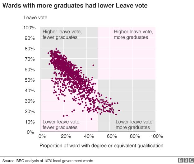
next to the line, to show the extent of correlation!