Heads of departments

Recently I was talking to someone about someone else. “He got an offer to join XXXXXX as CTO”, the guy I was talking to told me, “but I told him not to take it. Problem with CTO role is that you just stop learning and growing. Better to join a bigger place as a VP”.

The discussion meandered for a couple of minutes when I added “I feel the same way about being head of analytics”. I didn’t mention it then (maybe it didn’t flash), but this was one of the reasons why I lobbied for (and got) taking on the head of data science role as well.

I sometimes feel lonely in my job. It is not something anyone in my company can do anything about. The loneliness is external – I sometimes find that I don’t have too many “peers” (across companies). Yes, I know a handful of heads of analytics / data science across companies, but it is just that – a handful. And I can’t claim to empathise with all of them (and I’m sure the feeling is mutual).

Irrespective of the career path you have chosen, there comes a point in your career where your role suddenly becomes “illiquid”. Within your company, you are the only person doing the sort of job that you are doing. Across companies, again, there are few people who do stuff similar to what you do.

The kind of problems they solve might be different. Different companies are structured differently. The same role name might mean very different things in very different places. The challenges you have to face daily to do your job may be different. And more importantly, you might simply be interested in doing different things.

And the danger that you can get into when you get into this kind of a role is that you “stop growing”. Unless you get sufficient “push from below” (team members who are smarter than you, and who are better than you on some dimensions), there is no natural way for you to learn more about the kind of problems you are solving (or the techniques). You find that your current level is more than sufficient to be comfortable in your job. And you “put peace”.

And then one day you find ten years have got behind youNo one told you when to run, you missed the starting gun

(I want you to now imagine the gong sound at the beginning of “Time” playing in your ears at this point in the blogpost)

One thing I tell pretty much everyone I meet is that my networking within my own industry (analytics and data science) is shit. And this is something I need to improve upon. Apart from the “push from below” (which I get), the only way to continue to grow in my job is to network with peers and learn from them.

The other thing is to read. Over the weekend I snatched the new iPad (which my daughter had been using; now she has got my wife’s old Macbook Air) and put all my favourite apps on it. I feel like I’m back in 2007 again, subscribing to random blogs (just that most of them are on substack now, rather than on Blogspot or Livejournal or WordPress), in the hope that I will learn. Let me see where this takes me.

And maybe some people decide that all this pain is simply not worth it, and choose to grow by simply becoming more managerial, and “building an empire”.

So many numbers! Must be very complicated!

The story dates back to 2007. Fully retrofitting, I was in what can be described as my first ever “data science job”. After having struggled for several months to string together a forecasting model in Java (the bugs kept multiplying and cascading), I’d given up and gone back to the familiarity of MS Excel and VBA (remember that this was just about a year after I’d finished my MBA).

My seat in the office was near a door that led to the balcony, where smokers would gather. People walking to the balcony, with some effort, could see my screen. No doubt most of them would’ve seen my spending 90% (or more) of my time on Google Talk (it’s ironical that I now largely use Google Chat for work). If someone came at an auspicious time, though, they would see me really working, which was using MS Excel.

I distinctly remember this one time this guy who shared my office cab walked up behind me. I had a full sheet of Excel data and was trying to make sense of it. He took one look at my screen and exclaimed, “oh, so many numbers! Must be very complicated!” (FWIW, he was a software engineer). I gave him a fairly dirty look, wondering what was complicated about a fairly simple dataset on Excel. He moved on, to the balcony. I moved on, with my analysis.

It is funny that, fifteen years down the line, I have built my career in data science. Yet, I just can’t make sense of large sets of numbers. If someone sends me a sheet full of numbers I can’t make out the head or tail of it. Maybe I’m a victim of my own obsessions, where I spend hours visualising data so I can make some sense of it – I just can’t understand matrices of numbers thrown together.

At the very least, I need the numbers formatted well (in an Excel context, using either the “,” or “%” formats), with all numbers in a single column right aligned and rounded off to the exact same number of decimal places (it annoys me that by default, Excel autocorrects “84.0” (for example) to “84” – that disturbs this formatting. Applying “,” fixes it, though). Sometimes I demand that conditional formatting be applied on the numbers, so I know which numbers stand out (again I have a strong preference for red-white-green (or green-white-red, depending upon whether the quantity is “good” or “bad”) formatting). I might even demand sparklines.

But send me a sheet full of numbers and without any of the above mentioned decorations, and I’m completely unable to make any sense or draw any insight out of it. I fully empathise now, with the guy who said “oh, so many numbers! must be very complicated!”

And I’m supposed to be a data scientist. In any case, I’d written a long time back about why data scientists ought to be good at Excel.

Ranga and Big Data

There are some meeting stories that are worth retelling and retelling. Sometimes you think it should be included in some movie (or at least a TV show). And you never tire of telling the stories.

The way I met Ranga can qualify as one such story. At the outset, there was nothing special about it – both of us had joined IIT Madras at the same time, to do a B.Tech. in Computer Science. But the first conversation itself was epic, and something worth telling again and again.

During our orientation, one of the planned events was “a visit to the facilities”, where a professor would take us around to see the library, the workshops, a few prominent labs and other things.

I remember that the gathering point for Computer Science students was right behind the Central Lecture Theatre. This was the second day of orientation and I’d already met a few classmates by then. And that’s where I found Ranga.

The conversation went somewhat like this:

“Hi I’m Karthik. I’m from Bangalore”.
“Hi I’m Ranga. I’m from Madras. What are your hobbies?”
“I play the violin, I play chess…. ”
“Oh, you play chess? Me too. Why don’t we play a blindfold game right now?”
“Er. What? What do you want to do? Now?”
“Yeah. Let’s start. e4”.
(I finally managed to gather my senses) “c5”

And so we played for the next two hours. I clearly remember playing a Sicilian Dragon. It was a hard fought game until we ended up in an endgame with opposite coloured bishops. Coincidentally, by that time the tour of the facilities had ended. And we called it a draw.

We kept playing through our B.Techs., mostly blindfold in the backbenches of classrooms. Most of the time I would get soundly thrashed. One time I remember going from our class, with the half-played game in our heads, setting it up on a board in Ranga’s room, and continued to play.

In any case, chess apart, we’ve also had a lot of nice conversations over the last 21 years. Ranga runs a big data and AI company called TheDataTeam, so I thought it would be good to record one of our conversations and share it with the world.

And so I present to you the second episode of my new “Data Chatter” podcast. Ranga and I talk about all things “big data”, data architectures, warehousing, data engineering and all that.

As usual, the podcast is available on all podcasting platforms (though, curiously, each episode takes much longer to appear on Google Podcasts after it has released. So this second episode is already there on Spotify, Apple Podcasts, CastBox, etc. but not on Google yet).

Give it a listen. Share it with whoever you think might like it. Subscribe to my podcast. And let me know what you think of it.

Podcast: All Reals

I had spoken here a few times about starting a new “data podcast, right? The first episode is out today, and in this I speak to S Anand, cofounder and CEO of Gramener, about the interface of business with data science.

It’s a long freewheeling conversation, where we talk about data science in general, about Excel, about data visualisations, pie charts, Tufte and all that.

Do listen – it should be available on all podcast platforms, and let me know what you think. Oh, and don’t forget to subscribe to the podcast. New episodes will be out every Tuesday morning.

And if you think you want to be on the podcast, or know someone who wants to be a guest on the podcast, you can reach out. datachatterpodcast AT gmail.

Launching: Data Chatter

A few weeks back I had mentioned here that I’m starting a podcast. And it is now ready for release. Listen to the trailer here:

It is a series of conversations about all things data. First episode will be out on Tuesday, and then weekly after that. I’ve already built up an inventory of seven episodes. So far I’ve recorded episodes about big data, business intelligence, visualisations, a lot of “domain-specific” analytics, and the history of analytics in India. And many more are to come.

Subscribe to the podcast to be able to listen to it whenever it comes out. It is available on all podcasting platforms. For some reason, Apple is not listed on the anchor site, but if you search for “Data Chatter” on Apple Podcasts, you should find it (I did).

And of course, feedback is welcome (you can just comment on this post). And please share this podcast with whoever else you think might like it.

What is the Case Fatality Rate of Covid-19 in India?

The economist in me will give a very simple answer to that question – it depends. It depends on how long you think people will take from onset of the disease to die.

The modeller in me extended the argument that the economist in me made, and built a rather complicated model. This involved smoothing, assumptions on probability distributions, long mathematical derivations and (for good measure) regressions.. And out of all that came this graph, with the assumption that the average person who dies of covid-19 dies 20 days after the thing is detected.


Yes, there is a wide variation across the country. Given that the disease is the same and the treatment for most people diseased is pretty much the same (lots of rest, lots of water, etc), it is weird that the case fatality rate varies by so much across Indian states. There is only one explanation – assuming that deaths can’t be faked or miscounted (covid deaths attributed to other reasons or vice versa), the problem is in the “denominator” – the number of confirmed cases.

What the variation here tells us is that in states towards the top of this graph, we are likely not detecting most of the positive cases (serious cases will get themselves tested anyway, and get hospitalised, and perhaps die. It’s the less serious cases that can “slip”). Taking a state low down below in this graph as a “good tester” (say Andhra Pradesh), we can try and estimate what the extent of under-detection of cases in each state is.

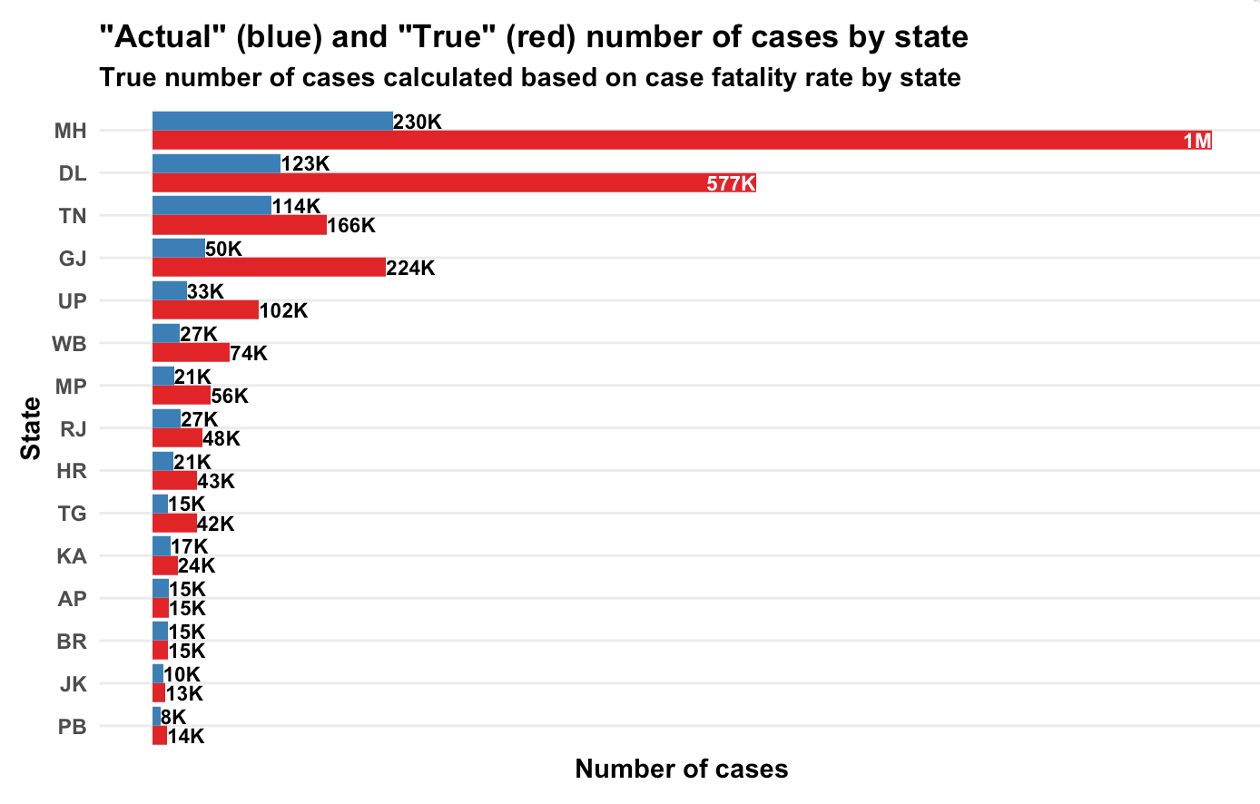
Based on state-wise case tallies as of now (might be some error since some states might have reported today’s number and some mgiht not have), here are my predictions on how many actual number of confirmed cases there are per state, based on our calculations of case fatality rate.

Yeah, Maharashtra alone should have crossed a million caess based on the number of people who have died there!

Now let’s get to the maths. It’s messy. First we look at the number of confirmed cases per day and number of deaths per day per state (data from here). Then we smooth the data and take 7-day trailing moving averages. This is to get rid of any reporting pile-ups.

Now comes the probability assumption – we assume that a proportion p of all the confirmed cases will die. We assume an average number of days (N) to death for people who are supposed to die (let’s call them Romeos?). They all won’t pop off exactly N days after we detect their infection. Let’s say a proportion \lambda dies each day. Of everyone who is infected, supposed to die and not yet dead, a proportion \lambda will die each day.

My maths has become rather rusty over the years but a derivation I made shows that \lambda = \frac{1}{N}. So if people are supposed to die in an average of 20 days, \frac{1}{20} will die today, \frac{19}{20}\frac{1}{20} will die tomorrow. And so on.

So people who die today could be people who were detected with the infection yesterday, or the day before, or the day before day before (isn’t it weird that English doesn’t a word for this?) or … Now, based on how many cases were detected on each day, and our assumption of p (let’s assume a value first. We can derive it back later), we can know how many people who were found sick k days back are going to die today. Do this for all k, and you can model how many people will die today.

The equation will look something like this. Assume d_t is the number of people who die on day t and n_t is the number of cases confirmed on day t. We get

d_t = p  (\lambda n_{t-1} + (1-\lambda) \lambda n_{t-2} + (1-\lambda)^2 \lambda n_{t-3} + ... )

Now, all these ns are known. d_t is known. \lambda comes from our assumption of how long people will, on average, take to die once their infection has been detected. So in the above equation, everything except p is known.

And we have this data for multiple days. We know the left hand side. We know the value in brackets on the right hand side. All we need to do is to find p, which I did using a simple regression.

And I did this for each state – take the number of confirmed cases on each day, the number of deaths on each day and your assumption on average number of days after detection that a person dies. And you can calculate p, which is the case fatality rate. The true proportion of cases that are resulting in deaths.

This produced the first graph that I’ve presented above, for the assumption that a person, should he die, dies on an average 20 days after the infection is detected.

So what is India’s case fatality rate? While the first graph says it’s 5.8%, the variations by state suggest that it’s a mild case detection issue, so the true case fatality rate is likely far lower. From doing my daily updates on Twitter, I’ve come to trust Andhra Pradesh as a state that is testing well, so if we assume they’ve found all their active cases, we use that as a base and arrive at the second graph in terms of the true number of cases in each state.

PS: It’s common to just divide the number of deaths so far by number of cases so far, but that is an inaccurate measure, since it doesn’t take into account the vintage of cases. Dividing deaths by number of cases as of a fixed point of time in the past is also inaccurate since it doesn’t take into account randomness (on when a Romeo might die).

Anyway, here is my code, for what it’s worth.

deathRate <- function(covid, avgDays) {
covid %>%
mutate(Date=as.Date(Date, '%d-%b-%y')) %>%
gather(State, Number, -Date, -Status) %>%
spread(Status, Number) %>%
arrange(State, Date) -> 
cov1

# Need to smooth everything by 7 days 
cov1 %>%
arrange(State, Date) %>%
group_by(State) %>%
mutate(
TotalConfirmed=cumsum(Confirmed),
TotalDeceased=cumsum(Deceased),
ConfirmedMA=(TotalConfirmed-lag(TotalConfirmed, 7))/7,
DeceasedMA=(TotalDeceased-lag(TotalDeceased, 7))/ 7
) %>%
ungroup() %>%
filter(!is.na(ConfirmedMA)) %>%
select(State, Date, Deceased=DeceasedMA, Confirmed=ConfirmedMA) ->
cov2

cov2 %>%
select(DeathDate=Date, State, Deceased) %>%
inner_join(
cov2 %>%
select(ConfirmDate=Date, State, Confirmed) %>%
crossing(Delay=1:100) %>%
mutate(DeathDate=ConfirmDate+Delay), 
by = c("DeathDate", "State")
) %>%
filter(DeathDate > ConfirmDate) %>%
arrange(State, desc(DeathDate), desc(ConfirmDate)) %>%
mutate(
Lambda=1/avgDays,
Adjusted=Confirmed * Lambda * (1-Lambda)^(Delay-1)
) %>%
filter(Deceased > 0) %>%
group_by(State, DeathDate, Deceased) %>%
summarise(Adjusted=sum(Adjusted)) %>%
ungroup() %>%
lm(Deceased~Adjusted-1, data=.) %>%
summary() %>%
broom::tidy() %>%
select(estimate) %>%
first() %>%
return()
}

Covid-19 superspreaders in Karnataka

Through a combination of luck and competence, my home state of Karnataka has handled the Covid-19 crisis rather well. While the total number of cases detected in the state edged past 2000 recently, the number of locally transmitted cases detected each day has hovered in the 20-25 range.

Perhaps the low case volume means that Karnataka is able to give out data at a level that few others states in India are providing. For each case, the rationale behind why the patient was tested (which is usually the source where they caught the disease) is given. This data comes out in two daily updates through the @dhfwka twitter handle.

There was this research that came out recently that showed that the spread of covid-19 follows a classic power law, with a low value of “alpha”. Basically, most infected people don’t infect anyone else. But there are a handful of infected people who infect lots of others.

The Karnataka data, put out by @dhfwka  and meticulously collected and organised by the folks at covid19india.org (they frequently drive me mad by suddenly changing the API or moving data into a new file, but overall they’ve been doing stellar work), has sufficient information to see if this sort of power law holds.

For every patient who was tested thanks to being a contact of an already infected patient, the “notes” field of the data contains the latter patient’s ID. This way, we are able to build a sort of graph on who got the disease from whom (some people got the disease “from a containment zone”, or out of state, and they are all ignored in this analysis).

From this graph, we can approximate how many people each infected person transmitted the infection to. Here are the “top” people in Karnataka who transmitted the disease to most people.

Patient 653, a 34 year-old male from Karnataka, who got infected from patient 420, passed on the disease to 45 others. Patient 419 passed it on to 34 others. And so on.

Overall in Karnataka, based on the data from covid19india.org as of tonight, there have been 732 cases where a the source (person) of infection has been clearly identified. These 732 cases have been transmitted by 205 people. Just two of the 205 (less than 1%) are responsible for 79 people (11% of all cases where transmitter has been identified) getting infected.

The top 10 “spreaders” in Karnataka are responsible for infecting 260 people, or 36% of all cases where transmission is known. The top 20 spreaders in the state (10% of all spreaders) are responsible for 48% of all cases. The top 41 spreaders (20% of all spreaders) are responsible for 61% of all transmitted cases.

Now you might think this is not as steep as the “well-known” Pareto distribution (80-20 distribution), except that here we are only considering 20% of all “spreaders”. Our analysis ignores the 1000 odd people who were found to have the disease at least one week ago, and none of whose contacts have been found to have the disease.

I admit this graph is a little difficult to understand, but basically I’ve ordered people found for covid-19 in Karnataka by number of people they’ve passed on the infection to, and graphed how many people cumulatively they’ve infected. It is a very clear pareto curve.

The exact exponent of the power law depends on what you take as the denominator (number of people who could have infected others, having themselves been infected), but the shape of the curve is not in question.

Essentially the Karnataka validates some research that’s recently come out – most of the disease spread stems from a handful of super spreaders. A very large proportion of people who are infected don’t pass it on to any of their contacts.

This year on Spotify

I’m rather disappointed with my end-of-year Spotify report this year. I mean, I know it’s automated analytics, and no human has really verified it, etc.  but there are some basics that the algorithm failed to cover.

The first few slides of my “annual report” told me that my listening changed by seasons. That in January to March, my favourite artists were Black Sabbath and Pink Floyd, and from April to June they were Becky Hill and Meduza. And that from July onwards it was Sigala.

Now, there was a life-changing event that happened in late March which Spotify knows about, but failed to acknowledge in the report – I moved from the UK to India. And in India, Spotify’s inventory is far smaller than it is in the UK. So some of the bands I used to listen to heavily in the UK, like Black Sabbath, went off my playlist in India. My daughter’s lullaby playlist, which is the most consumed music for me, moved from Spotify to Amazon Music (and more recently to Apple Music).

The other thing with my Spotify use-case is that it’s not just me who listens to it. I share the account with my wife and daughter, and while I know that Spotify has an algorithm for filtering out kid stuff, I’m surprised it didn’t figure out that two people are sharing this account (and pitched us a family subscription).

According to the report, these are the most listened to genres in 2019:

Now there are two clear classes of genres here. I’m surprised that Spotify failed to pick it out. Moreover, the devices associated with my account that play Rock or Power Metal are disjoint from the devices that play Pop, EDM or House. It’s almost like Spotify didn’t want to admit that people share accounts.

Then some three slides on my podcast listening for the year, when I’ve overall listened to five hours of podcasts using Spotify. If I, a human, were building this report, I would have dropped this section citing insufficient data, rather than wasting three slides with analytics that simply don’t make sense.

I see the importance of this segment in Spotify’s report, since they want to focus more on podcasts (being an “audio company” rather than a “music company”), but maybe something in the report to encourage me to use Spotify for more podcasts (maybe recommending Spotify’s exclusive podcasts that I might like, be it based on limited data?) might have helped.

Finally, take a look at my our most played songs in 2019.

It looks like my daughter’s sleeping playlist threaded with my wife’s favourite songs (after a point the latter dominate). “My songs” are nowhere to be found – I have to go all the way down to number 23 to find Judas Priest’s cover of Diamonds and Rust. I mean I know I’ve been diversifying the kind of music that I listen to, while my wife listens to pretty much the same stuff over and over again!

In any case, automated analytics is all fine, but there are some not-so-edge cases where the reports that it generates is obviously bad. Hopefully the people at Spotify will figure this out and use more intelligence in producing next year’s report!

Yet another “big data whisky”

A long time back I had used a primitive version of my Single Malt recommendation app to determine that I’d like Ardbeg. Presently, the wife was travelling to India from abroad, and she got me a bottle. We loved it.

And so I had screenshots from my app stored on my phone all the time, to be used while at duty frees, so I would know what whiskies to buy.

And then about a year back, we started planning a visit to Scotland. If you remember, we were living in London then, and my wife’s cousin and her family were going to visit us over Christmas. And the plan was to go to the Scottish Highlands for a few days. And that had to include a distillery tour.

Out came my app again, to determine which distillery to visit. I had made a scatter plot (which I have unfortunately lost since) with the distance from Inverness (where we were going to be based) on one axis, and the likelihood of my wife and I liking a whisky (based on my app) on the other (by this time, Ardbeg was firmly in the “calibration set”).

The clear winner was Clynelish – it was barely 100 kilometers away from Inverness, promised a nice drive there, and had a very high similarity score to the stuff that we liked. I presently called them to make a booking for a distillery tour. The only problem was that it’s a Diageo distillery, and Diageo distillery doesn’t allow kids inside (we were travelling with three of them).

I was proud of having planned my vacation “using data science”. I had made up a blog post in my head that I was going to write after the vacation. I was basically picturing “turning around to the umpire and shouting ‘howzzat'”. And then my hopes were dashed.

A week after I had made the booking, I got a call back from the distillery informing me that it was unfortunately going to be closed during our vacation, and so we couldn’t visit. My heart sank. We finally had to make do with two distilleries that were pretty close to Inverness, but which didn’t rate highly according to my app.

My cousin-in-law-in-law and I first visited Glen Ord, another Diageo distillery, leaving our wives and kids back in the hotel. The tour was nice, but the whisky at the distillery was rather underwhelming. The high point was the fact that Glen Ord also supplies highly peated malt to other Diageo distilleries such as Clynelish (which we couldn’t visit) and Talisker (one of my early favourites).

A day later, we went to the more family friendly Tomatin distillery, to the south of Inverness (so we could carry my daughter along for the tour. She seemed to enjoy it. The other kids were asleep in the car with their dad). The tour seemed better there, but their flagship whisky seemed flat. And then came Cu Bocan, a highly peated whisky that they produce in very limited quantities and distribute in a limited fashion.

Initially we didn’t feel anything, but then the “smoke hit from the back”. Basically the initial taste of the whisky was smooth, but as you swallowed it, the peat would hit you. It was incredibly surreal stuff. We sat at the distillery’s bar for a while downing glasses full of Cu Bocan.

The cousin-in-law-in-law quickly bought a bottle to take back to Singapore. We dithered, reasoning we could “use Amazon to deliver it to our home in London”. The muhurta for the latter never arrived, and a few months later we were on our way to India. Travelling with six suitcases and six handbags and a kid meant that we were never going to buy duty free stuff on our way home (not that Cu Bocan was available in duty free).

In any case, Clynelish is also not widely available in duty free shops, so we couldn’t have that as well for a long time. And then we found an incredibly well stocked duty free shop in Maldives, on our way back from our vacation there in August. A bottle was duly bought.

And today the auspicious event arrived for the bottle to be opened. And it’s spectacular. A very different kind of peat than Lagavulin (a bottle of which we just finished yesterday). This one hits the mouth from both the front and the back.

And I would like to call Clynelish the “new big data whisky”, having discovered it through my app, almost going there for a distillery tour, and finally tasting it a year later.

Highly recommended! And I’d highly recommend my app as well!

Cheers!

Telling stories with data

I’m about 20% through with The Verdict by Prannoy Roy and Dorab Sopariwala. It’s a fascinating book, except for one annoyance – it is full of tables that serve no purpose but to break the flow of text.

I must mention that I’m reading the book on the Kindle, which means that the tables can pose a major annoyance. Text breaks off midway through one page, and the next couple of pages involve a table or two, with several lines of text explaining what’s in the table. And then the text continues. It makes for a rather disruptive reading experience. And some of the tables have just one data point – making one wonder why it has been inserted there at all.

This is not the first book that I’ve noticed that makes this mistake. Some of the sports analytics books I’ve read in recent times, such as The Numbers Game also make the same error (I read that in print, and still had the same disruption). Bhagwati and Panagariya’s Why Growth Matters is similarly unreadable. Tables abruptly inserted into the middle of text, leading to the reader losing flow in the reading.

Telling a data story in book length is a completely different challenge to telling one in article length. And telling a story with data is a complete art form. When you’re putting a table there, you need to be able to explain why that table is important to the story – rather than putting it there just because it seems more rigorous.

Also the exact placement of the table (something that can’t be controlled well in Kindle, but is easy to fix in either HTML or print) matters –  the table should be relevant to the piece of text immediately preceding and succeeding it, in a way that it doesn’t disrupt the reader’s flow. More importantly, the table should be able to add value at that particular point – perhaps building on something that has been described in the previous paragraph.

Book length makes it harder because people don’t normally expect tables and figures to disturb their reading flow when reading something of book length. Also, the book format means that it is not always possible to insert a table at a precise point (even in print, where pagination is an issue).

So how do you tell a book length story with data? Firstly, be very stingy about the data that you want to show – anything that doesn’t immediately add value should be banished to the appendix. Even the rigour, which academics might be particular about, can be pushed to the end notes (not footnotes, since those can be disruptive to flow as well, turning pages into half pages).

Then, once you know that showing a particular table or graph is inevitable to telling the story, put it either in the beginning or the end of a chapter. This way, it doesn’t break the reader’s flow. Then, refer to individual numbers in the middle of the text without having to put the entire table in there. Unless each and every data point in the table is important, banish it to the endnotes.

One other common mistake (I did it in my piece in Forbes published yesterday) is to put a big table and not talk about it. It only seeks to confuse the reader, who starts looking for explanations for everything in the table in later parts.

I guess authors and analysts tend to get possessive. If you have worked hard to produce insights from data, you seek to share as much of it as possible. And this can mean simply dumping data all the data in the piece without a regard for what the reader will do with it.

I’m making a note to myself to not repeat this mistake in future.