Regular readers of this blog will know very well that I keep talking about how everything in life is Bayesian. I may not have said it in those many words, but I keep alluding to it.
For example, when I’m hiring, I find the process to be Bayesian – the CV and the cover letter set a prior (it’s really a distribution, not a point estimate). Then each round of interview (or assignment) gives additional data that UPDATES the prior distribution. The distribution moves around with each round (when there is sufficient mass below a certain cutoff there are no more rounds), until there is enough confidence that the candidate will do well.
In hiring, Bayes theorem can also work against the candidate. Like I remember interviewing this guy with an insanely spectacular CV, so most of the prior mass was to the “right” of the distribution. And then when he got a very basic question so badly wrong, the updation in the distribution was swift and I immediately cut him.
On another note, I’ve argued here about how stereotypes are useful – purely as a Bayesian prior when you have no more information about a person. So you use the limited data you have about them (age, gender, sex, sexuality, colour of skin, colour of hair, education and all that), and the best judgment you can make at that point is by USING this information rather than ignoring it. In other words, you need to stereotype.
However, the moment you get more information, you ought to very quickly update your prior (in other words, the ‘stereotype prior’ needs to be a very wide distribution, irrespective of where it is centred). Else it will be a bad judgment on your part.
In any case, coming to the point of this post, I find that the respect I have for people is also heavily Bayesian (I might have alluded to this while talking about interviewing). Typically, in case of most people, I start with a very high degree of respect. It is actually a fairly narrowly distributed Bayesian prior.
And then as I get more and more information about them, I update this prior. The high starting position means that if they do something spectacular, it moves up only by a little. If they do something spectacularly bad, though, the distribution moves way left.
So I’ve noticed that when there is a fall, the fall is swift. This is again because of the way the maths works – you might have a very small probability of someone being “bad” (left tail). And then when they do something spectacularly bad (well into that tail), there is no option but to update the distribution such that a lot of the mass is now in this tail.
Once that has happened, unless they do several spectacular things, it can become irredeemable. Each time they do something slightly bad, it confirms your prior that they are “bad” (on whatever dimension), and the distribution narrows there. And they become more and more irredeemable.
It’s like “you cannot unsee” the event that took their probability distribution and moved it way left. Soon, the end is near.
Of late I’ve been feeling a little short in terms of intellectual stimulation. Maybe it was my decision at work to hunker down and focus on execution and tying up loose ends this quarter, rather than embarking on fresh exploratory work. Maybe it’s just that I’m not meeting too many people.
The last time I REMEMBER feeling this way was in May-June 2007. I clearly remember the drive (I was in my old Zen, driving past Urvashi Theatre on an insanely rainy Sunday afternoon, having met friends for lunch) where I felt this way. Back then, I had responded by massively upping my reading – that was the era of blogs and I had subscribed to hundreds on my bloglines (remember that?). I clearly remember feeling much better about myself by the end of that year.
Now, I continue to read, and read fairly insightful stuff. I’m glad that Substack has taken the place that blogs had in the noughties (after the extreme short-form-dominated 2010s), and have subscribed (for free) to a whole bunch of fairly interesting newsletters.
What I miss, though, is the stimulation in conversations. Maybe it’s just that I’m having way fewer of them, and not a reflection of the average quality of conversations I’ve been having. I’ve come to a stage where I don’t even know who I should meet or what I should talk about to stimulate me.
With that background, I was really happy to come across my (2000) JEE maths paper on Twitter. Baal sent it to me this afternoon when I was at work. Having got home, had dinner and dessert and sent off the daughter to bed, I got to it.
Thanks to @ravihanda on Twitter
Memories of that Sunday morning in Malleswaram came flooding back to me. Looking back, I’m impressed with my seventeen year old self in terms of the kind of prep I did for the exam. For the JEE screening that January, I had felt I had peaked a week too early, so I took an entire week off after my board exams so that I could peak at the right time.
For a few days before the exam, I practiced waking up really early, so that I could change my shit rhythm (the exam started at 8am in Malleswaram, meaning we would have to leave home by 7. Back then, you didn’t want to go to any toilets outside of home). The menu for the day had been carefully pre-planned (breakfast after the maths exam, lunch after physics).
The first fifteen minutes or so of this maths paper I had blanked out. And then slowly started working my way from the first question. I remember coming out of the exam feeling incredibly happy. “I’m surely getting in, if I don’t screw up the other papers”, I remember telling some friends.
Anyway, having seen this paper, I HAD to attempt it. I didn’t bother with any “exam conditions”. I put on a “heavy metal” playlist on spotify, took out my iPad and pencil, and started looking at the questions.
Again courtesy https://twitter.com/ravihanda
I took 15 minutes for the first part of the first question. While I was clearly rusty, this was a decent start. Then I started with the second part of the first question, got stuck and gave up.
I started browsing Twitter but decided the paper is more interesting. The second question was relatively easy. I left the third one (forgotten my trigonometry), but found the fourth one quite easy (and I remember from my JEE about encountering Manhattan Distance ). The second half I didn’t focus so much on today, but was surprised to see the eighth question – with full benefit of hindsight, it’s way too easy to make it to the JEE!
I didn’t bother attempting all the questions, of “completing the paper” in any way. I didn’t need that. I haven’t decayed THAT MUCH in 23 years. And this was some nice intellectual stimulation for a weekday evening!
PS: I don’t think I’ll feel remotely as kicked if I encounter my physics or chemistry IIT-JEE papers.
PS2: Now one of my school and IIT classmates is pinging me on WhatsApp discussing questions. And i’m finding bugs in my (today’s) answers
When I’m visiting someone’s house and they have an accessible bookshelf, one of the things I do is to go check out the books they have. There is no particular motivation, but it’s just become a habit. Sometimes it serves as conversation starters (or digressors). Sometimes it helps me understand them better. Most of the time it’s just entertaining.
So at a friend’s party last night, I found this book on Graph Theory. I just asked my hosts whose book it was, got the answer and put it back.
As many of you know, whenever we host a party, we use graph theory to prepare the guest list. My learning from last night’s party, though, is that you should not only use graph theory to decide WHO to invite, but also to adjust the times you tell people so that the party has the best outcome possible for most people.
With the full benefit of hindsight, the social network at last night’s party looked approximately like this. Rather, this is my interpretation of the social network based on my knowledge of people’s affiliation networks.
This is approximate, and I’ve collapsed each family to one dot. Basically it was one very large clique, and two or three other families (I told you this was approximate) who were largely only known to the hosts. We were one of the families that were not part of the large clique.
This was not the first such party I was attending, btw. I remember this other party from 2018 or so which was almost identical in terms of the social network – one very large clique, and then a handful of families only known to the hosts. In fact, as it happens, the large clique from the 2018 party and from yesterday’s party were from the same affiliation network, but that is only a coincidence.
Thinking about it, we ended up rather enjoying ourselves at last night’s party. I remember getting comfortable fairly quickly, and that mood carrying on through the evening. Conversations were mostly fun, and I found myself connecting adequately with most other guests. There was no need to get drunk. As we drove back peacefully in the night, my wife and daughter echoed my sentiments about the party – they had enjoyed themselves as well.
This was in marked contrast with the 2018 party with the largely similar social network structure (and dominant affiliation network). There we had found ourselves rather disconnected, unable to make conversation with anyone. Again, all three of us had felt similarly. So what was different yesterday compared to the 2018 party?
I think it had to do with the order of arrival. Yesterday, we were the second family to arrive at the party, and from a strict affiliation group perspective, the family that had preceded us at the party wasn’t part of the large clique affiliation network (though they knew most of the clique from beforehand). In that sense, we started the party on an equal footing – us, the hosts and this other family, with no subgroup dominating.
The conversation had already started flowing among the adults (the kids were in a separate room) when the next set of guests (some of them from the large clique arrived), and the assimilation was seamless. Soon everyone else arrived as well.
The point I’m trying to make here is that because the non-large-clique guests had arrived first, they had had a chance to settle into the party before the clique came in. This meant that they (non-clique) had had a chance to settle down without letting the party get too cliquey. That worked out brilliantly.
In contrast, in the 2018 party, we had ended up going rather late which meant that the clique was already in action, and a lot of the conversation had been clique-specific. This meant that we had struggled to fit in and never really settled, and just went through the motions and returned.
I’m reminded of another party WE had hosted back in 2012, where there was a large clique and a small clique. The small clique had arrived first, and by the theory in this post, should have assimilated well into the party. However, as the large clique came in, the small clique had sort of ended up withdrawing into itself, and I remember having had to make an effort to balance the conversation between all guests, and it not being particularly stress-free for me.
The difference there was that there were TWO cliques with me as cut-vertex. Yesterday, if you took out the hosts (cut-vertex), you would largely have one large clique and a few isolated nodes. And the isolated nodes coming in first meant they assimilated both with one another and with the party overall, and the party went well!
And now that I’ve figured out this principle, I might break my head further at the next party I host – in terms of what time I tell to different guests!
There were quite a few teachers during my time at IIT Madras who were rumoured to have said the line “I want everyone in class to be above average”. Some people credit a professor of mathematics for saying this. At other times, the quote is ascribed to a lecturer of Engineering Drawing. In the last 20 years I’m sure even some statistics professors would have been credited with this line.
The absurdity in the line is clear. By definition, everyone cannot be above average. The average is a measure of central tendency. However you define it (arithmetic mean, geometric mean, harmonic mean, median, mode), the average is by definition a “central value”, meaning you will have numbers both above and below it. In the worst case (assuming you are using a mode or median for a highly skewed distribution), there will be a large number of data points EQUAL to the average. Everyone cannot be above (strictly greater than) average.
However, based on some recent incidents, I figured out a way in which everyone can actually be above average. All it takes is some kind of selection bias. Basically you need to be clever in terms of how you count – both when you calculate the average and when you define the “everyone”.
Take one example – you have an exam you need to pass to go from Grade 1 to Grade 2. Let’s say the class average (let’s use the simple mean here) is 41, and you need to have scored at least 40 to pass. Let’s also assume that nobody has scored exactly 40 or 41.
Now, if you come back next month and look at the exam scores of all the Grade 2 students, you will find that all of them would have scored strictly more than 41 – the old “average”. In other words, since the below average students are no longer part of the sample (since they have “not passed”), everyone left is above average! The below average set has simply been eliminated!
Another way is simple relative grading. Let’s say there are 3 sections in the class. Telling one section that “everyone should be above average” is fairly legit – all it says is that this particular section should outperform the others so significantly that everyone in this section will be above the average defined by all sections!
It is easier to do in code – using some statistical packages, as long as you slip in a few missing values into your dataset, you will find that the average is meaningless, and when you ask your software for how many are above average, the program defaults can mean that everyone can be classified as “above average” (even the ones with missing values).
I must have recommended this a few times already, but Darrell Huff’s 1954 book How to Lie With Statistics remains a masterpiece.
Recently I’ve been remembering the first assignment of my “quantitative methods 2” course at IIMB back in 2004. In the first part of that course, we were learning regression. And so this assignment involved a regression problem. Not too hard at first sight – maybe 3 explanatory variables.
We had been randomly divided into teams of four. I remember working on it in the Computer Centre, in close proximity to some other teams. I remember trying to “do gymnastics” – combining variables, transforming them, all in the hope of trying to get the “best possible R square”. From what I remember, most of the groups went “R square hunting” that day. The assignment had been cleverly chosen such that for an academic exercise, the R Square wasn’t very high.
As an aside – one thing a lot of people take a long time to come to terms with is that in “real life” (industry problems) R squares aren’t usually that high. Forecast accuracy isn’t that high. And that the elegant methods they had learnt back in school / academia may not be as elegant any more in industry. I think I’ve written about this, but I can’t find the link now.
Anyway, back to QM2. I remember the professor telling us that three groups would be chosen at random on the day of the assignment submission, and from each of these three groups one person would be chosen at random who would have to present the group’s solution to the class. I remember that the other three people in my group all decided to bunk class that day! In any case, our group wasn’t called to present.
The whole point of this massive build up is – our approach (and the approach of most other groups) had been all wrong. We had just gone in a mad hunt for R square, not bothering to figure out whether the wild transformations and combinations that we were making made any business sense. Moreover, in our mad hunt for R square, we had all forgotten to consider whether a particular variable was significant, and if the regression itself was significant.
What we learnt was that while R square matters, it is not everything. The “model needs to be good”. The variables need to make sense. In statistics you can’t just go about optimising for one metric – there are several others. And this lesson has stuck with me. And guides how I approach all kinds of data modelling work. And I realise that is in conflict with the way data science is widely practiced nowadays.
The way data science is largely practiced in the wild nowadays is precisely a mad hunt for R Square (or area under ROC curve, if you’re doing a classification problem). Whether the variables used make sense doesn’t matter. Whether the transformations are sound doesn’t matter. It doesn’t matter at all whether the model is “good”, or appropriate – the only measure of goodness of the model seems to be the R square!
In a way, contests such as Kaggle have exacerbated this trend. In contests, typically, there is a precise metric (such as R Square) that you are supposed to maximise. With contests being evaluated algorithmically, it is difficult to evaluate on multiple parameters – especially not whether “the model is good”. And since nowadays a lot of data scientists hone their skills by participating in contests such as on Kaggle, they are tuned to simply go R square hunting.
Also, the big difference between Kaggle and real life is that in Kaggle, the model that you build doesn’t matter. It’s just a combination. You get the best R square. You win. You take the prize. You go home.
You don’t need to worry about how the data for the model was collected. The model doesn’t have to be implemented. No business decisions need to be made based on the model. Contest done, model done.
Obviously that is not how things work in real life. Building the model is only one in a long series of steps in solving the business problem. And when you focus too much on just one thing – the model’s accuracy in the data that you have been given, a lot can be lost in the rest of the chain (including application of the model in future situations).
And in this way, by focussing on just a small portion of the entire data science process (model building), I think Kaggle (and other similar competition platforms) has actually done a massive disservice to data science itself.
Tailpiece
This is completely unrelated to the rest of the post, but too small to merit a post of its own.
Suppose you ask a software engineer to sort a few datasets. He goes about applying bubble sort, heap sort, quick sort, insertion sort and a whole host of other techniques. And then picks the one that sorted the given datasets fastest.
That’s precisely how it seems “data science” is practiced nowadays
Earlier this week I read this masterful blogpost on Andrew Gelman’s blog (though the post itself is not written by Andrew Gelman – it’s written by Phil Price) about communicating numbers.
Basically the way you communicate a number can give a lot more information “between the lines”. Take the example at the top of the article:
“At the New York Marathon, three of the five fastest runners were wearing our shoes.” I’m sure I’m not the first or last person to have realized that there’s more information there than it seems at first. For one thing, you can be sure that one of those three runners finished fifth: otherwise the ad would have said “three of the four fastest.” Also, it seems almost certain that the two fastest runners were not wearing the shoes, and indeed it probably wasn’t 1-3 or 2-3 either: “The two fastest” and “two of the three fastest” both seem better than “three of the top five.” The principle here is that if you’re trying to make the result sound as impressive as possible, an unintended consequence is that you’re revealing the upper limit.
Incredible. So 3 in 5 means one of them is likely to be 5th. And likely one is fourth as well. Similarly, if you see a company that calls itself a “Fortune 500 company”, it is likely closer to 500 than to 100.
The other, slightly unrelated, example quoted in the article is about Covid-19 spread in outdoor conditions. There is another article that says that “less than 10% of covid-19 transmission that happens indoors”. This is misleading because if you say “less than 10%”, people will assume it’s 9%! The number, apparently, is closer to 0.1%.
There are many more such examples that we encounter in real life. If you write on LinkedIn that you went to a “top 10 ranked B-school”, it means you DID NOT go to a “top 5 ranked B-school”.
Loosely related to this, I’ve got a bit irritated over the last year and a bit in terms of imprecise numerical reporting by the media (related to covid-19). I won’t provide links or quotes here, since what I can remember are mostly by one person and I don’t want to implicate her here (and it’s a systemic problem, not unique to her).
You see reports saying “20000 new cases in Karnataka. A majority of them are from Bangalore”. I’ve seen this kind of a report even when 90% of the cases have been from Bangalore, and that is misleading – when you say “majority”, you instinctively think of “50% + 1”. Another report said “as many as 10000 cases”. Now, the “as many as” phrasing makes it sound like a very large number, but put in context, this 10000 wasn’t really very high.
Communication of numbers is an art that is not very well spread. Nowadays we see lots of courses on “telling stories with data”, “data visualisation”, graphics, etc. but none in terms of communication of sheer numbers itself.
Maybe I should record an episode about this in my forthcoming podcast. If you know who might be a good guest for it, AND can make an introduction, let me know.
One silver lining in the madness of the US Presidential election counting is that there are some interesting analyses floating around regarding polling and surveying and probabilities and visualisation. Take this post from Andrew Gelman’s blog, for example:
Suppose our forecast in a certain state is that candidate X will win 0.52 of the two-party vote, with a forecast standard deviation of 0.02. Suppose also that the forecast has a normal distribution.[…]
Then your 68% predictive interval for the candidate’s vote share is [0.50, 0.54], and your 95% interval is [0.48, 0.56].
Now suppose the candidate gets exactly half of the vote. Or you could say 0.499, the point being that he lost the election in that state.
This outcome falls on the boundary of the 68% interval, it’s one standard deviation away from the forecast. In no sense would this be called a prediction error or a forecast failure.
But now let’s say it another way. The forecast gave the candidate an 84% chance of winning! And then he lost. That’s pretty damn humiliating. The forecast failed.
It took me a while to appreciate this. In a binary outcome, if your model says predicts 52%, with a standard deviation of 2%, you are in effect predicting a “win” (50% or higher) with a probability of 84%! Somehow I had never thought about it that way.
In any case, this tells you how tricky forecasting a binary outcome is. You might think (based on your sample size) that a 2% standard deviation is reasonable. Except that when the mean of your forecast is close to the barrier (50% in this case), the “reasonable standard deviation” lends a much stronger meaning to your forecast.
Gelman goes on:
That’s right. A forecast of 0.52 +/- 0.02 gives you an 84% chance of winning.
We want to increase the sd in the above expression so as to send the win probability down to 60%. How much do we need to increase it? Maybe send it from 0.02 to 0.03?
> pnorm(0.52, 0.50, 0.03)
[1] 0.75
Uh, no, that wasn’t enough! 0.04?
> pnorm(0.52, 0.50, 0.04)
[1] 0.69
0.05 won’t do it either. We actually have to go all the way up to . . . 0.08:
> pnorm(0.52, 0.50, 0.08)
[1] 0.60
That’s right. If your best guess is that candidate X will receive 0.52 of the vote, and you want your forecast to give him a 60% chance of winning the election, you’ll have to ramp up the sd to 0.08, so that your 95% forecast interval is a ridiculously wide 0.52 +/- 2*0.08, or [0.36, 0.68].
The economist in me will give a very simple answer to that question – it depends. It depends on how long you think people will take from onset of the disease to die.
The modeller in me extended the argument that the economist in me made, and built a rather complicated model. This involved smoothing, assumptions on probability distributions, long mathematical derivations and (for good measure) regressions.. And out of all that came this graph, with the assumption that the average person who dies of covid-19 dies 20 days after the thing is detected.
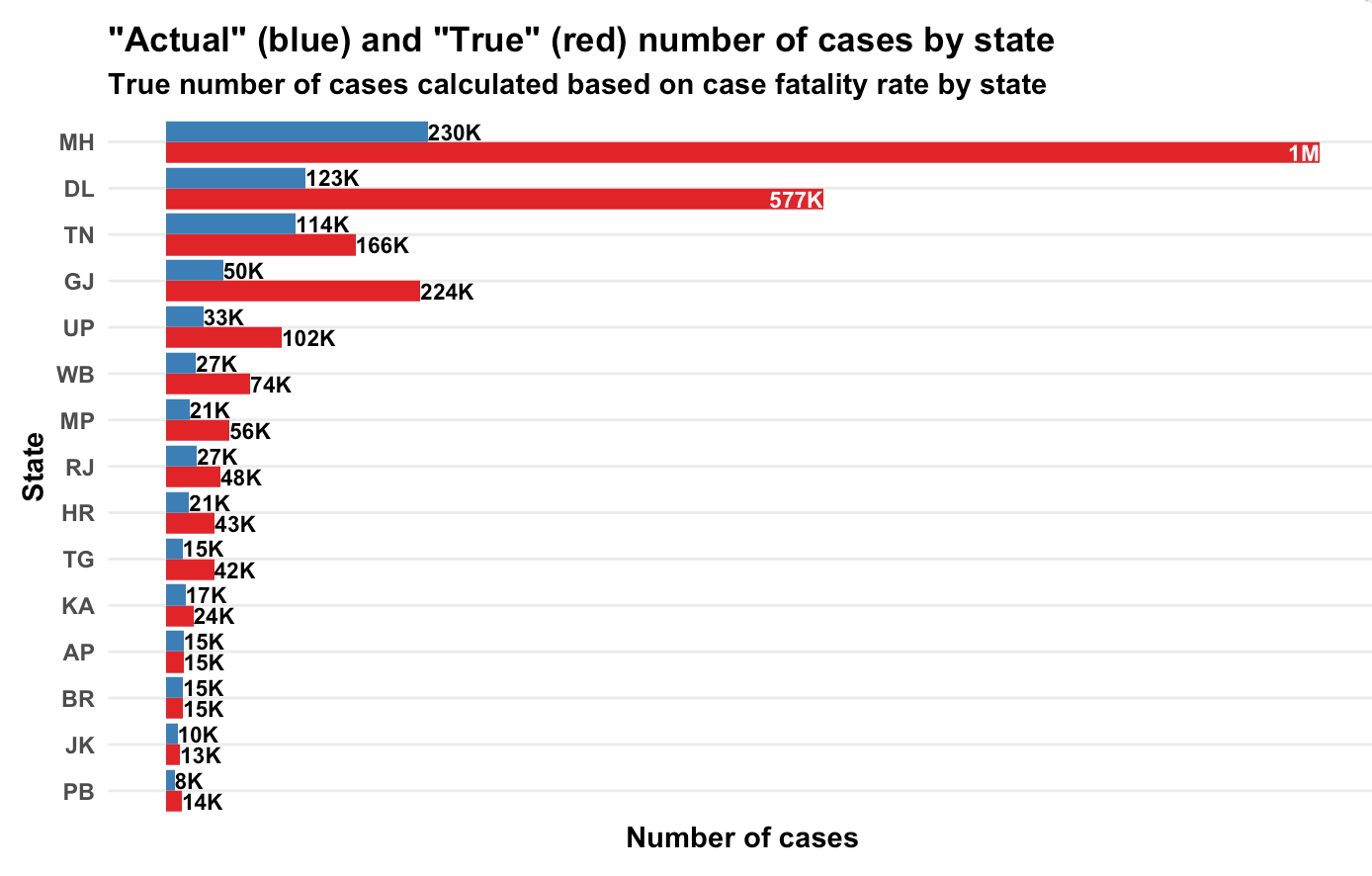
Yes, there is a wide variation across the country. Given that the disease is the same and the treatment for most people diseased is pretty much the same (lots of rest, lots of water, etc), it is weird that the case fatality rate varies by so much across Indian states. There is only one explanation – assuming that deaths can’t be faked or miscounted (covid deaths attributed to other reasons or vice versa), the problem is in the “denominator” – the number of confirmed cases.
What the variation here tells us is that in states towards the top of this graph, we are likely not detecting most of the positive cases (serious cases will get themselves tested anyway, and get hospitalised, and perhaps die. It’s the less serious cases that can “slip”). Taking a state low down below in this graph as a “good tester” (say Andhra Pradesh), we can try and estimate what the extent of under-detection of cases in each state is.
Based on state-wise case tallies as of now (might be some error since some states might have reported today’s number and some mgiht not have), here are my predictions on how many actual number of confirmed cases there are per state, based on our calculations of case fatality rate.
Yeah, Maharashtra alone should have crossed a million caess based on the number of people who have died there!
Now let’s get to the maths. It’s messy. First we look at the number of confirmed cases per day and number of deaths per day per state (data from here). Then we smooth the data and take 7-day trailing moving averages. This is to get rid of any reporting pile-ups.
Now comes the probability assumption – we assume that a proportion of all the confirmed cases will die. We assume an average number of days () to death for people who are supposed to die (let’s call them Romeos?). They all won’t pop off exactly days after we detect their infection. Let’s say a proportion dies each day. Of everyone who is infected, supposed to die and not yet dead, a proportion will die each day.
My maths has become rather rusty over the years but a derivation I made shows that . So if people are supposed to die in an average of 20 days, will die today, will die tomorrow. And so on.
So people who die today could be people who were detected with the infection yesterday, or the day before, or the day before day before (isn’t it weird that English doesn’t a word for this?) or … Now, based on how many cases were detected on each day, and our assumption of (let’s assume a value first. We can derive it back later), we can know how many people who were found sick days back are going to die today. Do this for all , and you can model how many people will die today.
The equation will look something like this. Assume is the number of people who die on day and is the number of cases confirmed on day . We get
Now, all these s are known. is known. comes from our assumption of how long people will, on average, take to die once their infection has been detected. So in the above equation, everything except is known.
And we have this data for multiple days. We know the left hand side. We know the value in brackets on the right hand side. All we need to do is to find , which I did using a simple regression.
And I did this for each state – take the number of confirmed cases on each day, the number of deaths on each day and your assumption on average number of days after detection that a person dies. And you can calculate , which is the case fatality rate. The true proportion of cases that are resulting in deaths.
This produced the first graph that I’ve presented above, for the assumption that a person, should he die, dies on an average 20 days after the infection is detected.
So what is India’s case fatality rate? While the first graph says it’s 5.8%, the variations by state suggest that it’s a mild case detection issue, so the true case fatality rate is likely far lower. From doing my daily updates on Twitter, I’ve come to trust Andhra Pradesh as a state that is testing well, so if we assume they’ve found all their active cases, we use that as a base and arrive at the second graph in terms of the true number of cases in each state.
PS: It’s common to just divide the number of deaths so far by number of cases so far, but that is an inaccurate measure, since it doesn’t take into account the vintage of cases. Dividing deaths by number of cases as of a fixed point of time in the past is also inaccurate since it doesn’t take into account randomness (on when a Romeo might die).
There has been a massive jump in the number of covid-19 positive cases in Karnataka over the last couple of days. Today, there were 44 new cases discovered, and yesterday there were 36. This is a big jump from the average of about 15 cases per day in the preceding 4-5 days.
The good news is that not all of this is new infection. A lot of cases that have come out today are clusters of people who have collectively tested positive. However, there is one bit from yesterday’s cases (again a bunch of clusters) that stands out.
Source: covid19india.org
I guess by now everyone knows what “travelled from Delhi” is a euphemism for. The reason they are interesting to me is that they are based on a “repeat test”. In other words, all these people had tested negative the first time they were tested, and then they were tested again yesterday and found positive.
Why did they need a repeat test? That’s because the sensitivity of the Covid-19 test is rather low. Out of every 100 infected people who take the test, only about 70 are found positive (on average) by the test. That also depends upon when the sample is taken. From the abstract of this paper:
Over the four days of infection prior to the typical time of symptom onset (day 5) the probability of a false negative test in an infected individual falls from 100% on day one (95% CI 69-100%) to 61% on day four (95% CI 18-98%), though there is considerable uncertainty in these numbers. On the day of symptom onset, the median false negative rate was 39% (95% CI 16-77%). This decreased to 26% (95% CI 18-34%) on day 8 (3 days after symptom onset), then began to rise again, from 27% (95% CI 20-34%) on day 9 to 61% (95% CI 54-67%) on day 21.
About one in three (depending upon when you draw the sample) infected people who have the disease are found by the test to be uninfected. Maybe I should state it again. If you test a covid-19 positive person for covid-19, there is almost a one-third chance that she will be found negative.
The good news (at the face of it) is that the test has “high specificity” of about 97-98% (this is from conversations I’ve had with people in the know. I’m unable to find links to corroborate this), or a false positive rate of 2-3%. That seems rather accurate, except that when the “prior probability” of having the disease is low, even this specificity is not good enough.
Let’s assume that a million Indians are covid-19 positive (the official numbers as of today are a little more than one-hundredth of that number). With one and a third billion people, that represents 0.075% of the population.
Let’s say we were to start “random testing” (as a number of commentators are advocating), and were to pull a random person off the street to test for Covid-19. The “prior” (before testing) likelihood she has Covid-19 is 0.075% (assume we don’t know anything more about her to change this assumption).
If we were to take 20000 such people, 15 of them will have the disease. The other 19985 don’t. Let’s test all 20000 of them.
Of the 15 who have the disease, the test returns “positive” for 10.5 (70% accuracy, round up to 11). Of the 19985 who don’t have the disease, the test returns “positive” for 400 of them (let’s assume a specificity of 98% (or a false positive rate of 2%), placing more faith in the test)! In other words, if there were a million Covid-19 positive people in India, and a random Indian were to take the test and test positive, the likelihood she actually has the disease is 11/411 = 2.6%.
If there were 10 million covid-19 positive people in India (no harm in supposing), then the “base rate” would be .75%. So out of our sample of 20000, 150 would have the disease. Again testing all 20000, 105 of the 150 who have the disease would test positive. 397 of the 19850 who don’t have the disease will test positive. In other words, if there were ten million Covid-19 positive people in India, and a random Indian were to take the test and test positive, the likelihood she actually has the disease is 105/(397+105) = 21%.
If there were ten million Covid-19 positive people in India, only one-fifth of the people who tested positive in a random test would actually have the disease.
Take a sip of water (ok I’m reading The Ken’s Beyond The First Order too much nowadays, it seems).
This is all standard maths stuff, and any self-respecting book or course on probability and Bayes’s Theorem will have at least a reference to AIDS or cancer testing. The story goes that this was a big deal in the 1990s when some people suggested that the AIDS test be used widely. Then, once this problem of false positives and posterior probabilities was pointed out, the strategy of only testing “high risk cases” got accepted.
And with a “low incidence” disease like covid-19, effective testing means you test people with a high prior probability. In India, that has meant testing people who travelled abroad, people who have come in contact with other known infected, healthcare workers, people who attended the Tablighi Jamaat conference in Delhi, and so on.
The advantage with testing people who already have a reasonable chance of having the disease is that once the test returns positive, you can be pretty sure they actually have the disease. It is more effective and efficient. Testing people with a “high prior probability of disease” is not discriminatory, or a “sampling bias” as some commentators alleged. It is prudent statistical practice.
Again, as I found to my own detriment with my tweetstorm on this topic the other day, people are bound to see politics and ascribe political motives to everything nowadays. In that sense, a lot of the commentary is not surprising. It’s also not surprising that when “one wing” heavily retweeted my article, “the other wing” made efforts to find holes in my argument (which, again, is textbook math).
One possibly apolitical criticism of my tweetstorm was that “the purpose of random testing is not to find out who is positive. It is to find out what proportion of the population has the disease”. The cost of this (apart from the monetary cost of actually testing) are threefold. Firstly, a large number of uninfected people will get hospitalised in covid-specific hospitals, clogging hospital capacity and increasing the chances that they get infected while in hospital.
Secondly, getting a truly random sample in this case is tricky, and possibly unethical. When you have limited testing capacity, you would be inclined (possibly morally, even) to use it on people who already have a high prior probability.
Finally, when the incidence is small, we need a really large sample to find out the true range.
Let’s say 1 in 1000 Indians have the disease (or about 1.35 million people). Using the Chi Square test of proportions, our estimate of the incidence of the disease varies significantly on how many people are tested.
If we test a 1000 people and find 1 positive, the true incidence of the disease (95% confidence interval) could be anywhere from 0.01% to 0.65%.
If we test 10000 people and find 10 positive, the true incidence of the disease could be anywhere between 0.05% and 0.2%.
Only if we test 100000 people (a truly massive random sample) and find 100 positive, then the true incidence lies between 0.08% and 0.12%, an acceptable range.
I admit that we may not be testing enough. A simple rule of thumb is that anyone with more than a 5% prior probability of having the disease needs to be tested. How we determine this prior probability is again dependent on some rules of thumb.
I’ll close by saying that we should NOT be doing random testing. That would be unethical on multiple counts.
For a long time now, I’ve been sceptical of the practice of finding out the average income in a country or state or city or locality by doing a random survey. The argument I’ve made is “whether you keep Mukesh Ambani in the sample or not makes a huge difference in your estimate”. So far, though, I hadn’t been able to make a proper mathematical argument.
In the course of writing a piece for Bloomberg Quint (my first for that publication), I figured out a precise mathematical argument. Basically, incomes are distributed according to a power law distribution, and the exponent of the power law means that variance is not defined. And hence the Central Limit Theorem isn’t applicable.
OK let me explain that in English. The reason sample surveys work is due to a result known as the Central Limit Theorem. This states that for a distribution with finite mean and variance, the average of a random sample of data points is not very far from the average of the population, and the difference follows a normal distribution with zero mean and variance that is inversely proportional to the number of points surveyed.
So if you want to find out the average height of the population of adults in an area, you can simply take a random sample, find out their heights and you can estimate the distribution of the average height of people in that area. It is similar with voting intention – as long as the sample of people you survey is random (and without bias), the average of their voting intention can tell you with high confidence the voting intention of the population.
This, however, doesn’t work for income. Based on data from the Indian Income Tax department, I could confirm (what theory states) that income in India follows a power law distribution. As I wrote in my piece:
The basic feature of a power law distribution is that it is self-similar – where a part of the distribution looks like the entire distribution.
Based on the income tax returns data, the number of taxpayers earning more than Rs 50 lakh is 40 times the number of taxpayers earning over Rs 5 crore.
The ratio of the number of people earning more than Rs 1 crore to the number of people earning over Rs 10 crore is 38.
About 36 times as many people earn more than Rs 5 crore as do people earning more than Rs 50 crore.
In other words, if you increase the income limit by a factor of 10, the number of people who earn over that limit falls by a factor between 35 and 40. This translates to a power law exponent between 1.55 and 1.6 (log 35 to base 10 and log 40 to base 10 respectively).
Now power laws have a quirk – their mean and variance are not always defined. If the exponent of the power law is less than 1, the mean is not defined. If the exponent is less than 2, then the distribution doesn’t have a defined variance. So in this case, with an exponent around 1.6, the distribution of income in India has a well-defined mean but no well-defined variance.
To recall, the central limit theorem states that the population mean follows a normal distribution with the mean centred at the sample mean, and a variance of where is the standard deviation of the underlying distribution. And when the underlying distribution itself is a power law distribution with an exponent less than 2 (as the case is in India), itself is not defined.
Which means the distribution of population mean around sample mean has infinite variance. Which means the sample mean tells you absolutely nothing!
And hence, surveying is not a good way to find the average income of a population.


 of all the confirmed cases will die. We assume an average number of days (
 ) to death for people who are supposed to die (let’s call them
  dies each day. Of everyone who is infected, supposed to die and not yet dead, a proportion
  . So if people are supposed to die in an average of 20 days,
  will die today,
  will die tomorrow. And so on.
 days back are going to die today. Do this for all
  is the number of people who die on day
  and
and  is the number of cases confirmed on day
 s are known.
 where
where  is the standard deviation of the underlying distribution. And when the underlying distribution itself is a power law distribution with an exponent less than 2 (as the case is in India),