Bayes Theorem and Respect

Regular readers of this blog will know very well that I keep talking about how everything in life is Bayesian. I may not have said it in those many words, but I keep alluding to it.

For example, when I’m hiring, I find the process to be Bayesian – the CV and the cover letter set a prior (it’s really a distribution, not a point estimate). Then each round of interview (or assignment) gives additional data that UPDATES the prior distribution. The distribution moves around with each round (when there is sufficient mass below a certain cutoff there are no more rounds), until there is enough confidence that the candidate will do well.

In hiring, Bayes theorem can also work against the candidate. Like I remember interviewing this guy with an insanely spectacular CV, so most of the prior mass was to the “right” of the distribution. And then when he got a very basic question so badly wrong, the updation in the distribution was swift and I immediately cut him.

On another note, I’ve argued here about how stereotypes are useful – purely as a Bayesian prior when you have no more information about a person. So you use the limited data you have about them (age, gender, sex, sexuality, colour of skin, colour of hair, education and all that), and the best judgment you can make at that point is by USING this information rather than ignoring it. In other words, you need to stereotype.

However, the moment you get more information, you ought to very quickly update your prior (in other words, the ‘stereotype prior’ needs to be a very wide distribution, irrespective of where it is centred). Else it will be a bad judgment on your part.

In any case, coming to the point of this post, I find that the respect I have for people is also heavily Bayesian (I might have alluded to this while talking about interviewing). Typically, in case of most people, I start with a very high degree of respect. It is actually a fairly narrowly distributed Bayesian prior.

And then as I get more and more information about them, I update this prior. The high starting position means that if they do something spectacular, it moves up only by a little. If they do something spectacularly bad, though, the distribution moves way left.

So I’ve noticed that when there is a fall, the fall is swift. This is again because of the way the maths works – you might have a very small probability of someone being “bad” (left tail). And then when they do something spectacularly bad (well into that tail), there is no option but to update the distribution such that a lot of the mass is now in this tail.

Once that has happened, unless they do several spectacular things, it can become irredeemable. Each time they do something slightly bad, it confirms your prior that they are “bad” (on whatever dimension), and the distribution narrows there. And they become more and more irredeemable.

It’s like “you cannot unsee” the event that took their probability distribution and moved it way left. Soon, the end is near.


JEE Math!!

Of late I’ve been feeling a little short in terms of intellectual stimulation. Maybe it was my decision at work to hunker down and focus on execution and tying up loose ends this quarter, rather than embarking on fresh exploratory work. Maybe it’s just that I’m not meeting too many people.

The last time I REMEMBER feeling this way was in May-June 2007. I clearly remember the drive (I was in my old Zen, driving past Urvashi Theatre on an insanely rainy Sunday afternoon, having met friends for lunch) where I felt this way. Back then, I had responded by massively upping my reading – that was the era of blogs and I had subscribed to hundreds on my bloglines (remember that?). I clearly remember feeling much better about myself by the end of that year.

Now, I continue to read, and read fairly insightful stuff. I’m glad that Substack has taken the place that blogs had in the noughties (after the extreme short-form-dominated 2010s), and have subscribed (for free) to a whole bunch of fairly interesting newsletters.

What I miss, though, is the stimulation in conversations. Maybe it’s just that I’m having way fewer of them, and not a reflection of the average quality of conversations I’ve been having. I’ve come to a stage where I don’t even know who I should meet or what I should talk about to stimulate me.

With that background, I was really happy to come across my (2000) JEE maths paper on Twitter. Baal sent it to me this afternoon when I was at work. Having got home, had dinner and dessert and sent off the daughter to bed, I got to it.

Thanks to @ravihanda on Twitter

Memories of that Sunday morning in Malleswaram came flooding back to me. Looking back, I’m impressed with my seventeen year old self in terms of the kind of prep I did for the exam. For the JEE screening that January, I had felt I had peaked a week too early, so I took an entire week off after my board exams so that I could peak at the right time.

For a few days before the exam, I practiced waking up really early, so that I could change my shit rhythm (the exam started at 8am in Malleswaram, meaning we would have to leave home by 7. Back then, you didn’t want to go to any toilets outside of home). The menu for the day had been carefully pre-planned (breakfast after the maths exam, lunch after physics).

The first fifteen minutes or so of this maths paper I had blanked out. And then slowly started working my way from the first question. I remember coming out of the exam feeling incredibly happy. “I’m surely getting in, if I don’t screw up the other papers”, I remember telling some friends.

Anyway, having seen this paper, I HAD to attempt it. I didn’t bother with any “exam conditions”. I put on a “heavy metal” playlist on spotify, took out my iPad and pencil, and started looking at the questions.

Again courtesy https://twitter.com/ravihanda

I took 15 minutes for the first part of the first question. While I was clearly rusty, this was a decent start. Then I started with the second part of the first question, got stuck and gave up.

I started browsing Twitter but decided the paper is more interesting. The second question was relatively easy. I left the third one (forgotten my trigonometry), but found the fourth one quite easy (and I remember from my JEE about encountering Manhattan Distance ). The second half I didn’t focus so much on today, but was surprised to see the eighth question – with full benefit of hindsight, it’s way too easy to make it to the JEE!

I didn’t bother attempting all the questions, of “completing the paper” in any way. I didn’t need that. I haven’t decayed THAT MUCH in 23 years. And this was some nice intellectual stimulation for a weekday evening!

PS: I don’t think I’ll feel remotely as kicked if I encounter my physics or chemistry IIT-JEE papers.

PS2: Now one of my school and IIT classmates is pinging me on WhatsApp discussing questions. And i’m finding bugs in my (today’s) answers

Sierpinski Triangles

On Saturday morning, my daughter had made some nice art with sketch pen on an A4 paper. It was rather “geometric” consisting of repeating patterns across the page. My wife took one look at it and said, “do you know that you can make such art with computers also? Your father has made some”.

Some drawings I had made using code, back in 2016

“Reallly?”, piped the daughter. I had been intending for a while to start teaching her to code (she is six), and figured this was the perfect trigger, and said I will teach her.

A quick search revealed that there is an “ACS Logo” for Mac (Logo was the first “programming language” I had learnt, when I was nine). I quickly downloaded it on her computer (my wife’s old Macbook Air) and figured I remembered most of the commands.

And then I started typing, and showed her what they had showed me back in  a “computer class” behind my house in 1992 – FD for “forward”. RT for right turn. HT for hide turtle. Etc. Etc.

Soon she was engrossed in it. Thankfully she has learnt angles in her school, though it took her some trial and error to figure out how much to turn by for different shapes (later I was thinking this can also serve as a good “angles revision” for her during her ongoing summer holidays).

With my wife having reminded me that I could produce images through code, I realised that as my daughter was engrossed in her “coding”, I should do some “coding art” on my own. All she needed was some occasional input, and for me to sit right next to her.

Last Monday I had got a bit of a scare – at work, I needed to generate randomly distributed points in a regular hexagon. A lookup online told me that I could just get a larger number of randomly distributed points in a bounding rectangle, and then only pick points within the hexagon. And then take a random sample of those.

This had meant that I needed to write equations for whether a point lay inside a hexagon. And I realised I’d forgotten ALL my coordinate geometry. It took me over half an hour to get the equation for the sides of the hexagon right – I’m clearly rusty.

And on Saturday, as I sat down to make some “computer art”, I decided I’ll make some fractals. Why don’t I make some Sierpinski Triangles, I thought. I started breaking down what code I needed to write.

First, given an equilateral triangle, I had to return three similar equilateral triangles, each of half the side length of the original triangles.

Then, given the centroid of an equilateral triangle and the length of each side, I had to return the vertices.

Once these two functions had been written, I could just chain them (after running the first one recursively) and then had to just plot to get the Sierpinski triangle.

And then I had my second scare of the week – not only had I forgotten my coordinate geometry – I had forgotten my trigonometry as well. Again I messed up a few times, but the good thing about programming with a computer is that i could do trial and error. Soon I had it right, and started producing Sierpinski triangles.

Then, there was another problem – my code was really inefficient. If I went beyond depth 4 or 5, the figures would take inordinately long to render. Since I was coding in R, I set about vectorising all my code. In R you don’t write loops if you can help it – instead, you apply functions on entire vectors. This again took some time, and then I had the triangles ready. I proudly showed them off to my daughter.

“Appa, why is it that as you increase the number it becomes greyer”, she asked . I explained how with each step, you were taking away more of the filled areas from the triangles. Then I figured this wasn’t that good-looking – maybe I should colour it.

And so I wrote code to colour the triangles. Basically, I started recursively colouring them – the top third green, left third red and right third blue (starting with a red base). This is what I ended up producing:

And this is what my daughter produced at the same time, using Logo:

I forgot to “HT” before taking the screenshot. This is a “lollipop” 

The Twelfth Camel

In a way, this post should write itself. For those of you with context, the title should be self explanatory. And you need not read further.

For the rest I’ll write a rather small essay.

The story is of the old Arab who died leaving his eldest son half his wealth, the second a fourth of his wealth and the youngest one sixth. The wealth in question turned out to be 11 camels.

With 11 being a prime number, how could this will be executed without any of the camels being executed? An ingenious neighbour came in and lent his camel. Now there were twelve. The three sons respectively received 6 (\frac{12}{2}), , 3 (\frac{12}{4}) and 2 (\frac{12}{6}) camels respectively. One camel was left over – the neighbour’s, who took it back.
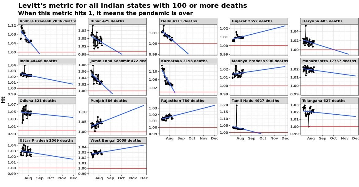
This is mathematically inaccurate, since the sons received fractions of their father’s wealth slightly different from what he had intended. However, in general in life, this parable of the twelfth camel offers a useful metaphor.

In engineering, this is rather common – you have systems such as a choke, for example, to enable systems to get started from a “cold start process”. The choke comes in only at the time of startup – once the thing has started, it plays no role.

However, it has its role in normal life and business as well. For example, after a bad breakup, you might rebound to a “stop gap partner”. You know that this is not going to be a long term relationship, but this partner helps you tide over the shock of the bad breakup, and by the time this relationship (inevitably) breaks up, it has achieved its purpose of getting you back on track. And you get on with life, finding more long term partners.

Then, when the company is in deep trouble, you have specialists who come in to take over with the explicit goal of cleaning things up and getting the company ready for new ownership. For exanple, John Ray III has recently taken over as CEO of FTX. His previous notable appointment was as CEO of Enron, soon after that scandal had broken. He will not stay for a long term – he will just clean things up and move on.

And sometimes the role of the twelfth camel is rather more specific. Apart from “generic cleaning”, the temporary presence of the twelfth camel can be used to get rid of people who had earlier been hard to get rid of.

In sum, the key thing about the twelfth camel theory is that the neighbour knew all along that he was going to get back his camel. In other words, it is a deliberate temporary measure intended to achieve a certain set of specific outcomes. And the camel itself may not know that it is being “lent”!

Simpson’s Paradox for Levitt’s Measure

Some of you might know that I do this daily covid-19 update on twitter (not linking since I delete each day’s posts the next morning). A couple of weeks back I revamped it, in advance of which I asked what people wanted to see.

A lot of people suggested I use “Levitt’s metric”. I ignored it. Then, after I had revamped the output last week, two people I know very well got in touch asking me to report that metric every morning in my update. This time I decided to do it, and added it to my update on Monday.

My daily update has the smoothed line using a loess smoothing, but I also wanted to see if I can “predict” when the pandemic might end in different places. And so I did a linear fit as well (using 1 month of data – the slope of the line is highly sensitive to how far back you go), and posted it on Twitter.

I’ve extended the X axis of the graph until the end of the year. The idea is that when the blue line (the regression line based on the last 30 data points) hits the red line, the pandemic in that place is “effectively over”. So we can predict when the pandemic might end in different places.

Now, if you slightly contort your neck and try and extend the “india” graph here rightwards, you might see that the pandemic might end (for all practical purposes) around February. The funny thing is that while on average the pandemic might end in India in February, we see that for specific regions the slope is actually increasing (which suggests the pandemic might never end).

And this creates confusion. When you have a bunch of regions with upward slopes, and then suddenly for the aggregate (India) it is a downward slope, it doesn’t make intuitive sense. It is similar to Simpson’s paradox, where a trend disappears when you aggregate data. This graph possibly represents the most famous example of Simpson’s paradox.

Back to the Levitt’s metric, my only explanation is that the curve can’t be infinitely upward sloping – the number of people in any place is finite and so the disease is bound to die out some time or the other. The upward sloping lines are only a figment of the arbitrary linear extrapolation, and are likely to turn down sooner rather than later.

Distribution of political values

Through Baal on Twitter I found this “Political Compass” survey. I took it, and it said this is my “political compass”.

Now, I’m not happy with the result. I mean, I’m okay with the average value where the red dot has been put for me, and I think that represents my political leanings rather well. However, what I’m unhappy about is that my political views have been all reduced to one single average point.

I’m pretty sure that based on all the answers I gave in the survey, my political leaning across both the two directions follows a distribution, and the red dot here is only the average (mean, I guess, but could also be median) value of that distribution.

However, there are many ways in which people can have a political view that lands right on my dot – some people might have a consistent but mild political view in favour of or against a particular position. Others might have pretty extreme views – for example, some of my answers might lead you to believe that I’m an extreme right winger, and others might make me look like a Marxist (I believe I have a pretty high variance on both axes around my average value).

So what I would have liked instead from the political compass was a sort of heat map, or at least two marginal distributions, showing how I’m distributed along the two axes, rather than all my views being reduced to one average value.

A version of this is the main argument of this book I read recently called “The End Of Average“. That when we design for “the average man” or “the average customer”, and do so across several dimensions,  we end up designing for nobody, since nobody is average when looked at on many dimensions.

Correlation and causation

So I have this lecture on “smelling (statistical) bullshit” that I’ve delivered in several places, which I inevitably start with a lesson on how correlation doesn’t imply causation. I give a large number of examples of people mistaking correlation for causation, the class makes fun of everything that doesn’t apply to them, then everyone sees this wonderful XKCD cartoon and then we move on.

One of my favourite examples of correlation-causation (which I don’t normally include in my slides) has to do with religion. Praying before an exam in which one did well doesn’t necessarily imply that the prayer resulted in the good performance in the exam, I explain. So far, there has been no outward outrage at my lectures, but this does visibly make people uncomfortable.

Going off on a tangent, the time in life when I discovered to myself that I’m not religious was when I pondered over the correlation-causation issue some six or seven years back. Until then I’d had this irrational need to draw a relationship between seemingly unrelated things that had happened together once or twice, and that had given me a lot of mental stress. Looking at things from a correlation-causation perspective, however, helped clear up my mind on those things, and also made me believe that most religious activity is pointless. This was a time in life when I got immense mental peace.

Yet, for most of the world, it is not freedom from religion but religion itself that gives them mental peace. People do absurd activities only because they think these activities lead to other good things happening, thanks to a small number of occasions when these things have coincided, either in their own lives or in the lives of their ancestors or gurus.

In one of my lectures a few years back I had remarked that one reason why humans still mistake correlation for causation is religion – for if correlation did not imply causation then most of religious rituals would be rendered meaningless and that would render people’s lives meaningless. Based on what I observed today, however, I think I’ve got this causality wrong.

It’s not because of religion that people mistake correlation for causation. Instead, we’ve evolved to recognise patterns whenever we observe them, and a side effect of that is that we immediately assume causation whenever we see things happening together. Religion is just a special case of application of this correlation-causation second nature to things in real life.

So my daughter (who is two and a half) and I were standing in our balcony this evening, observing that it had rained heavily last night. Heavy rain reminded my daughter of this time when we had visited a particular aunt last week – she clearly remembered watching the heavy rain from this aunt’s window. Perhaps none of our other visits to this aunt’s house really registered in the daughter’s imagination (it’s barely two months since we returned to Bangalore, so admittedly there aren’t that many data points), so this aunt’s house is inextricably linked in her mind to rain.

And this evening because she wanted it to rain heavily again, the daughter suggested that we go visit this aunt once again. “We’ll go to Inna Ajji’s house and then it will start raining”, she kept saying. “Yes, it rained the last time it went there, but it was random. It wasn’t because we went there”, I kept saying. It wasn’t easy to explain it.

You know when you are about to have a kid you develop visions of how you’ll bring her up, and what you’ll teach her, and what she’ll say to “jack” the world. Back then I’d decided that I’d teach my yet-unborn daughter that “correlation does not imply causation” and she could use it use it against “elders” who were telling her absurd stuff.

I hadn’t imagined that mistaking correlation for causation is so fundamental to human nature that it would be a fairly difficult task to actually teach my daughter that correlation does not imply causation! Hopefully in the next one year I can convince her.

Surveying Income

For a long time now, I’ve been sceptical of the practice of finding out the average income in a country or state or city or locality by doing a random survey. The argument I’ve made is “whether you keep Mukesh Ambani in the sample or not makes a huge difference in your estimate”. So far, though, I hadn’t been able to make a proper mathematical argument.

In the course of writing a piece for Bloomberg Quint (my first for that publication), I figured out a precise mathematical argument. Basically, incomes are distributed according to a power law distribution, and the exponent of the power law means that variance is not defined. And hence the Central Limit Theorem isn’t applicable.

OK let me explain that in English. The reason sample surveys work is due to a result known as the Central Limit Theorem. This states that for a distribution with finite mean and variance, the average of a random sample of data points is not very far from the average of the population, and the difference follows a normal distribution with zero mean and variance that is inversely proportional to the number of points surveyed.

So if you want to find out the average height of the population of adults in an area, you can simply take a random sample, find out their heights and you can estimate the distribution of the average height of people in that area. It is similar with voting intention – as long as the sample of people you survey is random (and without bias), the average of their voting intention can tell you with high confidence the voting intention of the population.

This, however, doesn’t work for income. Based on data from the Indian Income Tax department, I could confirm (what theory states) that income in India follows a power law distribution. As I wrote in my piece:

The basic feature of a power law distribution is that it is self-similar – where a part of the distribution looks like the entire distribution.

Based on the income tax returns data, the number of taxpayers earning more than Rs 50 lakh is 40 times the number of taxpayers earning over Rs 5 crore.
The ratio of the number of people earning more than Rs 1 crore to the number of people earning over Rs 10 crore is 38.
About 36 times as many people earn more than Rs 5 crore as do people earning more than Rs 50 crore.

In other words, if you increase the income limit by a factor of 10, the number of people who earn over that limit falls by a factor between 35 and 40. This translates to a power law exponent between 1.55 and 1.6 (log 35 to base 10 and log 40 to base 10 respectively).

Now power laws have a quirk – their mean and variance are not always defined. If the exponent of the power law is less than 1, the mean is not defined. If the exponent is less than 2, then the distribution doesn’t have a defined variance. So in this case, with an exponent around 1.6, the distribution of income in India has a well-defined mean but no well-defined variance.

To recall, the central limit theorem states that the population mean follows a normal distribution with the mean centred at the sample mean, and a variance of \frac{\sigma^2}{n} where \sigma is the standard deviation of the underlying distribution. And when the underlying distribution itself is a power law distribution with an exponent less than 2 (as the case is in India), \sigma itself is not defined.

Which means the distribution of population mean around sample mean has infinite variance. Which means the sample mean tells you absolutely nothing!

And hence, surveying is not a good way to find the average income of a population.

Elegant and practical solutions

There are two ways in which you can tie a shoelace – one is the “ordinary method”, where you explicitly make the loops around both ends of the lace before tying together to form a bow. The other is the “elegant method” where you only make one loop explicitly, but tie with such great skill that the bow automatically gets formed.

I have never learnt to tie my shoelaces in the latter manner – I suspect my father didn’t know it either, because of which it wasn’t passed on to me. Metaphorically, however, I like to implement such solutions in other aspects.

Having been educated in mathematics, I’m a sucker for “elegant solutions”. I look down upon brute force solutions, which is why I might sometimes spend half an hour writing a script to accomplish a repetitive task that might have otherwise taken 15 minutes. Over the long run, I believe, this elegance will pay off, in terms of scaling easier.

And I suspect I’m not alone in this love for elegance. If the world were only about efficiency, brute force would prevail. That we appreciate things like poetry and music and art and what not means that there is some preference for elegance. And that extends to business solutions as well.

While going for elegance is a useful heuristic, sometimes it can lead to missing the woods for the trees (or missing the random forests for the decision trees if you may will). For there are situations that simply don’t, or won’t, scale, and where elegance will send you on a wild goose chase while a little fighter work will get the job done.

I got reminded of this sometime last week when my wife asked me for some Excel help in some work she was doing. Now, there was a recent article in WSJ which claimed that the “first rule of Microsoft Excel is that you shouldn’t let people know you’re good at it”. However, having taught a university course on spreadsheet modelling, there is no place to hide for me, and people keep coming to me for Excel help (though it helps I don’t work in an office).

So the problem wasn’t a simple one, and I dug around for about half an hour without a solution in sight. And then my wife happened to casually mention that this was a one-time thing. That she had to solve this problem once but didn’t expect to come across it again, so “a little manual work” won’t hurt.

And the problem was solved in two minutes – a minor variation of the requirement was only one formula away (did you know that the latest versions of Excel for Windows offer a “count distinct” function in pivot tables?). Five minutes of fighter work by the wife after that completely solved the problem.

Most data scientists (now that I’m not one!)  typically work in production environments, where the result of their analysis is expressed in code that is run on a repeated basis. This means that data scientists are typically tuned to finding elegant solutions since any manual intervention means that the code is not production-able and scalable.

This can mean finding complicated workarounds in order to “pull the bow of the shoelaces” in order to avoid that little bit of manual effort at the end, so that the whole thing can be automated. And these habits can extend to the occasional work that is not needed to be repeatable and scalable.

And so you have teams spending an inordinate amount of time finding elegant solutions for problems for which easy but non-scalable “solutions exist”.

Elegance is a hard quality to shake off, even when it only hinders you.

I’ll close with a fairytale – a deer looks at its reflection and admires its beautiful anchors and admonishes its own ugly legs. Lion arrives, the ugly legs help the deer run fast, but the beautiful antlers get stuck in a low tree, and the lion catches up.


JEE coaching and high school learning

One reason I’m not as good at machine learning as I can possibly be is because I suck at linear algebra. I totally completely suck at it. Seven years of usage of R has meant that at least I no longer get spooked out by the very sight of vectors or matrices, and I understand the concept of matrix multiplication (an operator rotating a vector), but I just don’t get linear algebra.

For example, when I see terms such as “singular value decomposition” I almost faint. Multiple repeated attempts at learning the concept have utterly failed. Don’t even get me started on the more complicated stuff – and machine learning is full of them.

My inability to understand linear algebra runs deep, and it’s mainly due to a complete inability to imagine vectors and matrices and matrix operations. As far back as I remember, I have hated matrices and have tried to run away from it.

For a long time, I had placed the blame for this on IIT Madras, whose mathematics department in its infinite wisdom had decided to get its brilliant Graph Theory expert to teach us matrices. Thinking back, though, I remember going in to MA102 (Vectors, Matrices and Differential Equations) already spooked. The rot had set in even earlier – in school.

The problem with class 11 in my school (a fairly high-profile school which was full of studmax characters) was that most people harboured ambitions of going to IIT, and had consequently enrolled themselves in formal coaching “factories”. As a result, these worthies always came to maths, physics and chemistry classes “ahead” of people like me who didn’t go for such classes (I’d decided to chill for a year after a rather hectic class 10 when I’d been under immense pressure to get my school a “centum”).

Because a large majority of the class already knew what was to be taught, teachers had an incentive to slack. Also the fact that most students were studmax had meant that people preferred to mug on their own rather than display their ignorance in class. And so jai happened.

I remember the class when vectors and matrices were introduced (it was in class 11). While I don’t remember too many details, I do remember that a vocal majority already knew about “dot product” and “cross product”. It was similar a few days later when the vocal majority knew matrix multiplication.

And so these concepts were glossed over, and lacking a grounding in fundamentals, I somehow never “got” the concept.

In my year (2000), CBSE decided to change format for its maths examination – everyone had to attempt “Part A” (worth 70 marks) and then had a choice between “Part B” (vectors, matrices, etc.) and “Part C” (introductory statistics). Most science students were expected to opt for Part B (Part C had been introduced for the benefit of commerce students studying maths since they had little to gain from reading about vectors). For me and one other guy from my class, though, it was a rather obvious choice to do Part C.

I remember the invigilator (who was from another school) being positively surprised during my board exam when I mentioned that I was going to attempt Part C instead of Part B. He muttered something to the extent of “isn’t that for commerce students?” but to his credit permitted us to do the paper in whatever way we wanted (I fail to remember why I had to mention to him I was doing Part C – maybe I needed log tables to do that).

Seventeen odd years down the line, I continue to suck at linear algebra and be stud at statistics. And it is all down to the way the two subjects were introduced to me in school (JEE statistics wasn’t up to the same standard as Part C so the school teachers did a great job of teaching that).