Recreating Tufte, and Bangalore weather

For most of my life, I pretty much haven’t understood what the point of “recreating” is. For example, in school if someone says they were going to “act out ______’s _____” I would wonder what the point of it was – that story is well known so they might as well do something more creative.

Later on in life, maybe some 12-13 years back, I discovered the joy in “retelling known stories” – since everyone knows the story you can be far more expressive in how you tell it. Still, however, just “re-creation” (not recreation) never really fascinated me. Most of the point of doing things is to do them your way, I’ve believed (and nowadays, if you think of it, most re-creating can be outsourced to a generative AI).

And the this weekend that changed. On Saturday, I made the long-pending trip to Blossom (helped that daughter had a birthday party to attend nearby), and among other things, I bought Edward Tufte’s classic “The Visual Display of Quantitative Information“. I had read a pirated PDF of this a decade ago (when I was starting out in “data science”), but always wanted the “real thing”.

And this physical copy, designed by Tufte himself, is an absolute joy to read. And I’m paying more attention to the (really beautiful) graphics. So, when I came across this chart of New York weather, I knew I had to recreate it.

A few months earlier, I had dowloaded the dataset for Bangalore’s hourly temperature and rainfall since 1981 (i.e. a bit longer than my own life). This dataset ended in November 2022, but I wasn’t concerned. Basically, this is such a large and complex dataset that so far I had been unable to come up with an easy way to visualise it. So, when I saw this thing from Tufte, recreating would be a good idea.

I spent about an hour and half yesterday doing this. I’ve ignored the colour schemes and other “aesthetic” stuff (just realised I’ve not included the right axis in my re-creation). But I do think I’ve got something fairly good.

My re-creation of Tufte’s New York weather map, in the context of Bangalore in 2022

2022 was an unusual weather year for Bangalore and it shows in this graph. May wasn’t as hot as usual, and there were some rather cold days. Bangalore recorded its coldest October and November days since the 90s (though as this graph shows, not a record by any means). It was overall a really wet year, constantly raining from May to November. The graph shows all of it.

Also if you look at the “noraml pattern” and the records, you see Bangalore’s unusual climate (yes, I do mean “climate” and not “weather” here). Thanks to the monsoons (and pre-monsoons), April is the hottest month. Summer, this year, has already started – in the afternoons it is impossible to go out now. The minimum temperatures are remarkably consistent through the year (so except early in the mornings, you pretty much NEVER need a sweater here – at least I haven’t after I moved back from London).

There is so much more I can do. I’m glad to have come across a template to analyse the data using. Whenever I get the enthu (you know what this website is called) I’ll upload my code to produce this graph onto github or something. And when I get more enthu, I’ll make it aesthetically similar to Tufte’s graph (and include December 2022 data as well).


Placing data labels in bar graphs

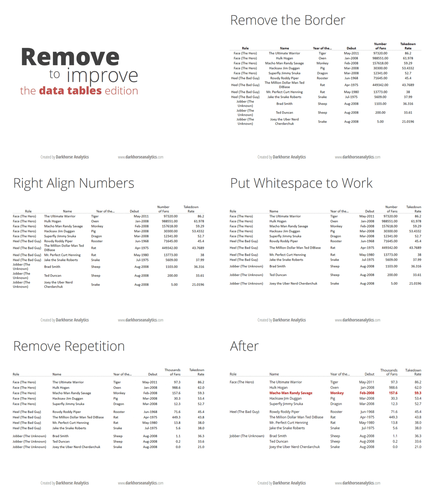
If you think you’re a data visualisation junkie, it’s likely that you’ve read Edward Tufte’s Visual Display Of Quantitative Information. If you are only a casual observer of the topic, you are likely to have come across these gifs that show you how to clean up a bar graph and a data table.

And if you are a real geek when it comes to visualisation, and you are the sort of person who likes long-form articles about the information technology industry, I’m sure you’ve come across Eugene Wei’s massive essay on “remove the legend to become one“.

The idea in the last one is that when you have something like a line graph, a legend telling you which line represents what can be distracting, especially if you have too many lines. You need to constantly move your head back and forth between the chart and the table as you try to interpret it. So, Wei says, in order to “become a legend” (by presenting information that is easily consumable), you need to remove the legend.

My equivalent of that for bar graphs is to put data labels directly on the bar, rather than having the reader keep looking at a scale (the above gif with bar graphs also does this). It makes for easier reading, and by definition, the bar graph conveys the information on the relative sizes of the different data points as well.

There is one problem, though, especially when you’re drawing what my daughter calls “sleeping bar graphs” (horizontal) – where do you really put the text so that it is easily visible? This becomes especially important if you’re using a package like R ggplot where you have control over where to place the text, what size to use and so on.

The basic question is – do you place the label inside or outside the bar? I was grappling with this question yesterday while making some client chart. When I placed the labels inside the bar, I found that some of the labels couldn’t be displayed in full when the bars were too short. And since these were bars that were being generated programmatically, I had no clue beforehand how long the bars would be.

So I decided to put all the labels outside. This presented a different problem – with the long bars. The graph would automatically get cut off a little after the longest bar ended, so if you placed the text outside, then the labels on the longest bar couldn’t be seen! Again the graphs have to come out programmatically so when you’re making them you don’t know what the length of the longest bar will be.

I finally settled on this middle ground – if the bar is at least half as long as the longest bar in the chart set, then you put the label inside the bar. If the bar is shorter than half the longest bar, then you put the label outside the bar. And then, the text inside the bar is right-justified (so it ends just inside the end of the bar), and the text outside the bar is left-justified (so it starts exactly where the bar ends). And ggplot gives you enough flexibility to decide the justification (‘hjust’) and colour of the text (I keep it white if it is inside the bar, black if outside), that the whole thing can be done programmatically, while producing nice and easy-to-understand bar graphs with nice labels.

Obviously I can’t share my client charts here, but here is one I made for the doubling days for covid-19 cases by district in India. I mean it’s not exactly what I said here, but comes close (the manual element here is a bit more).


Behavioural colour schemes

One of the seminal results of behavioural economics (a field I’m having less and less faith in as the days go by, especially once I learnt about ergodicity) is that by adding a choice to an existing list of choices, you can change people’s preferences.

For example, if you give people a choice between vanilla ice cream for ?70 and vanilla ice cream with chocolate sauce for ?110, most people will go for just the vanilla ice cream. However, when you add a third option, let’s say “vanilla ice cream with double chocolate sauce” for ?150, you will see more people choosing the vanilla ice cream with chocolate sauce (?110) over the plain vanilla ice cream (?70).

That example I pulled out of thin air, but trust me, this is the kind of examples you see in behavioural economics literature. In fact, a lot of behavioural economics research is about getting 24 undergrads to participate in an experiment (which undergrad doesn’t love free ice cream?) and giving them options like above. Then based on how their preferences change when the new option is added, a theory is concocted on how people choose.

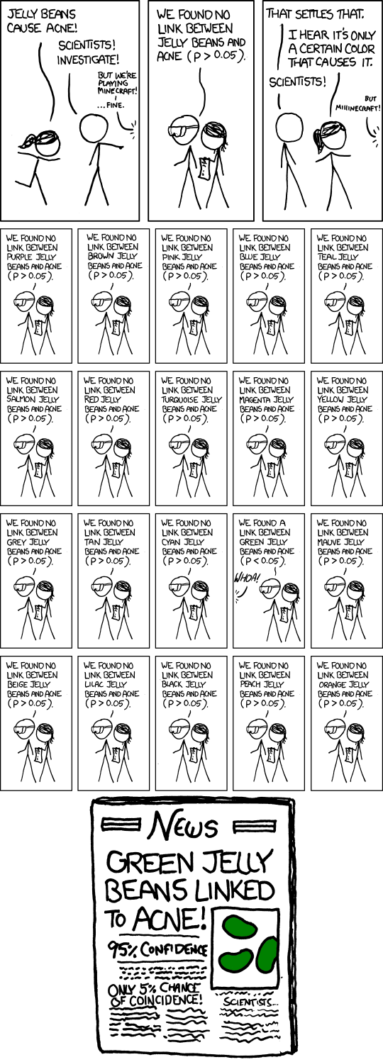
The existence of “green jelly beans” (or p-value hunting, also called “p-hacking”) cannot be ruled out in such studies.

Anyway, enough bitching about behavioural economics, because while their methods may not be rigorous, and can sometimes be explained using conventional economics, some of their insights do sometimes apply in real life. Like the one where you add a choice and people start seeing the existing choices in a different way.

The other day, Nitin Pai asked me to product a district-wise map of Karnataka colour coded by the prevalence of Covid-19 (or the “Wuhan virus”) in each district. “We can colour them green, yellow, orange and red”, he said, “based on how quickly cases are growing in each district”.

After a few backs and forths, and using data from the excellent covid19india.org  , we agreed on a formula for how to classify districts by colour. And then I started drawing maps (R now has superb methods to draw maps using ggplot2).

For the first version, I took his colour recommendations at face value, and this is what came out. 

While the data is shown easily, there are two problems with this chart. Firstly, as my father might have put it, “the colours hit the eyes”. There are too many bright colours here and it’s hard to stare at the graph for too long. Secondly, the yellow and the orange appear a bit too similar. Not good.

So I started playing around. As a first step, I replaced “green” with “darkgreen”. I think I got lucky. This is what I got. 

Just this one change (OK i made one more change – made the borders black, so that the borders between contiguous dark green districts can be seen more clearly) made so much of a difference.

Firstly, the addition of the sober dark green (rather the bright green) means that the graph looks so much better on the eye now. The same yellow and orange and red don’t “hit the eyes” like they used to in green’s company.

And more importantly (like the behavioural economics theory), the orange and yellow look much more distinct from each other now (my apologies to readers who are colour blind). Rather than trying to change the clashing colours (the other day I’d tried changing yellow to other closer colours but nothing had worked), adding a darker shade alongside meant that the distinctions became much more visible.

Maybe there IS something to behavioural economics, at least when it comes to colour schemes.

The problem with spider charts

On FiveThirtyEight, Nate Silver has a piece looking ahead to the Democratic primaries ahead of the presidential elections in the US next year. I don’t know enough about US politics to comment on the piece itself, but what caught my eye is the spider chart describing the various Democratic nominees.

This is a standard spider chart that people who read business news should recognise, so the appearance of such a chart isn’t big news. What bothers me, though, is that a respected data journalist like Nate Silver is publishing such charts, especially in an article under his own name. For spider charts do a lousy job of conveying information.

Implicitly, you might think that the area of the pentagon (in this case) thus formed conveys the strength of a particular candidate. Leaving aside the fact that the human eye can judge areas less well than lengths, the area of a spider chart accurately shows “strength” only in one corner case – where the values along all five axes are the same.

In all other cases, such as in the spider charts  above, the area of the pentagon (or whatever-gon) thus formed depends on the order in which the factors are placed. For example, in this chart, why should black voters be placed between the asian/hispanic and millennials? Why should party loyalists lie between the asian/hispanics and the left?

I may not have that much insight into US politics, but it should be fairly clear that the ordering of the factors in this case has no particular sanctity. You should be able to jumble up the order of the axes and the information in the chart should remain the same.

The spider chart doesn’t work this way. If lengths of the “semidiagonals” (the five axes on which we are measuring) are l_1, l_2, ... l_n, the area of the polygon thus formed equals \frac{1}{2} sin \frac{360}{n}  (l_1.l_2 + l_2.l_3 + ... + l_n.l_1). It is not hard to see that for any value of n \ge 4, the ordering of the “axes” makes a material difference in the area of the chart.

Moreover, in this particular case, with the legend being shown only with one politician, you need to keep looking back and forth to analyse where a particular candidate lies in terms of support among the five big democrat bases. Also, the representation suggests that these five bases have equal strength in the Democrat support base, while the reality may be far from it (again I don’t have domain knowledge).

Spider charts can look pretty, which might make them attractive for graphic designers. They are just not so good in conveying information.

PS: for this particular data set, I would just go with bars with small multiples (call me boring if you may). One set of bar graphs for each candidate, with consistent colour coding and ordering among the bars so that candidates can be compared easily.

Just Plot It

One of my favourite work stories is from this job I did a long time ago. The task given to me was demand forecasting, and the variable I needed to forecast was so “micro” (this intersection that intersection the other) that forecasting was an absolute nightmare.

A side effect of this has been that I find it impossible to believe that it’s possible to forecast anything at all. Several (reasonably successful) forecasting assignments later, I still dread it when the client tells me that the project in question involves forecasting.

Another side effect is that the utter failure of standard textbook methods in that monster forecasting exercise all those years ago means that I find it impossible to believe that textbook methods work with “real life data”. Textbooks and college assignments are filled with problems that when “twisted” in a particular way easily unravel, like a well-tied tie knot. Industry data and problems are never as clean, and elegance doesn’t always work.

Anyway, coming back to the problem at hand, I had struggled for several months with this monster forecasting problem. Most of this time, I had been using one programming language that everyone else in the company used. The code was simultaneously being applied to lots of different sub-problems, so through the months of struggle I had never bothered to really “look at” the data.

I must have told this story before, when I spoke about why “data scientists” should learn MS Excel. For what I did next was to load the data onto a spreadsheet and start looking at it. And “looking at it” involved graphing it. And the solution, or the lack of it, lay right before my eyes. The data was so damn random that it was a wonder that anything had been forecast at all.

It was also a wonder that the people who had built the larger model (into which my forecasting piece was to plug in) had assumed that this data would be forecast-able at all (I mentioned this to the people who had built the model, and we’ll leave that story for another occasion).

In any case, looking at the data, by putting it in a visualisation, completely changed my perspective on how the problem needed to be tackled. And this has been a learning I haven’t let go of since – the first thing I do when presented with data is to graph it out, and visually inspect it. Any statistics (and any forecasting for sure) comes after that.

Yet, I find that a lot of people simply fail to appreciate the benefits of graphing. That it is not intuitive to do with most programming languages doesn’t help. Incredibly, even Python, a favoured tool of a lot of “data scientists”, doesn’t make graphing easy. Last year when I was forced to use it, I found that it was virtually impossible to create a PDF with lots of graphs – something that I do as a matter of routine when working on R (I subsequently figured out a (rather inelegant) hack the next time I was forced to use Python).

Maybe when you work on data that doesn’t have meaningful variables – such as images, for example – graphing doesn’t help (since a variable on its own has little information). But when the data remotely has some meaning – sales or production or clicks or words, graphing can be of immense help, and can give you massive insight on how to develop your model!

So go ahead, and plot it. And I won’t mind if you fail to thank me later!

Attractive graphics without chart junk

A picture is worth a thousand words, but ten pictures are worth much less than ten thousand words

One of the most common problems with visualisation, especially in the media, is that of “chart junk”. Graphics designers working for newspapers and television channels like to decorate their graphs, to make it more visually appealing. And in most cases, this results in the information in the graphs getting obfuscated and harder to read.

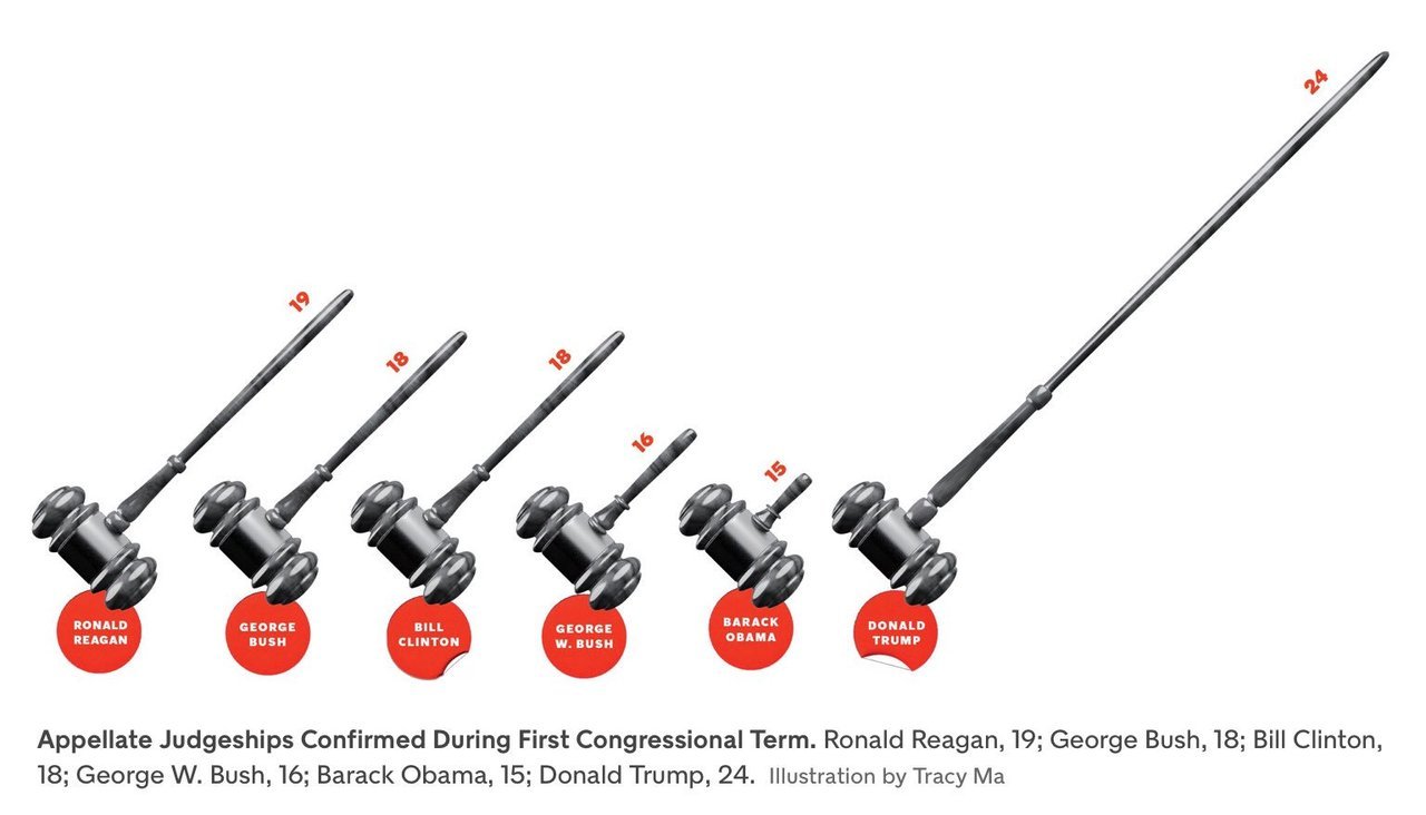
The commonest form this takes is in the replacement of bars in a simple bar graph with weird objects. When you want to show number of people in something, you show little people, sometimes half shaded out. Sometimes instead of having multiple people, the information is conveyed in the size of the people, or objects  (like below). 

Then, instead of using simple bar graphs, designers use more complicated structures such as 3-dimensional bar graphs, or cone graphs or doughnut charts (I’m sure I’ve abused some of them on my tumblr). All of them are visually appealing and can draw attention of readers or viewers. Most of them come at the cost of not really conveying the information!

I’ve spoken to a few professional graphic designers and asked them why they make poor visualisation choices even when the amount of information the graphics convey goes down. The most common answer is novelty – “a page full of bars can be boring for the reader”. So they try to spice it up by replacing bars with other items that “look different”.

Putting it another way, the challenge is two-fold – first you need to get your readers to look at your graph (here is where novelty helps). And once you’ve got them to look at it, you need to convey information to them. And the two objectives can sometimes collide, with the best looking graphs not being the ones that convey the best information. And this combination of looking good and being effective is possibly what turns visualisation into an art.

My way of dealing with this has been to play around with the non-essential bits of the visualisation. Using colours judiciously, for example. Using catchy headlines. Adding decorations outside of the graphs.

Another lesson I’ve learnt over time is to not have too many graphics in the same piece. Some of this has come due to pushback from my editors at Mint, who have frequently asked me to cut the number of graphs for space reasons. And some of this is something I’ve learnt as a reader.

The problem with visualisations is that while they can communicate a lot of information, they can break the flow in reading. So having too many visualisations in the piece means that you break the reader’s flow too many times, and maybe even risk your article looking academic. Cutting visualisations forces you to be concise in your use of pictures, and you leave in only the ones that are most important to your story.

There is one other upshot out of cutting the number of visualisations – when you have one bar graph and one line graph, you can leave them as they are and not morph or “decorate” them just for the heck of it!

PS: Even experienced visualisers are not immune to not having their graphics mangled by editors. Check out this tweet storm by Edward Tufte, the guru of visualisation.

Taking your audience through your graphics

A few weeks back, I got involved in a Twitter flamewar with Shamika Ravi, a member of the Indian Prime Minister’s Economic Advisory Council. The object of the argument was a set of gifs she had released to show different aspects of the Indian economy. Admittedly I started the flamewar. Guilty as charged.

Thinking about it now, this wasn’t the first time I was complaining about her gifs – I began my now popular (at least on Twitter) Bad Visualisations tumblr with one of her gifs.

So why am I so opposed to animated charts like the one in the link above? It is because they demand too much of the consumer’s attention and it is hard to get information out of them. If there is something interesting you notice, by the time you have had time to digest the information the graphic has moved several frames forward.

Animated charts became a thing about a decade ago following the late Hans Rosling’s legendary TED Talk. In this lecture, Rosling used “motion charts” (a concept he possibly invented) – which was basically a set of bubbles moving around a chart, as he sought to explain how the condition of the world has improved significantly over the years.

It is a brilliant talk. It is a very interesting set of statistics simply presented, as Rosling takes the viewers through them. And the last phrase is the most important – these motion charts work for Rosling because he talks to the audience as the charts play out. He pauses when there is some explanation to be made or the charts are at a key moment. He explains some counterintuitive data points exhibited by the chart.

And this is precisely how animated visualisations need to be done, and where they work – as part of a live presentation where a speaker is talking along with the charts and using them as visual aids. Take Rosling (or any other skilled speaker) away from the motion charts, though, and you will see them fall flat – without knowing what the key moments in the chart are, and without the right kind of annotations, the readers are lost and don’t know what to look for.

There are a large number of aids to speaking that can occasionally double up as aids to writing. Graphics and charts are one example. Powerpoint (or Keynote or Slides) presentations are another. And the important thing with these visual aids is that the way they work as an aid is very different from the way they work standalone. And the makers need to appreciate the difference.

In business school, we were taught to follow the 5 by 5 formula (or some such thing) while making slides – that a slide should have no more than five bullet points, and each point should have no more than five words. This worked great in school as most presentations we made accompanied our talks.

Once I started working (for a management consultancy), though, I realised this didn’t work there because we used powerpoint presentations as standalone written communications. Consequently, the amount of information on each slide had to be much greater, else the reader would fail to get any information out of it.

Conversely, a powerpoint presentation meant as a standalone document would fail spectacularly when used to accompany a talk, for there would be too much information on each slide, and massive redundancy between what is on the slide and what the speaker is saying.

The same classification applies to graphics as well. Interactive and animated graphics do brilliantly as part of speeches, since the speaker can control what the audience is seeing and make sure the right message gets across. As part of “print” (graphics shared standalone, like on Twitter), though, these graphics fail as readers fail to get information out of them.

Similarly, a dense well-annotated graphic that might do well in print can fail when used as a visual aid, since there will be too much information and audience will not be able to focus on either the speaker or the graphic.

It is all about the context.

New blog on visualisations

For a while now I’ve been commenting on visualisations on Twitter, pointing out the good (and especially bad) graphs. I also have a “chart of the edition” section in my newsletter.

Recently, the legendary Krish Ashok suggested that I collect all these bad visualisations in a Tumblr, and I decided to oblige.

You can follow it here.

I like Tumblr as a medium (no pun intended) for collecting pictures. The UI is not great (compared to WordPress), but in some way it encourages short posts, and that’s a great thing from the perspective of what I want to do. Go follow off!

More on interactive graphics

So for a while now I’ve been building this cricket visualisation thingy. Basically it’s what I think is a pseudo-innovative way of describing a cricket match, by showing how the game ebbs and flows, and marking off the key events.

Here’s a sample, from the ongoing game between Chennai Super Kings and Kolkata Knight Riders.

As you might appreciate, this is a bit cluttered. One “brilliant” idea I had to declutter this was to create an interactive version, using Plotly and D3.js. It’s the same graphic, but instead of all those annotations appearing, they’ll appear when you hover on those boxes (the boxes are still there). Also, when you hover over the line you can see the score and what happened on that ball.

When I came up with this version two weeks back, I sent it to a few friends. Nobody responded. I checked back with them a few days later. Nobody had seen it. They’d all opened it on their mobile devices, and interactive graphics are ill-defined for mobile!

Because on mobile there’s no concept of “hover”. Even “click” is badly defined because fingers are much fatter than mouse pointers.

And nowadays everyone uses mobile – even in corporate settings. People who spend most time in meetings only have access to their phones while in there, and consume all their information through that.

Yet, you have visualisation “experts” who insist on the joys of tools such as Tableau, or other things that produce nice-looking interactive graphics. People go ga-ga over motion charts (they’re slightly better in that they can communicate more without input from the user).

In my opinion, the lack of use on mobile is the last nail in the coffin of interactive graphics. It is not like they didn’t have their problems already – the biggest problem for me is that it takes too much effort on the part of the user to understand the message that is being sent out. Interactive graphics are also harder to do well, since the users might use them in ways not intended – hovering and clicking on the “wrong” places, making it harder to communicate the message you want to communicate.

As a visualiser, one thing I’m particular about is being in control of the message. As a rule, a good visualisation contains one overarching message, and a good visualisation is one in which the user gets the message as soon as she sees the chart. And in an interactive chart which the user has to control, there is no way for the designer to control the message!

Hopefully this difficulty with seeing interactive charts on mobile will mean that my clients will start demanding them less (at least that’s the direction in which I’ve been educating them all along!). “Controlling the narrative” and “too much work for consumer” might seem like esoteric problems with something, but “can’t be consumed on mobile” is surely a winning argument!


A banker’s apology

Whenever there is a massive stock market crash, like the one in 1987, or the crisis in 2008, it is common for investment banking quants to talk about how it was a “1 in zillion years” event. This is on account of their models that typically assume that stock prices are lognormal, and that stock price movement is Markovian (today’s movement is uncorrelated with tomorrow’s).

In fact, a cursory look at recent data shows that what models show to be a one in zillion years event actually happens every few years, or decades. In other words, while quant models do pretty well in the average case, they have thin “tails” – they underestimate the likelihood of extreme events, leading to building up risk in the situation.

When I decided to end my (brief) career as an investment banking quant in 2011, I wanted to take the methods that I’d learnt into other industries. While “data science” might have become a thing in the intervening years, there is still a lot for conventional industry to learn from banking in terms of using maths for management decision-making. And this makes me believe I’m still in business.

And like my former colleagues in investment banking quant, I’m not immune to the fat tail problem as well – replicating solutions from one domain into another can replicate the problems as well.

For a while now I’ve been building what I think is a fairly innovative way to represent a cricket match. Basically you look at how the balance of play shifts as the game goes along. So the representation is a line graph that shows where the balance of play was at different points of time in the game.

This way, you have a visualisation that at one shot tells you how the game “flowed”. Consider, for example, last night’s game between Mumbai Indians and Chennai Super Kings. This is what the game looks like in my representation.

What this shows is that Mumbai Indians got a small advantage midway through the innings (after a short blast by Ishan Kishan), which they held through their innings. The game was steady for about 5 overs of the CSK chase, when some tight overs created pressure that resulted in Suresh Raina getting out.

Soon, Ambati Rayudu and MS Dhoni followed him to the pavilion, and MI were in control, with CSK losing 6 wickets in the course of 10 overs. When they lost Mark Wood in the 17th Over, Mumbai Indians were almost surely winners – my system reckoning that 48 to win in 21 balls was near-impossible.

And then Bravo got into the act, putting on 39 in 10 balls with Imran Tahir watching at the other end (including taking 20 off a Mitchell McClenaghan over, and 20 again off a Jasprit Bumrah over at the end of which Bravo got out). And then a one-legged Jadhav came, hobbled for 3 balls and then finished off the game.

Now, while the shape of the curve in the above curve is representative of what happened in the game, I think it went too close to the axes. 48 off 21 with 2 wickets in hand is not easy, but it’s not a 1% probability event (as my graph depicts).

And looking into my model, I realise I’ve made the familiar banker’s mistake – of assuming independence and Markovian property. I calculate the probability of a team winning using a method called “backward induction” (that I’d learnt during my time as an investment banking quant). It’s the same system that the WASP system to evaluate odds (invented by a few Kiwi scientists) uses, and as I’d pointed out in the past, WASP has the thin tails problem as well.

As Seamus Hogan, one of the inventors of WASP, had pointed out in a comment on that post, one way of solving this thin tails issue is to control for the pitch or  regime, and I’ve incorporated that as well (using a Bayesian system to “learn” the nature of the pitch as the game goes on). Yet, I see I struggle with fat tails.

I seriously need to find a way to take into account serial correlation into my models!

That said, I must say I’m fairly kicked about the system I’ve built. Do let me know what you think of this!