One of the seminal results of behavioural economics (a field I’m having less and less faith in as the days go by, especially once I learnt about ergodicity) is that by adding a choice to an existing list of choices, you can change people’s preferences.
For example, if you give people a choice between vanilla ice cream for ?70 and vanilla ice cream with chocolate sauce for ?110, most people will go for just the vanilla ice cream. However, when you add a third option, let’s say “vanilla ice cream with double chocolate sauce” for ?150, you will see more people choosing the vanilla ice cream with chocolate sauce (?110) over the plain vanilla ice cream (?70).
That example I pulled out of thin air, but trust me, this is the kind of examples you see in behavioural economics literature. In fact, a lot of behavioural economics research is about getting 24 undergrads to participate in an experiment (which undergrad doesn’t love free ice cream?) and giving them options like above. Then based on how their preferences change when the new option is added, a theory is concocted on how people choose.
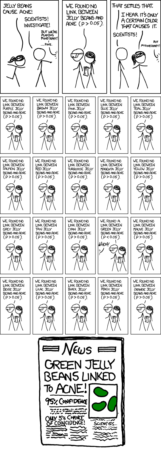
The existence of “green jelly beans” (or p-value hunting, also called “p-hacking”) cannot be ruled out in such studies.
Anyway, enough bitching about behavioural economics, because while their methods may not be rigorous, and can sometimes be explained using conventional economics, some of their insights do sometimes apply in real life. Like the one where you add a choice and people start seeing the existing choices in a different way.
The other day, Nitin Pai asked me to product a district-wise map of Karnataka colour coded by the prevalence of Covid-19 (or the “Wuhan virus”) in each district. “We can colour them green, yellow, orange and red”, he said, “based on how quickly cases are growing in each district”.
After a few backs and forths, and using data from the excellent covid19india.org , we agreed on a formula for how to classify districts by colour. And then I started drawing maps (R now has superb methods to draw maps using ggplot2).
For the first version, I took his colour recommendations at face value, and this is what came out. 
While the data is shown easily, there are two problems with this chart. Firstly, as my father might have put it, “the colours hit the eyes”. There are too many bright colours here and it’s hard to stare at the graph for too long. Secondly, the yellow and the orange appear a bit too similar. Not good.
So I started playing around. As a first step, I replaced “green” with “darkgreen”. I think I got lucky. This is what I got. 
Just this one change (OK i made one more change – made the borders black, so that the borders between contiguous dark green districts can be seen more clearly) made so much of a difference.
Firstly, the addition of the sober dark green (rather the bright green) means that the graph looks so much better on the eye now. The same yellow and orange and red don’t “hit the eyes” like they used to in green’s company.
And more importantly (like the behavioural economics theory), the orange and yellow look much more distinct from each other now (my apologies to readers who are colour blind). Rather than trying to change the clashing colours (the other day I’d tried changing yellow to other closer colours but nothing had worked), adding a darker shade alongside meant that the distinctions became much more visible.
Maybe there IS something to behavioural economics, at least when it comes to colour schemes.