When a two-by-two ruins a scatterplot

The BBC has some very good analysis of the Brexit vote (how long back was that?), using voting data at the local authority level, and correlating it with factors such as ethnicity and educational attainment.

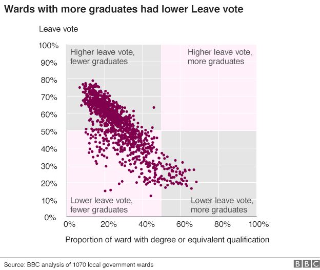
In terms of educational attainment, there is a really nice chart, that shows the proportion of voters who voted to leave against the proportion of population in the ward with at least a bachelor’s degree. One look at the graph tells you that the correlation is rather strong:

‘Source: http://www.bbc.com/news/uk-politics-38762034And then there is the two-by-two that is superimposed on this – with regions being marked off in pink and grey. The idea of the two-by-two must have been to illustrate the correlation – to show that education is negatively correlated with the “leave” vote.

But what do we see here? A majority of the points lie in the bottom left pink region, suggesting that wards with lower proportion of graduates were less likely to leave. And this is entirely the wrong message for the graph to send.

The two-by-two would have been useful had the points in the graph been neatly divided into clusters that could be arranged in a grid. Here, though, what the scatter plot shows is a nice negatively correlated linear relationship. And by putting those pink and grey boxes, the illustration is taking attention away from that relationship.

Instead, I’d simply put the scatter plot as it is, and maybe add the line of best fit, to emphasise the negative correlation. If I want to be extra geeky, I might also write down the R^2 next to the line, to show the extent of correlation!
 

Medium stats

So Medium sends me this email:

Congratulations! You are among the top 10% of readers and writers on Medium this year. As a small thank you, we’ve put together some highlights from your 2016.

Now, I hardly use Medium. I’ve maybe written one post there (a long time ago) and read only a little bit (blogs I really like I’ve put on RSS and read on Feedly). So when Medium tells me that I, who considers myself a light user, is “in the top 10%”, they’re really giving away the fact that the quality of usage on their site is pretty bad.

Sometimes it’s bloody easy to see through flattery! People need to be more careful on what the stats they’re putting out really convey!


Quantifying life

During a casual conversation on Monday, the wife remarked that given my interests and my profession (where I mostly try to derive insights from data), she was really surprised that I had never tried using data to optimise my own life.

This is a problem I’ve had in the past – I can look at clients’ data and advise them on how exactly to build their business, but I’m thoroughly incapable of doing similar analysis of my own business. I berate people for not using data and relying too much on “gut”, but “gut” is what I use for most of my own life decisions.

With this contradiction in mind, it made sense for me to start quantifying my life. Except that I didn’t know where to start. The first thing you think of when you want to do something new is to buy new gadgets for it, and I quickly asked the wife to pick up a Fitbit for me on her way back from the US next month. She would have none of it – I should use the tools that I have, she said.

I’ve tried logging stuff and writing diaries in the past but it’s mostly been tedious business (unless I’ve had to write my diary free form, which I’ve quite liked). A couple of days is all that most logs have lasted before I’ve lost interest. I hate making checklists (looking at them psyches me out), I maintain my calendar in my head (thus wasting precious memory space) and had nightmares writing notes in school.

A couple of times when I’ve visited dieticians or running coaches I’ve been asked to make a log of what I’ve been eating, and I’ve never been able to do it for more than one meal – there is too much ambiguity in the data (a “cup of dal” can mean several things) to be entered which makes the data entry process tedious.

This time, however, I’m quite bullish about maintaining the log that the wife has created for me. Helpfully, it’s on Google Docs, so I can access it on the move. More importantly, she has structured the sheet in a way that there is no fatigue in entry. The number of columns is more than what I would have liked, but having used it for two days so far, I don’t see why I should be tired of this.

The key is the simplicity of questions, and amount of effort required to fill them in. Most questions are straightforward (“what time did you wake up?” “what time did you have breakfast” etc.) and have deterministic answers. There are subjective questions (“quality of pre-lunch work”) but the wife has designed them such that I only need to enter a rating (she had put in a 3-point Likert scale which I changed to a 5-point Likert scale since I found the latter more useful here).

There are no essays. No comments. Very little ambiguity on how I should fill. And minimal judgment required.

I might be jumping to conclusions already (it’s been but two days since I started filling), but the design of this questionnaire holds important lessons in how to design a survey or questionnaire in order to get credible.
1. Keep things simple
2. Reduce subjectivity as much as possible
3. Don’t tax the filler’s mind too much. The less the mental effort required the better.
4. Account for NED. Don’t make the questionnaire too long else it causes fatigue. My instructions to the wife was that the questionnaire should be small enough to fit in my browser window (when viewed on computer). This would have limited the questions to 11 but she’s put 14, which is still not too bad.

The current plan is to collect data over the next 45 days after which we will analyse it. I may or may not share the results of the analysis here. But I’ll surely recommend my wife’s skills in designing questionnaires! Maybe she should take a hint from this in terms of her post-MBA career.

Restaurants, deliveries and data

Delivery aggregators are moving customer data away from the retailer, who now has less knowledge about his customer. 

Ever since data collection and analysis became cheap (with cloud-based on-demand web servers and MapReduce), there have been attempts to collect as much data as possible and use it to do better business. I must admit to being part of this racket, too, as I try to convince potential clients to hire me so that I can tell them what to do with their data and how.

And one of the more popular areas where people have been trying to use data is in getting to “know their customer”. This is not a particularly new exercise – supermarkets, for example, have been offering loyalty cards so that they can correlate purchases across visits and get to know you better (as part of a consulting assignment, I once sat with my clients looking at a few supermarket bills. It was incredible how much we humans could infer about the customers by looking at those bills).

The recent tradition (after it has become possible to analyse large amounts of data) is to capture “loyalties” across several stores or brands, so that affinities can be tracked across them and customer can be understood better. Given data privacy issues, this has typically been done by third party agents, who then sell back the insights to the companies whose data they collect. An early example of this is Payback, which links activities on your ICICI Bank account with other products (telecom providers, retailers, etc.) to gain superior insights on what you are like.

Nowadays, with cookie farming on the web, this is more common, and you have sites that track your web cookies to figure out correlations between your activities, and thus infer your lifestyle, so that better advertisements can be targeted at you.

In the last two or three years, significant investments have been made by restaurants and retailers to install devices to get to know their customers better. Traditional retailers are being fitted with point-of-sale devices (provision of these devices is a highly fragmented market). Restaurants are trying to introduce loyalty schemes (again a highly fragmented market). This is all an attempt to better get to know the customer. Except that middlemen are ruining it.

I’ve written a fair bit on middleman apps such as Grofers or Swiggy. They are basically delivery apps, which pick up goods for you from a store and deliver it to your place. A useful service, though as I suggest in my posts linked above, probably overvalued. As the share of a restaurant or store’s business goes to such intermediaries, though, there is another threat to the restaurant – lack of customer data.

When Grofers buys my groceries from my nearby store, it is unlikely to tell the store who it is buying for. Similarly when Swiggy buys my food from a restaurant. This means loyalty schemes of these sellers will go for a toss. Of course not offering the same loyalty program to delivery companies is a no-brainer. But what the sellers are also missing out on is the customer data that they would have otherwise captured (had they sold directly to the customer).

A good thing about Grofers or Swiggy is that they’ve hit the market at a time when sellers are yet to fully realise the benefits of capturing customer data, so they may be able to capture such data for cheap, and maybe sell it back to their seller clients. Yet, if you are a retailer who is selling to such aggregators and you value your customer data, make sure you get your pound of flesh from these guys.

On Uppi2’s top rating

So it appears that my former neighbour Upendra’s new magnum opus Uppi2 is currently the top rated movie on IMDB, with a rating of 9.7/10.0. The Times of India is so surprised that it has done an entire story about it, which I’ve screenshot here: Screen Shot 2015-08-17 at 8.50.33 pm

The story also mentions that another Kannada movie RangiTaranga (which I’ve reviewed here) is in third spot, with a rating of 9.4 out of 10. This might lead you to wonder why Kannada movies have suddenly turned out to be so good. The answer, however, lies in simple logic.

The first is that both are relatively new movies and hence their ratings suffer from “small sample bias”. Of course, the sample isn’t that small – Uppi2 has received 1900 votes, which is 3 times as much as its 1999 prequel Upendra. Yet, it being a new movie, only a subset of the small set of people who have watched it so far would have reviewed it.

The second is selection bias. The people who see a movie in its first week are usually the hardcore fans, and in this case it is hardcore fans of Upendra’s movies. And hardcore fans usually find it hard to have their belief shaken (a version of what I’ve written about online opinions for Mint here), and hence they all give the movie a high rating.

As time goes by, and people who are not as hardcore fans of Upendra start watching and reviewing the movie, the ratings are likely to rationalise. Finally, ratings are easy to rig, especially when samples are small. For example, an Upendra fan club might have decided to play up the movie online by voting en masse on IMDB, and pushing up its ratings. This might explain both why the movie already has 1900 ratings in four days, and most of them are extremely positive.

The solution for this is for the rating system (IMDB in this case) to pay more weightage for “verified ratings” (by people who have rated more movies in the past, for instance), or remove highly correlated ratings. Right now, the rating algorithm seems pretty naive.

Coming back to Uppi2, from what I’ve heard from people, the movie is supposed to be really good, though perhaps not 9.7 good. I plan to watch the movie in the next few days and will write a review once I do so.

Meanwhile, read this absolutely brilliant review (in Kannada) written by this guy called “Jogi”

Using all available information

In “real-life” problems, it is not necessary to use all the given data. 

My mind goes back eleven years, to the first exam in the Quantitative Methods course at IIMB. The exam contained a monster probability problem. It was so monstrous that only some two or three out of my batch of 180 could solve it. And it was monstrous because it required you to use every given piece of information (most people missed out the “X and Y are independent” statement, since this bit of information was in words, while everything else was in numbers).

In school, you get used to solving problems where you are required to use all the given information and only the given information to solve the given problem. Taken out of the school setting, however, this is not true any more. Sometimes in “real life”, you have problems where next to no data is available, for which you need to make assumptions (hopefully intelligent) and solve the problem.

And there are times  in “real life” when you are flooded with so much data that a large part of the problem solving process is in the identification of what data is actually relevant and what you can ignore. And it can often happen that different pieces of given information contradict each other and deciding upon what to use and what to ignore is critical to efficient solution, and the decision is an art form.

Yet, in the past I’ve observed that people are not happy when you don’t use all the information at your disposal. The general feeling is that ignoring information leads to a suboptimal model – one which could be bettered by including the additional information. There are several reasons, though, that one might choose to leave out information while solving a real-life problem:

  • Some pieces of available information are mutually contradictory, so taking them both into account will lead to no solution.
  • A piece of data may not add any value after taking into account the other data at hand
  • The incremental impact of a particular piece of information is so marginal that you don’t lose much by ignoring it
  • Making use of all available information can lead to increased complexity in the model, and the incremental impact of the information may not warrant this complexity
  • It might be possible to use established models if you were to use part of the information. So we lose precision for a known model. Not always recommended but done.

The important takeaway, though, is that knowing what information to use is an art, and this forms a massive difference between textbook problems and real-life problems.

Recommendations and rating systems

This is something that came out of my IIMB class this morning. We were discussing building recommendation systems, using the whisky database (check related blog posts here and here). One of the techniques of recommendation we were discussing was the “market basket analysis“, where you recommend products to people based on combinations of products that other people have been buying.

This is when one of the students popped up with the observation that market basket analysis done without “ratings” can be self-fulfilling! It was an extremely profound observation, so I made a mental note to blog about this. And I’ve told you earlier that this IIMB class that I’m teaching is good!

So the concept is that if a lot of people have been buying A and B together, then you start recommending B to buyers of A. Let us say that there are a number of people who are buying A and C, but not B, but based on our analysis that people buy A and B together, we recommend B to them. Let’s assume that they’ve taken our recommendation and bought B, which means that these people are now seen to have bought both B and C together.

Now, in case we don’t collect their feedback on B, we have no clue that they didn’t like B (let’s assume that for whatever reason buyers of C don’t like B), but in the next iteration, we see that buyers of C have been buying B, and so we start recommending B to other C buyers. And so a bad idea (recommending B to buyers of C, thanks to A) can spiral and put the confidence of our recommendation system in tatters.

Hence, it is useful to collect feedback (in the form of ratings) to items that we recommend to customers, so that these “recommended purchases” don’t end up distorting our larger data set!

Of course what I’m saying here is not definitive, and needs more work, but it is an interesting idea nevertheless and worth being communicated. There can be some easy workarounds – like not taking into account recommended products while doing the market basket analysis, or trying to find negative lists and so on.

Nevertheless, I thought this is an interesting concept and hence worth sharing.

Rating systems need to be designed carefully

Different people use the same rating scale in different ways. Hence, nuance is required while aggregating ratings taking decisions based on them

During the recent Times Lit Fest in Bangalore, I was talking to some acquaintances regarding the recent Uber rape case (where a car driver hired though the Uber app in Delhi allegedly raped a woman). We were talking about what Uber can potentially do to prevent bad behaviour from drivers (which results in loss of reputation, and consequently business, for Uber), when one of them mentioned that the driver accused of rape had an earlier complaint against him within the Uber system, but because the complainant in that case had given him “three stars”, Uber had not pulled him up.

Now, Uber has a system of rating both drivers and passengers after each ride – you are prompted to give the rating as soon as the ride is done, and you are unable to proceed to your next booking unless you’ve rated the previous ride. What this ensures is that there is no selection bias in rating – typically you leave a rating only when the product/service has been exceptionally good or bad, leading to skewed ratings. Uber’s prompts imply that there is no opportunity for such bias and ratings are usually fair.

Except for one problem – different people have different norms for rating. For example, i believe that there is nothing “exceptional” that an Uber driver can do for me, and hence my default rating for all “satisfactory” rides is a 5, with lower scores being used progressively for different levels of infractions. For another user, for example, the default might be 1, with 2 to 5 being used for various levels of good service. Yet another user might use only half the provided scale, with 3 being “pathetic”, for example. I once worked for a firm where annual employee ratings came out on a similar five-point scale. Over the years so much “rating inflation” had happened that back when I worked there anything marginally lower than 4 on 5 was enough to get you sacked.

What this means is that arithmetically averaging ratings across raters, and devising policies based on particular levels of ratings is clearly wrong. For example, when in the earlier case (as mentioned by my acquaintance) a user rated the offending driver a 3, Uber should not have looked at the rating in isolation, but in relation to other ratings given by that particular user (assuming she had used the service before).

It is a similar case with any other rating system – a rating looked at in isolation tells you nothing. What you need to do is to look at it in relation to other ratings by the user. It is also not enough to look at a rating in relation to just the “average” rating given by a user – variance also matters. Consider, for example, two users. Ramu uses 3 for average service, 4 for exceptional and 2 for pathetic. Shamu also uses 3 for average, but he instead uses the “full scale”, using 5 for exceptional service and 1 for pathetic. Now, if a particular product/service is rated 1 by both Ramu and Shamu, it means different things – in Shamu’s case it is “simply pathetic”, for that is both the lowest score he has given in the past and the lowest he can give. In Ramu’s case, on the other hand, a rating of 1 can only be described as “exceptionally pathetic”, for his variance is low and hence he almost never rates someone below 2!

Thus, while a rating system is a necessity in ensuring good service in a two-sided market, it needs to be designed and implemented in a careful manner. Lack of nuance in designing a rating system can result in undermining the system and rendering it effectively useless!

The Ramayana and the Mahabharata principles

An army of monkeys can’t win you a complex war like the Mahabharata. For that you need a clever charioteer.

A business development meeting didn’t go well. The potential client indicated his preference for a different kind of organisation to solve his problem. I was about to say “why would you go for an army of monkeys to solve this problem when you can.. ” but I couldn’t think of a clever end to the sentence. So I ended up not saying it.

Later on I was thinking of the line and good ways to end it. The mind went back to Hindu mythology. The Ramayana war was won with an army of monkeys, of course. The Mahabharata war was won with the support of a clever and skilled consultant (Krishna didn’t actually fight the war, did he?). “Why would you go for an army of monkeys to solve this problem when you can hire a studmax charioteer”, I phrased. Still doesn’t have that ring. But it’s a useful concept anyway.

Extending the analogy, the Ramayana was was different from the Mahabharata war. In the former, the enemy was a ten-headed demon who had abducted the hero’s wife. Despite what alternate retellings say, it was all mostly black and white. A simple war made complex with the special prowess of the enemy (ten heads, special weaponry, etc.). The army of monkeys proved decisive, and the war was won.

The Mahabharata war was, on the other hand, much more complex. Even mainstream retellings talk about the “shades of grey” in the war, and both sides had their share of pluses and minuses. The enemy here was a bunch of cousins, who had snatched away the protagonists’ kingdom. Special weaponry existed on both sides. Sheer brute force, however, wouldn’t do. The Mahabharata war couldn’t be won with an army of monkeys. Its complexity meant it needed was skilled strategic guidance, and a bit of cunning, which is what Krishna provided when he was hired by Arjuna ostensibly as a charioteer. Krishna’s entire army (highly trained and skilled, but footsoldiers mostly) fought on opposite side, but couldn’t influence the outcome.

So when the problem at hand is simple, and the only complexity is in size or volume or complexity of the enemy, you will do well to hire an army of monkeys. They’ll work best for you there. But when faced with a complex situation and complexity that goes well beyond the enemy’s prowess, you need a charioteer. So make the choice based on the kind of problem you are facing.


Selection bias and recommendation systems

Yesterday I was watching a video on youtube, and at the end of it it recommended another (the “top recommendation” at that point in time). This video floored me – it was a superb rendition of Endaro Mahaanubhaavulu by Mandolin U Shrinivas. Listen and enjoy as you read the rest of the post.

https://www.youtube.com/watch?v=gvC4Pleog_0

I was immediately bowled over by youtube’s recommendation system. I had searched for both Shrinivas and Endaro … in the not-so-distant past so Youtube had put two and two together and served me up an awesome rendition! I was so happy that I went to town twitter about it.

It was then that I realised that this was the firs time ever that I had noticed the top recommendation of Youtube. In other words, every time I use youtube, it recommends a video to me, but I seldom notice it. And I seldom notice it for a reason – they’re usually irrelevant and crap. The one time I like the video it throws up, though, I feel really happy and go gaga over the algorithm!

In other words, there’s a bias which I don’t know what its exactly called – the bias that when event happens in a certain direction, you tend to notice it and give credit where you think it’s due. And when it doesn’t happen that way, you simply ignore it!

In terms of larger implications, this is similar to how legends such as “lucky shirts” are born. When something spectacular happens, you notice everything that is associated with that spectacular event and give credit where you think it’s due (lucky shirt, lucky pen, etc.). But when things don’t go your way you think it’s despite the lucky shirt, not because the shirt has become unlucky.

It’s the same thing with belief in “god”. When you pray and something good happens to you after that, you believe that your prayers have been answered. However, when you pray and something good doesn’t happen, you ignore the fact that you prayed.

Coming back to recommendation systems such as Youtube’s, the problem is that it is impossible for a recommendation system to get recommendations right all the time. There will be times when you get it wrong. In fact, going by my personal experience with Youtube, Amazon, etc. most of the time you will get your recommendation wrong.

The key to building a recommendation system, thus, is to build it such that you maximise the chances of getting it right. Going one step further I can say that you should maximise the chances of getting it spectacularly right, in which case the customer will notice and give you credit for understanding her. Getting it “partly right” most of the time is not enough to catch the customer’s attention.

Putting marketing jargon on it, what you should focus on is delighting the customer some of the time rather than keeping her merely happy most of the time!