The Art of Drawing Spectacular Graphs

Bloomberg Business has a feature on the decline of the Euro after the Greek “No” vote last night. As you might expect, the feature is accompanied by a graphic which shows a “precipitous fall” in the European currency.

I’m in two minds of whether to screenshot the graphic (so that any further changes are not reflected), or to not plagiarise by simply putting a link (but exposing this post to the risk of becoming moot, if Bloomberg changes its graphs later on. It seems like the graphic on the site is a PNG, so let me go ahead and link to it:

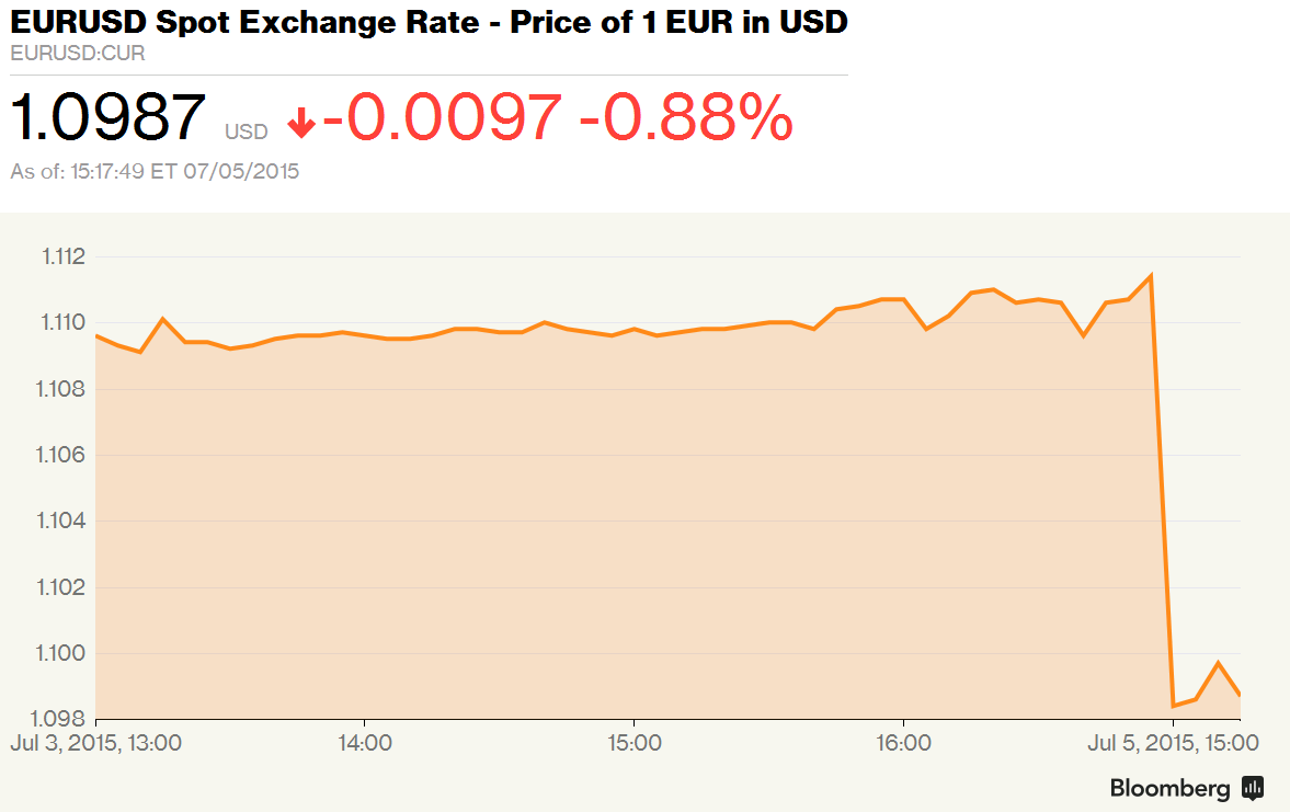
You notice the spectacular drop right? Cliff-like. You think the Euro is doomed now that the Greeks have voted “no”? Do not despair, for all you need to do is to look at the axis, and the axis labels.

The “precipitous drop” that is indicated by the above graph indicates a movement of the EUR/USD from about 1.11 to about 1.10. Or a fall of 0.88%, as the text accompanying the graph says! And given how volatile the EUR/USD has been over the last couple of months (look at graph below), this is not that significant!

eurusd


I won’t accuse Bloomberg of dishonesty since they’ve clearly mentioned “0.88%”, but they sure know how to use graphics to propagate their message!

Deranging groups

Ok so this is a mathematical problem. I plan to give three group assignments to my IIMB class. Let’s assume that there are 60 kids and for each assignment I want them to form groups of four members each. For the first assignment I’ve let them form the groups themselves.

For the second assignment, though, I want to create a “derangement” of these groups – in the sense that I want to form a different set of 15 groups of 4 members each such that no pair of students who are in the same group for assignment 1 will be in the same group for assignment 2. And I’m looking for an algorithm to thus “derange” my students. And whether it is possible at all to derange students thus.

My inclination is that this might have a solution in graph theory – in terms of graph colouring or something? Take the students from the first group and join every pair of students that are in the same group with an edge. Then colour the nodes of the graph. Pick nodes of the same colour (these are students that haven’t been in groups together) and randomly assign them to new groups. Repeat for all colours.

Question is how many colours we need to colour the graph. If it’s planar, we’ll need only 4 colours! And considering that the first assignment has 4 students per group, the maximum degree of a node is 3. If the maximum degree of an edge is 3, does that say anything about the planarity of the graph? If I derange the students once for assignment 2, can I do it again for assignment 3 (now each node has a degree of 6!) ? How do I think about this mathematically? Can you help?

Yet another startup idea

This time it’s an i-phone/android app. The motivation for this is the heavy advertising in the last few days for Mapmyindia GPS, on hoardings all over Bangalore. Again, I don’t know if this has been implemented before.

So this will be built on top of Mapmyindia or any other similar GPS. When you hunt for the shortest route between point A and point B, you can give two possible choices – shortest by distance and shortest by time. The former is the default choice that all GPSs currently use. This one is an app to provide the latter.

Now, each city will be mapped out as a network of intersections. And then, for each “edge” on this graph, we use data that we’ve gathered from other users of the app in order to predict the amount of time taken to travel. Of course, the prediction model is not going to be simple, and I’m willing to partner you (via my forthcoming quant consultancy firm) in developing it. It’s going to be a fairly complex model based on time-of-day, recency of data, outlier detection (what if someone stops off for lunch in the middle of an “edge”?) and all such.

So, now you have the city mapped out (for a particular instant) both in terms of distance and in terms of time, and in cases of any traffic jams or such, my system will help you find the quickest route to your destination. Should be useful, right?

Of course, the success of this app (like a lot of other apps, I guess) depends heavily on “network effect”. The more the users of this app, the better the model I’ll have in predicting time between intersections, and save you the headache of mentally trying to optimize the route to your destination each time you set out (like I do).

I’m pretty serious about this. If you think this hasn’t been done before, we can work together to get this up!