The BBC has some very good analysis of the Brexit vote (how long back was that?), using voting data at the local authority level, and correlating it with factors such as ethnicity and educational attainment.
In terms of educational attainment, there is a really nice chart, that shows the proportion of voters who voted to leave against the proportion of population in the ward with at least a bachelor’s degree. One look at the graph tells you that the correlation is rather strong:
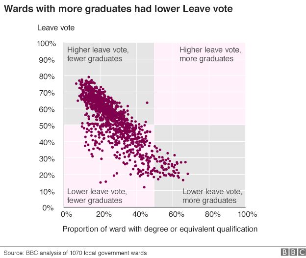
‘Source: http://www.bbc.com/news/uk-politics-38762034And then there is the two-by-two that is superimposed on this – with regions being marked off in pink and grey. The idea of the two-by-two must have been to illustrate the correlation – to show that education is negatively correlated with the “leave” vote.
But what do we see here? A majority of the points lie in the bottom left pink region, suggesting that wards with lower proportion of graduates were less likely to leave. And this is entirely the wrong message for the graph to send.
The two-by-two would have been useful had the points in the graph been neatly divided into clusters that could be arranged in a grid. Here, though, what the scatter plot shows is a nice negatively correlated linear relationship. And by putting those pink and grey boxes, the illustration is taking attention away from that relationship.
Instead, I’d simply put the scatter plot as it is, and maybe add the line of best fit, to emphasise the negative correlation. If I want to be extra geeky, I might also write down the 
Let’s assume they had to superimpose a 2×2. I’d say they just placed the divider on x axis incorrectly.
Instead of placing it at 50%, they should’ve placed it at the national value of ‘proportion of population with at least a degree’.
As per the last census, this number was 27.2% for ages 16-74. (https://www.theguardian.com/higher-education-network/blog/2013/jun/04/higher-education-participation-data-analysis)
Move the vertical box divider to 30%, and suddenly a good proportion of dots move from lower left to lower right box.
It’s not a good use of a 2×2, but even it could’ve been much improved with just a little more thought.
There could be an even better x-axis divider than national educational attainment rate – educational attainment rate of the median local authority.