Attractive graphics without chart junk

A picture is worth a thousand words, but ten pictures are worth much less than ten thousand words

One of the most common problems with visualisation, especially in the media, is that of “chart junk”. Graphics designers working for newspapers and television channels like to decorate their graphs, to make it more visually appealing. And in most cases, this results in the information in the graphs getting obfuscated and harder to read.

The commonest form this takes is in the replacement of bars in a simple bar graph with weird objects. When you want to show number of people in something, you show little people, sometimes half shaded out. Sometimes instead of having multiple people, the information is conveyed in the size of the people, or objects  (like below). 

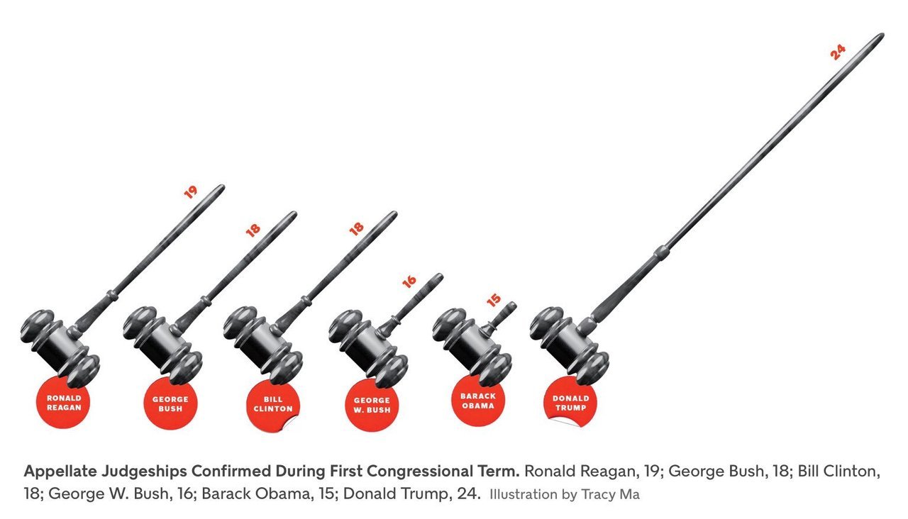
Then, instead of using simple bar graphs, designers use more complicated structures such as 3-dimensional bar graphs, or cone graphs or doughnut charts (I’m sure I’ve abused some of them on my tumblr). All of them are visually appealing and can draw attention of readers or viewers. Most of them come at the cost of not really conveying the information!

I’ve spoken to a few professional graphic designers and asked them why they make poor visualisation choices even when the amount of information the graphics convey goes down. The most common answer is novelty – “a page full of bars can be boring for the reader”. So they try to spice it up by replacing bars with other items that “look different”.

Putting it another way, the challenge is two-fold – first you need to get your readers to look at your graph (here is where novelty helps). And once you’ve got them to look at it, you need to convey information to them. And the two objectives can sometimes collide, with the best looking graphs not being the ones that convey the best information. And this combination of looking good and being effective is possibly what turns visualisation into an art.

My way of dealing with this has been to play around with the non-essential bits of the visualisation. Using colours judiciously, for example. Using catchy headlines. Adding decorations outside of the graphs.

Another lesson I’ve learnt over time is to not have too many graphics in the same piece. Some of this has come due to pushback from my editors at Mint, who have frequently asked me to cut the number of graphs for space reasons. And some of this is something I’ve learnt as a reader.

The problem with visualisations is that while they can communicate a lot of information, they can break the flow in reading. So having too many visualisations in the piece means that you break the reader’s flow too many times, and maybe even risk your article looking academic. Cutting visualisations forces you to be concise in your use of pictures, and you leave in only the ones that are most important to your story.

There is one other upshot out of cutting the number of visualisations – when you have one bar graph and one line graph, you can leave them as they are and not morph or “decorate” them just for the heck of it!

PS: Even experienced visualisers are not immune to not having their graphics mangled by editors. Check out this tweet storm by Edward Tufte, the guru of visualisation.

Taking your audience through your graphics

A few weeks back, I got involved in a Twitter flamewar with Shamika Ravi, a member of the Indian Prime Minister’s Economic Advisory Council. The object of the argument was a set of gifs she had released to show different aspects of the Indian economy. Admittedly I started the flamewar. Guilty as charged.

Thinking about it now, this wasn’t the first time I was complaining about her gifs – I began my now popular (at least on Twitter) Bad Visualisations tumblr with one of her gifs.

So why am I so opposed to animated charts like the one in the link above? It is because they demand too much of the consumer’s attention and it is hard to get information out of them. If there is something interesting you notice, by the time you have had time to digest the information the graphic has moved several frames forward.

Animated charts became a thing about a decade ago following the late Hans Rosling’s legendary TED Talk. In this lecture, Rosling used “motion charts” (a concept he possibly invented) – which was basically a set of bubbles moving around a chart, as he sought to explain how the condition of the world has improved significantly over the years.

It is a brilliant talk. It is a very interesting set of statistics simply presented, as Rosling takes the viewers through them. And the last phrase is the most important – these motion charts work for Rosling because he talks to the audience as the charts play out. He pauses when there is some explanation to be made or the charts are at a key moment. He explains some counterintuitive data points exhibited by the chart.

And this is precisely how animated visualisations need to be done, and where they work – as part of a live presentation where a speaker is talking along with the charts and using them as visual aids. Take Rosling (or any other skilled speaker) away from the motion charts, though, and you will see them fall flat – without knowing what the key moments in the chart are, and without the right kind of annotations, the readers are lost and don’t know what to look for.

There are a large number of aids to speaking that can occasionally double up as aids to writing. Graphics and charts are one example. Powerpoint (or Keynote or Slides) presentations are another. And the important thing with these visual aids is that the way they work as an aid is very different from the way they work standalone. And the makers need to appreciate the difference.

In business school, we were taught to follow the 5 by 5 formula (or some such thing) while making slides – that a slide should have no more than five bullet points, and each point should have no more than five words. This worked great in school as most presentations we made accompanied our talks.

Once I started working (for a management consultancy), though, I realised this didn’t work there because we used powerpoint presentations as standalone written communications. Consequently, the amount of information on each slide had to be much greater, else the reader would fail to get any information out of it.

Conversely, a powerpoint presentation meant as a standalone document would fail spectacularly when used to accompany a talk, for there would be too much information on each slide, and massive redundancy between what is on the slide and what the speaker is saying.

The same classification applies to graphics as well. Interactive and animated graphics do brilliantly as part of speeches, since the speaker can control what the audience is seeing and make sure the right message gets across. As part of “print” (graphics shared standalone, like on Twitter), though, these graphics fail as readers fail to get information out of them.

Similarly, a dense well-annotated graphic that might do well in print can fail when used as a visual aid, since there will be too much information and audience will not be able to focus on either the speaker or the graphic.

It is all about the context.

Analytics for general managers

While good managers have always been required to be analytical, the level of analytical ability being asked of managers has been going up over the years, with the increase in availability of data.

Now, this post is once again based on that one single and familiar data point – my wife. In fact, if you want me to include more data in my posts, you should talk to me more.

Leaving that aside, my wife works as a mid-level manager for an extremely large global firm. She was recruited straight out of business school for a “MBA track” program. And from our discussions about her work in the first few months, one thing she did lots of was writing SQL queries. And she still spends a lot of her time writing queries and building Excel models.

This isn’t something she was trained for, or was tested on while being recruited. She did her MBA in a famously diverse global business school, the diversity of its student bodies implying the level of maths and quantitative methods being kept rather low. She was recruited as a “general manager”. Yet, in a famously data-driven company, she spends a considerable amount of time on quantitative stuff.

It wasn’t always like this. While analytical ability has what (in my opinion) set apart graduates of elite MBA programs from those of middling MBA programs, the level of quantitative ability expected out of MBAs (apart from maybe those in finance) wasn’t too high. You were expected to know to use spreadsheets. You were expected to know some rudimentary statistics- means and standard deviations and some basic hypothesis testing, maybe. And you were expected to be able to make managerial decisions based on numbers. That’s about it.

Over the years, though, as the corpus of data within (and outside) organisations has grown, and making decisions based on data has become fashionable (a brilliant thing as far as I’m concerned), the requirement from managers has grown as well. Now they are expected to do more with data, and aren’t always trained for that.

Some organisations have responded to this problem by supplying “data analysts” who are attached to mid level managers, so that the latter can outsource the analytical work to the former and spend most of their time on “managerial” stuff. The problem with this is twofold – it is hard to guarantee a good career path to this data analyst (which makes recruitment hard), and this introduces “friction” – the manager needs to tell the analyst what precise data and analysis she needs, and iterating on this can lead to a lot of time lost.

Moreover, as the size of the data has grown, the complexity of the analysis that can be done and the insights that can be produced has become greater as well. And in that sense, managers who have been able to adapt to the volume and complexity of data have a significant competitive advantage over their peers who are less comfortable with data.

So what does all this mean for general managers and their education? First, I would expect the smarter managers to know that data analysis ability is a competitive advantage, and so invest time in building that skill. Second, I know of some business schools that are making their MBA programs less quantitative, as their student body becomes more diverse and the recruitment body becomes less diverse (banks are recruiting far less nowadays). This is a bad move. In fact, business schools need to realise that a quantitative MBA program is more of a competitive advantage nowadays, and tune their programs accordingly, while not compromising on the diversity of the student intake.

Then, there is a generation of managers that got along quite well without getting its hands dirty with data. These managers will now get challenged by younger managers who are more conversant with data. It will be interesting to see how organisations deal with this dynamic.

Finally, organisations need to invest in training programs, to make sure that their general managers are comfortable with data, and analysis, and making use of internal and external data science resources. Interestingly enough (I promise I hadn’t thought of this when I started writing this post), my company offers precisely one such workshop. Get in touch if you’re interested!

The missing middle in data science

Over a year back, when I had just moved to London and was job-hunting, I was getting frustrated by the fact that potential employers didn’t recognise my combination of skills of wrangling data and analysing businesses. A few saw me purely as a business guy, and most saw me purely as a data guy, trying to slot me into machine learning roles I was thoroughly unsuited for.

Around this time, I happened to mention to my wife about this lack of fit, and she had then remarked that the reason companies either want pure business people or pure data people is that you can’t scale a business with people with a unique combination of skills. “There are possibly very few people with your combination of skills”, she had said, and hence companies had gotten around the problem by getting some very good business people and some very good data people, and hope that they can add value together.

More recently, I was talking to her about some of the problems that she was dealing with at work, and recognised one of them as being similar to what I had solved for a client a few years ago. I quickly took her through the fundamentals of K-means clustering, and showed her how to implement it in R (and in the process, taught her the basics of R). As it had with my client many years ago, clustering did its magic, and the results were literally there to see, the business problem solved. My wife, however, was unimpressed. “This requires too much analytical work on my part”, she said, adding that “If I have to do with this level of analytical work, I won’t have enough time to execute my managerial duties”.

This made me think about the (yet unanswered) question of who should be solving this kind of a problem – to take a business problem, recognise it can be solved using data, figuring out the right technique to apply to it, and then communicating the results in a way that the business can easily understand. And this was a one-time problem, not something you would need to solve repeatedly, and so without the requirement to set up a pipeline and data engineering and IT infrastructure around it.

I admit this is just one data point (my wife), but based on observations from elsewhere, managers are usually loathe to get their hands dirty with data, beyond perhaps doing some basic MS Excel work. Data science specialists, on the other hand, will find it hard to quickly get intuition for a one-time problem, get data in a “dirty” manner, and then apply the right technique to solving it, and communicate the results in a business-friendly manner. Moreover, data scientists are highly likely to be involved in regular repeatable activities, making it an organisational nightmare to “lease” them for such one-time efforts.

This is what I call as the “missing middle problem” in data science. Problems whose solutions will without doubt add value to the business, but which most businesses are unable to address because of a lack of adequate skillset in solving the issue; and whose one-time nature makes it difficult for businesses to dedicate permanent resources to solve.

I guess so far this post has all the makings of a sales pitch, so let me turn it into one – this is precisely the kind of problem that my company Bespoke Data Insights is geared to solving. We specialise in solving problems that lie at the cusp of business and data. We provide end-to-end quantitative solutions for typically one-time business problems.

We come in, understand your business needs, and use a hypothesis-driven approach to model the problem in data terms. We select methods that in our opinion are best suited for the precise problem, not hesitating to build our own models if necessary (hence the Bespoke in the name). And finally, we synthesise the analysis in the form of recommendations that any business person can easily digest and action on.

So – if you’re facing a business problem where you think data might help, but don’t know how to proceed; or if you are curious about all this talk about AI and ML and data science and all that, and want to include it in your business; or you want your business managers to figure out how to use the data  teams better, hire us.

Statistics and machine learning approaches

A couple of years back, I was part of a team that delivered a workshop in machine learning. Given my background, I had been asked to do a half-day session on Regression, and was told that the standard software package being used was the scikit-learn package in python.

Both the programming language and the package were new to me, so I dug around a few days before the workshop, trying to figure out regression. Despite my best efforts, I couldn’t locate how to find out the R^2. What some googling told me was surprising:

There exists no R type regression summary report in sklearn. The main reason is that sklearn is used for predictive modelling / machine learning and the evaluation criteria are based on performance on previously unseen data

As it happened, I requested the students at the workshop to install a package called statsmodels, which provides standard regression outputs. And then I proceeded to lecture to them on regression as I know it, including significance scores, p values, t statistics, multicollinearity and the likes. It was only much later was I to figure out that that is now how regression (and logistic regression) is done in the machine learning world.

In a statistical framework, the data sets in regression are typically “long” – you have a large number of data points, and a small number of variables. Putting it differently, we start off with a model with few degrees of freedom, and then “constrain” the variables with a large enough number of data points, so that if a signal exists, and it is in the right format (linear relationship and all that), we can pin it down effectively.

In a machine learning framework, it is common to run a regression where the number of data points is of the same order of magnitude as, or even smaller than the number of variables. Strictly speaking, such a problem is unbounded (there are too many degrees of freedom), and so regression is not well-defined. Instead, we rely upon “regularisation methods” to “tie down” the variables and (hopefully) produce a consistent solution.

Moreover, machine learning approaches are common to problems where individual predictor variables don’t have meaning. In this scenario, knowing whether a particular variable is significant or not is of no utility. Then, the signal in machine learning lies in the combination of variables, which means that multicollinearity (correlation between predictor variables) is not really a bad thing as it is in statistics. Variables not having meanings means that there are no correlations per se to be defined, and so machine learning models are harder to interpret, and are more likely to have hidden spurious correlations.

Also, when you have a small number of variables and a large number of data points, it is easy to get an “exact solution” for regression, which is what statistical methods use. In a machine learning framework with “wide” data, though, exact solutions are computationally infeasible, and so you need to use approximate algorithms such as gradient descent – which are common across ML techniques.

All in all, while statistics and machine learning might use techniques with the same name (“regression”, for example), they are both in theory and practice, very different ways to solve the problem. The important thing is to figure out the approach most suited for a particular problem, and use it accordingly.

Why data scientists should be comfortable with MS Excel

Most people who call themselves “data scientists” aren’t usually fond of MS Excel. It is slow and clunky, can only handle a million rows of data (and nearly crash your computer if you go anywhere close to that), and despite the best efforts of Visual Basic, is not very easy to program for doing repeatable tasks.

In fact, some data scientists may consider Excel to be “too downmarket” for them to use. At one firm I worked for, I had heard a rumour that using Excel for modelling was a fire-able offence, though I’m glad to report that I flouted this rule without much adverse effect. Yet, in my years as a “data science” and analytics consultant, and having done several modelling jobs before, I think Excel is an extremely necessary tool in a data scientist’s arsenal. There are several reasons for this.

The main one is communication. “Business types” love Excel – they use it for pretty much every official activity (I know of people who write documents in Excel). If you ask for a set of numbers, you are most likely to find it in an Excel sheet. I know of fairly large organisations which use Excel to store and transmit data (admittedly poor usage). And even non-quantitaive business types understand some of the basic quantitative functions thanks to Excel, such as joining (VLookup), pivoting, basic data cleaning (TRIM, VALUE, etc.), averaging, visualisation and sometimes even basic statistics such as correlation and regression.

One of the main problems that organisations face is lack of communication between data scientists and the business side (I mentioned this in a talk I gave last month: video here and slides here). Excel is an excellent middle ground, since it is reasonably quantitative and business people know how to use it.

In fact, in my consulting experience I’ve found that when working with clients, using Excel can make your client (usually a business person) feel more comfortable and involved in the analysis, speeding up the process and significantly improving collaboration. They’ll feel more empowered to intervene, which means they can add value, and they can feel especially happy if you occasionally let them enter some simple quantitative formulae.

The next advantage of Excel is that it puts the numbers out there. A long time back, when I was still doing full time jobs, I was asked to build a forecasting model (using a programming language) and couldn’t get it right for several months. And then on a whim I decided to use Excel, and when I saw the data in front of me, it was clear why the forecasts were so useless – because the data was so random.

Excel also allows you to quickly try things and iterate, again by putting the data and the analysis in front of you. Admittedly, the toolkit available is limited compared to what programming languages or statistical softwares can offer, but through clever usage (especially with Visual Basic), there is a lot you can achieve.

Then, Excel sometimes nudges you towards finding simple solutions. It is possible when you’re using a programming language to veer towards overly complicated solutions, and possibly use the proverbial nuclear weapon against the sparrow.

When I was working on the forecasting work a decade ago, I found that the forecasts would feed into a fairly complicated-looking model that had been developed over several years by several developers. On a whim, I decided to “do more” in Excel and managed to replicate the entire model in Excel (using VB and Solver). The people leading the product weren’t particularly happy, but using Excel was critical in ultimately moving to a simpler solution.

A similar thing occurred recently as well. I had been building a fairly complex optimisation model, which I tried replicating in Excel for communication purposes (so I could work on it together with the client). And it turned out there was a far simpler solution that I had missed all this time, and the simpler solution became apparent only because I used Excel.

I’m sure this is not an exhaustive list. So, if you’re a data scientist, you will do well to be at least conversant with Excel. I know it may only serve limited needs in terms of analysis, but the effort in learning  will get more than compensated for in the communication and collaboration and simplicity.

Tailpiece:
A long time ago, a co-worker passed by my desk and saw me work on Excel. He saw my spreadsheet and remarked, “oh, so many numbers! it must be very complicated” and went on his way. I don’t know if he is a data scientist now.

Meaningful and meaningless variables (and correlations)

A number of data scientists I know like to go about their business in a domain-free manner. They make a conscious choice to not know anything about the domain in which they are solving the problem, and instead treat a dataset as just a set of anonymised data, and attack it with the usual methods.

I used to be like this as well a long time ago. I remember in my very first job I had pissed off some clients by claiming that “I don’t care if this is a nut or a screw. As far as I’m concerned this is just a part number”.

Over time, though, I’ve come to realise that even a little bit of domain knowledge or intuition can help build significantly superior models. To use a framework I had introduced a few months back, your domain knowledge can be used to restrict the degrees of freedom in your model, thus increasing how much the machine can learn with the available data.

Then again, some problems lend themselves better to domain-based intuition than others, and this has to do with the meaning of a data point.

Consider two fairly popular problem statements from data science – determining whether a borrower will pay back a loan, and determining whether there is a cat in a given picture. While at the surface level, both are binary decisions, to be made by looking at large dimensional data (the number of data points that can be used for credit scoring can be immense), there is an important distinction between the two problems.

In the cat picture case, a single data point is basically the colour of a single pixel in an image, and it doesn’t really mean anything. If we were to try and build a cat recognition algorithm based on a single pre-chosen pixel in an image, it is unlikely we can do better than noise. Instead, the information is encoded in groups of pixels near each other – a bunch of pixels that look like cat ears, for example. In this case, whether you are training to model to identify cats or cinnamon buns is immaterial, and the domain-free approach works well.

With the credit scoring problem, the amount of information in each explanatory variable is significant. Unless we are looking at some extremely esoteric or insignificant variables (trust me, these get used fairly often in credit scoring models), it is possible to build a decision model based on just one explanatory variable and still have significant predictive power. There is definitely information in correlation between explanatory variables, but that pales compared to the information in the variables themselves.

And the amount of information captured by each explanatory variable means that it makes sense in these cases to invest some human effort to understand the variables and the impact it is having. In some cases, you might decide to use a mathematical transformation of a variable (square or log or inverse) instead of the variable itself. In other cases, you might determine based on logic that some correlations are spurious and drop the variables altogether. You might see a few explanatory variables with largely similar information and decide to drop some of them or use dimension reduction algorithms. And you can do a much better job of this if you have some experience or intuition about the domain, and care to understand what each variable means. Because variables have meanings.

Unlike in the image recognition problem, where most of the intuition is in the correlation term, because of which the “variables” don’t have any meaning, where domain doesn’t matter that much (though it can – in that some kinds of algorithms are superior at some kinds of images. I don’t have much experience in this domain to comment 🙂 ).

Again like in all the two-by-twos that I produce (and there are many, though this is arguably the most famous one), the problem is where you take people from one side and put them in a situation from the other side.

If you come from a background where you’ve mostly dealt with datasets where each individual variable is meaningless, but there is information in the collective, you are likely to “stir the pile” rather than using intuition to build better models.

If you are used to dealing with datasets with “meaning”, where variables hold the information, you might waste time doing your jiggery-pokery when you should be looking to apply models that get information in the collective.

The problem is this is a rather esoteric classification, so there is plenty of chance for people to be thrown into the wrong end.

More issues with Slack

A long time back I’d written about how Slack in some ways was like the old DBabble messaging and discussion group platform, except for one small difference – Slack didn’t have threaded conversations which meant that it was only possible to hold one thread of thought in a channel, significantly limiting discussion.

Since then, Slack has introduced threaded conversations, but done it in an atrocious manner. The same linear feed in each channel remains, but there’s now a way to reply to specific messages. However, even in this little implementation Slack has done worse than even WhatsApp – by default, unless you check one little checkbox, your reply will only be sent to the person who originally posted the message, and doesn’t really post the message on the group.

And if you click the checkbox, the message is displayed in the feed, but in a rather ungainly manner. And threads are only one level deep (this was one reason I used to prefer LiveJournal over blogspot back in the day – comments could be nested in the former, allowing for significantly superior discussions).

Anyway, the point of this post is not about threads. It’s about another bug/feature of Slack which makes it an extremely difficult tool to use, especially for people like me.

The problem is slack is that it nudges you towards sending shorter messages rather than longer messages. In fact, there’s no facility at all to send a long well-constructed argument unless you keep holding on to Shift+Enter everytime you need a new line. There is a “insert text snippet” feature, but that lacks richness of any kind – like bullet points, for example.

What this does is to force you to use Slack for quick messages only, or only share summaries. It’s possible that this is a design feature, intended to capture the lack of attention span of the “twitter generation”, but it makes it an incredibly hard platform to use to have real discussions.

And when Slack is the primary mode of communication in your company (some organisations have effectively done away with email for internal communications, preferring to put everything on Slack), there is no way at all to communicate nuance.

PS: It’s possible that the metric for someone at Slack is “number of messages sent”. And nudging users towards writing shorter messages can mean more messages are sent!

PS2: DBabble allowed for plenty of nuance, with plenty of space to write your messages and arguments.


Generalist and specialist managers

A really long time ago, I’d written this blog post about “comparative advantage” versus “competitive advantage” employees. A competitive advantage employee is better at a particular kind of task or skill compared to the rest of the team, and he is valued for that kind of skill.

A comparative advantage employee, on the other hand, is “dominated” by at least one other person in the team – in the sense that someone else is better than this person at everything required for the job. In that sense, the value that the comparative advantage employee adds is by taking load off his colleagues, and allowing them to do more (and focus on the more productive parts of their jobs).

Thinking about it now, I realise that a similar classification exists from the manager’s perspective as well. And this is broadly correlated with whether the manager manages a “generalist” or a “specialist” team.

A specialist manager manages a team all of whose members work on and excels at one specialist task. This task could come from any part of the organisation – it could be sales or a particular kind of operations, or some financial activity or whatever. The defining feature of this kind of task is that it is usually repetitive and needs to be done in high volumes. Such tasks also offer high “returns to experience”.

The average employee of a specialist team is usually a “comparative advantage” employee. In most cases, such an employee is likely to be “dominated” by the manager, and the value he adds is by taking the load off the manager and allowing him to do more. Over the course of time, he becomes good enough at the job to become a manager himself, and the cycle continues – he will manage a team of people who are mostly inferior to him in the job.

Due to managers dominating direct reports, such teams end up being largely hierarchical, and there can be a tendency for the manager to micro-manage – if you are better at the task than the person actually doing it, you can do worse than giving specific instructions.

Generalist managers, on the other hand, manage teams that involve at least a few competitive advantage employees. What this implies is that there is a set of people who are better than the manager at certain parts of the business. The manager’s role in such a team is more of a facilitator, in terms of bringing the team together and coordinating in a way that they can maximise the team’s effectiveness.

Generalist managers seldom micromanage, since usually their team members know better (literally). They are also usually open-minded, since extracting full value from the team means recognising each member’s strengths (and consequently their own weaknesses). They learn the art of asking questions and verifying insights and work of the team in a cheap manner (remember from complexity theory that the complexity of verifying a solution can be much lower than the complexity of finding a solution).

Regular readers of the blog might have anticipated this paragraph – the trouble comes when a generalist manager has to manage a specialist team or the other way round.

A generalist manager managing a specialist team may not offer as much as he can to the team based on his experience. He might be too hands-off and team members used to more handholding and direction might feel lost. And so on.

A specialist manager managing a generalist team can be more damaging – not appreciating that some members might know more about some parts of the business might limit the performance of the team (since what the team can do is limited by what the manager knows). Also too much micromanagement on employees who know better about some parts of the business than the manager can result in disillusionment and ultimately backfire on the manager.

I wonder if this has something to do with the Peter Principle!

Freelancing and transaction costs

In the six years of running my own consulting business, I’d forgotten about an essential part that you need to endure as part of a job – piecemeal work. It is fairly often when you’re working for someone else that you get work that is so tiny or insignificant that you can hardly take ownership of it. The best strategy for dealing with it is to quietly get it over with and hope you won’t get such stuff again.

However, sometimes you can get caught in a rut of continuously getting this kind of work, and start wondering what you actually signed up for. And this is one thing I hadn’t expected to encounter when I got back to full time working earlier this year.

Thinking about why I never had to encounter such stuff during my consulting life, I realised there’s a fairly simple explanation – transaction costs.

Being a consultant is high transaction cost business. Every time you need to take on a new piece of work, you need to go through the charade of negotiating specifics with the client, pricing and drawing up a contract. All put together, the effort is not insignificant.

Moreover, in the line of work that I used to do, there was this massive overhead cost of understanding, cleaning and getting comfortable with the client’s data  – the effort involved in that meant that after a particular point in time I stopped taking work that wasn’t chunky enough. For a while I started refusing such work, but then got smarter and started pricing myself out of such work (though some clients were generous enough to meet that price to get their little tasks done – effectively I’d passed on the transaction costs to them).

The downside of this, of course, was that there was a fair amount of money I could have made taking up small works which I didn’t since the transaction cost was too high – this can be thought of as potential lost revenues. The upside was that whatever work I did was of high quality and (hopefully) made a big impact on the client’s business.

In the nature of the firm, Ronald Coase wrote that the purpose of the corporation was that transaction cost of dealing with co-workers can be eliminated. But then, I realise that sometimes this transaction cost can also be a good thing!

Oh, and obligatory plug here – my book Between the buyer and the seller deals with transaction costs, among other things. It’s available for sale (both in print and digital) on Amazon.