The NRN premium is over

With the resignation of Infosys President BG Srinivas and the subsequent drop in the share price in the markets today, the NR Narayana Murthy premium on the Infosys stock is over. Ironically, this happens almost exactly a year since NRN made a comeback to the company in an executive capacity.

The figure below charts how the Infosys stock and the market index (Nifty ) have moved in the last one year. In order to compare the two, we have indexed their prices as of 30th May 2013, just before NRN’s return was announced (the announcement was made as of 2nd June, but the sharp spike in Infy on 31st May 2013, when the broad market fell, can be attributed to insider trading by people in the know), to 100. Notice how the Infosys stock soared in the six months after NRN’s return. In January and February, the stock traded at a 60% premium to its pre-NRN value, while the nifty was practically flat till then.

infy1

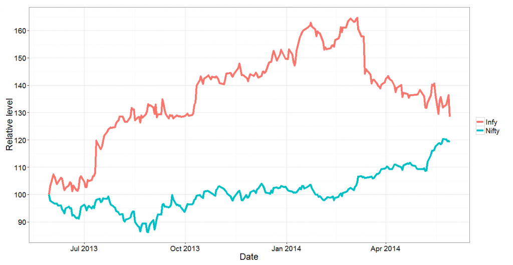
And then things started dropping. Even when the broad markets rose in March-April this year, Infosys continued to fall. The rally in early-mid May took it along, but now the stock has fallen again. This morning (latest data as of noon), the stock has fallen by about 6% thanks to Srinivas’s departure, and we can see that the gap between Infy and the market has really narrowed.

Next, we look at the ratio of the Infy price to the market index. Again we index it to 100 as of 30th May 2013. This graph shows the premium in the Infy share price over the last year. Notice that for the first time, the premium has fallen below 10% (it’s currently 7%). 

infy2


Finally, we will compare the Infy stock to the CNX IT index, which tracks the sector (that way, any sectoral premium in Infy can be extracted out). Again, we will plot the relative values of Infy to the CNX IT index, indexed to 100 as of 30th May 2013.

infy3

This graph looks like no other. What this tells us is that whatever premium Infosys enjoys over the broad market is a function of the sector, and that ever since the sharp drop in early March (on account of weak results), the NRN premium on the Infy stock relative to the sector has disappeared. As of now, compared to the sector, Infy is at an all time low.

Finally, a regression. If we regress infy stock returns against the returns in the IT index and Nifty, what we find is that Nifty returns hardly affect Infosys returns (R^2 of 7%), while the IT Index returns explain about 76% of Nifty returns. When regressed against both, Nifty returns come out as insignificant and the R^2 remains at 76%.

Putting all these statistics aside, however, the message is simple – the NRN premium on the Infy stock is over.


High Frequency Trading and Pricing Regulations

It all began with a tweet, moments ago. Degree Raju, a train travel attempter (I don’t know how often he manages to actually travel since he never seems to get tickets) tweeted this:

It is an apt analogy. The reason high frequency trading exists is that there is regulation on what the minimum bid-ask spread needs to be – it needs be at least 1 cent in the US, and at least 5 paise in India (if I’m not wrong). If the best bid (quote to purchase a stock) is at 49.95 and the best ask (quote to sell a stock) is at 50.00, there is nothing you can do to get ahead of the guy who has bid 49.95 – for regulations mean that you cannot bid 49.96!

The consequence of this is that if you want to offer the best bid, at a price close to 49.95, there is no option but for you to be the first person to have bid that amount! And so there is a race among all possible bidders, and in order to win the race you need to be fast, and so you co-locate your servers with the exchange, and so you (and your co-runners) indulge in what is called High Frequency Trading (this is a  rather simplified explanation, and it works).

Tatkal ticket booking has a similar pricing anomaly – the cancellation charges on Indian railways are fixed, and really low. Moreover, fares are static, and are not set according to demand and supply. More moreover, the Indian Railways suffers from chronic under-capacity. The result of all this together is that if you need to get a railway ticket, you should be the first person to put a bid (at a fixed price, of course) for that ticket, and so there is a race among all ticket-buyers!

In case the pricing of railway tickets was more flexible – either dynamic pricing according to demand, or higher cancellation charges (as I’ve noted here), this mad race (pun intended) to buy tatkal tickets would not be there. The way things are going I wouldn’t be surprised if agents want to get servers co-located with IRCTC servers so that they can procure tickets the fastest.

With HFT in stock prices, if only there were no limit on the minimum tick size – let’s say that a bid or an ask could just be any real number within a reasonable (say 6-digits?) precision, then in order to have the best bid, you need not be the fastest – you can compete on price!

Thus, HFT in stock markets and tatkal ticket booking are two good examples of situations where onerous regulations have led to a race to be the fastest.

And all this ties in with this old theory I have which says that the underlying reason for most financial innovation is stupid regulations. Swaps were invented because the World Bank could not borrow with floating (or was it fixed?) interest rates. CDOs became popular because AAA rated instruments required lower capital provisioning than home loans. Such examples are plentiful..

New Comment Policy

For about three or four years now the quality and quantity of comments on this blog has dropped. Earlier, there used to be some rather insightful discussions here in the comment section. Nowadays, people don’t seem to leave too many comments here. And I’m also a guilty party – for one I don’t promptly reply to comments on my blogposts, and I don’t usually leave comments on others’ blogs – preferring to add my two naya paise over twitter instead.

Also, of late I’ve been getting a lot of anonymous and sometimes abusive comments. So far I had tolerated them but henceforth will be marking all such comments as spam. Essentially I’ll be following a simple rule – if you leave a comment without leaving your name the comment will not be seen here for way too long. That will also be the case in case I feel that the comments are not adding to the discussion.

The best thing you can do while leaving a comment is to login – openid has been enabled and you can use the login of your own blog to leave the comment here. Next best thing is to leave your valid email id. If your comment follows neither of the above two conditions it will not be approved.

Thanks.

Why Keynes’s prediction has not come true

Writing in the 1930s economist John Maynard Keynes predicted at at the “time of our grandchildren” (figurative term since he himself had no kids) people would live a life of leisure and work for an average of fifteen hours a week. Yet, it’s been eighty years since and we still slog away, putting in anywhere between forty and sixty hours a week as we earn our living. And it doesn’t look like things are going to change soon

So why did this happen? I propose two reasons. When I quit my first job almost eight years ago within three months of joining I complained that the workload was way too high. I added that I didn’t need all the money that job paid me and wouldn’t mind taking up something that paid half the money and where I had to work only half the time. No such thing materialized and I slogged away, before going freelance two years back.

Now why does this little anecdote matter? I’m using this to show that the returns to work are not linear. If you were to plot the number of hours worked per week on the x axis and the total value added on the y axis you are likely to get a convex function. In other words the marginal benefit out of every additional hour you work per week is an increasing function of how much you’ve already worked.

The question is why this is so. One simple answer is that in jobs with a high degree of learning by working longer you end up learning faster. Then within the job you can have network effects where the work you do in one part of the job can help you do another part better (I constantly see this in my freelancing where I work on several projects at a time). If there is a steep learning curve it is easier for the firm to appoint one worker to work sixty hours a week than two to work thirty each – since the starting costs get saved. And so forth.

So this increasing returns to effort (in terms of the hours worked) is that the trade off between work and leisure gets resolved in favour of leisure only at a very high level of work – where you are working close to capacity and don’t want to risk burnout and want to maintain your sanity. Before that the increasing returns to effort means that you are likely to put off leisure in favour of “just a little more work”.

The question is if all jobs work this way, and why an economist as brilliant as Keynes didn’t see this concept of increasing returns to work. The answer is that increasing returns to work applies only to a certain kind of jobs – jobs that require a high level of skill and learning and which can be broadly classified as “knowledge jobs”.

Back in Keynes’s time such knowledge jobs were few – far fewer than they are today. Most workers were in jobs that didn’t require a high degree of skill or learning. In unskilled jobs or jobs that are physically demanding the expanding returns to effort part of the curve is extremely short. Once you have figured out the best way to bolt together two metal pieces doing more of this job is not going to make you much faster in bolting together two metal pieces.

Instead since it is physical after you’ve put in a certain number of hours in a day you begun to tire and become less efficient (notice this point occurs at a later stage for knowledge jobs). And the returns to hours curve starts flattening out much sooner. If you were to do the trade off with leisure using such a curve the equilibrium might occur much earlier than for knowledge work – perhaps at Keynes’s predicted value of fifteen hours per week.

Now even today while the proportion of non knowledge jobs is smaller than eighty years back the number of people doing such jobs is not small. So if the work-leisure equilibrium happens at fifteen hours a week why do people work longer?

The answer is that work-leisure is not the only equilibrium one is solving for. You also need to work enough to be able it fund your living. And it has happened that fifteen hours of non knowledge work pays nowhere close tO what is required to fund a reasonable living. For this reason non knowledge workers are forced to work much longer than their work-leisure equilibrium rule permits!

So why didn’t Keynes see this? I think what he missed was the boom in the knowledge economy in the postwar period. With the rise in the knowledge economy what you had was a set if jobs that had increasing returns to effort. Moreover these returns, on an hourly basis, were far larger than the returns on a non knowledge job. The boom in the knowledge economy meant that people working in such jobs impacted general prices and this forced the non knowledge workers to work longer!

So we have the unique situation now that those people who can afford to work for only fifteen hours a week have no incentive to do so. On the other hand people who have an incentive to work no more than fifteen hours a week are forced to work longer because otherwise they cannot find their lives!!

Money can buy me Premier League performance

The following graph plots the premier league performance (in terms of points) for the 2012-13 season as a function of the team’s wage bill. Apart from a few outliers here and there the correlation is astounding:

wageperformance


The red line is the line of best fit (according to a linear regression) and comparing team standings with respect to the line shows how well teams performed relative to what their wages would predict.

It is interesting to see that Manchester City almost fall off the charts in terms of wages, yet they could not translate this to on-pitch performance. It can also be seen that Manchester United, Spurs and Everton significantly over-performed given their wage bills.

Based on the wage bill, it would have also been reasonably easy to predict that Wigan Athletic and Reading would get relegated at the end of the season – though it must be mentioned they underperformed their wage bills, but QPR should have done a lot better given the size of their pay packet.

A simple linear regression of points against wage bill shows that every GBP 4 million increase in the wage bill leads to one additional point in the premier league! And the regression has an R-square of 69% – which means that the team’s wage bill can predict 69% of the variation in the team’s performance! Which is extremely significant.

The screenshot of the regression is given below: wagerank


Note that in this post we only use the wage bill and not any transfer fees paid. However, the assumption is that the two are reasonably correlated and we are not losing out on any information by using only the wage bill.


Classifying cricket grounds

For some work I’m trying to classify cricket grounds. The question is if we can classify cricket grounds based on what kind of cricket they support. Some pitches are slow and low – it is hard to score runs, but also hard to get the batsman out. Some others are fast and bouncy – easy to score and easy to get out. Then you have the “batting pitches” – easy to score and hard to get out and “bowling pitches” – hard to score but easy to take wickets.

Essentially I’m trying to see if I can classify a ground into one of the above four regimes (or a superposition of them) at different stages in a game – this will help estimate how the rest of the game is going to play out.

For this, I was looking at the runs per ball and balls per wicket statistic for a number of grounds based on T20 matches. All grounds which hosted over 10 T20 matches (international or IPL) before the 10th of April have been considered for this analysis. It is interesting, to say the least.

Here is the scatter plot – bottom right (only the Oval) is easy to score, easy to get out. Top right are the batting pitches, bottom left the bowling pitches and top left the slow-and-low! It is interesting that the “most bowling pitch” of the lot is Chittagong! The only Indian ground that can be classified thus is DY Patil Sports Academy in Navi Mumbai!

t20grounds